
AWS is great, for reasons everyone knows. The ability to spin up instances and services immediately, just when you need them, can make your organization more agile and responsive. However, with many people and departments able to provision services – it’s easy to lose track of them, and leave resources running long after they are needed. Not only does this increase the complexity of the environment, it also wastes money.
LogicMonitor’s AWS monitoring can help with controlling AWS costs, by identifying resources that are unused, or over-provisioned. And because LogicMonitor can show you these systems across all regions, and even across multiple AWS accounts (for example, combining views of both production and development AWS accounts, if they are separated), it is easy to identify the most wasteful resources first – no matter where they are. We went through this practice here at LogicMonitor, and thought it was worth sharing what we did and how we did it. At LogicMonitor, we found several unused EC2 instances, in different regions; a software bug in our code that was failing to remove unused DynamoDB tables, and several other cases where we were leaving money on the table. (Or rather, giving it to Amazon.)
We started by creating a new dashboard, which we called “AWS Under-utilized resources.” (Of course, a prerequisite of all the below is that you are using LogicMonitor’s AWS monitoring to get detailed metrics on all your AWS resources.)
We then added a variety of Advanced Custom Graph widgets, showing the least utilized resources of different types. We’ll walk through a few examples.
EC2 Instances
In the case of EC2 instances, AWS does not charge for stopped instances – so we want to filter them out of the view. The easiest way to do this is to create a dynamic device group that contains all non-stopped instances. Simply make a new group, set it to auto-assign devices, and set the query to hasCategory(“AWS/EC2”) && system.aws.stateName != “stopped”
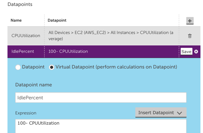
This will collect all the non-stopped EC2 instances in one group, that you can then use as the source of the custom graph. To do so, go to your AWS resource dashboard, select Add Advanced Custom Graph Widget, give it a title (“Idle EC2 resources”); set the default time range to 1 month; the Y Axis to “% idle”; and add a datapoint. For the first datapoint, select the dynamic group you made above as the group source; set device to “*”, to select all members of that group; device datasource to AWS_EC2; instance to “*”; datapoint to CPUUtilization, and select Limit Results to top 10.
Now add another datapoint, but this time select Virtual Datapoint, name it IdlePercent; and set the expression to 100-CPUUtilization, like the below:
Now we just need to add the IdlePercent datapoint to the graph line to be displayed. This will show the top 10 instances, sorted by how idle they are. Given we are only looking at the same datasource for all these devices, we can change the default legend to just ##HOSTNAME##.
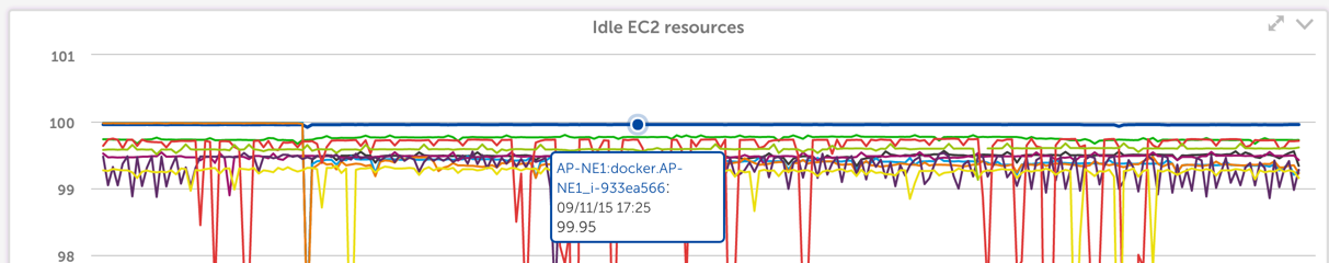
Save this widget, and you get a graph like this:
There are many machines that are generally not used much (which may be good targets for shifting to smaller, cheaper instance types). But you can see that the machine docker.AP-NE1 has been running at zero load for the last month – and a quick investigation with our TechOps team revealed it was a machine no longer in use, that they’d piloted some docker containers on, but after the pilot was moved to production, this particular machine was never terminated.
DynamoDB
Amazon charges for the provisioned capacity of DynamoDB tables, regardless of whether that capacity is being taken advantage of, or needed. So it is a good idea to have another Advanced Custom graph widget showing how much of your capacity, that you are paying for, you are actually using.
There are two views that are useful here. You want one graph showing the percentage of unused read (or write) provisioned capacity, and another showing the number of overprovisioned read (or write) capacity units.
The first view will show you tables that are not being used at all, and can be easily constructed with a custom graph widget like the below (make sure to set the CapacityUsagePercent to a Top 10 view):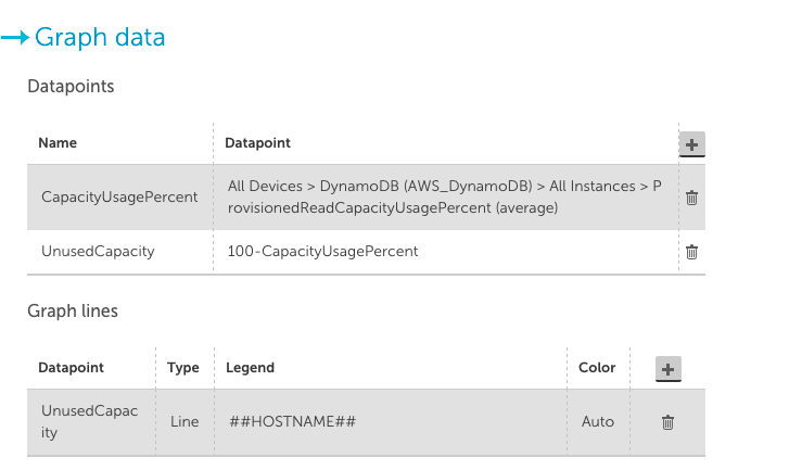
In the case of our internal systems, the above graph configuration showed 10 dynamoDB tables, all with 100% unused provisioned read capacity: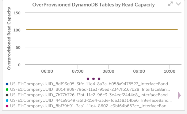
LogicMonitor uses dynamic DynamoDB tables for storing Netflow data – and it turned out we had a bug in the code that was supposed to delete DynamoDB tables, so they weren’t always being cleaned up. Another case where we would have kept wasting money if not for the monitoring.
Another useful view of DynamoDB provisioned capacity is to view it in terms of Capacity Units, not percentage.
A configuration like the below shows the top 10 tables by wasted capacity units (again, ensure you set the CapacityUsagePercent datapoint to a top 10 view):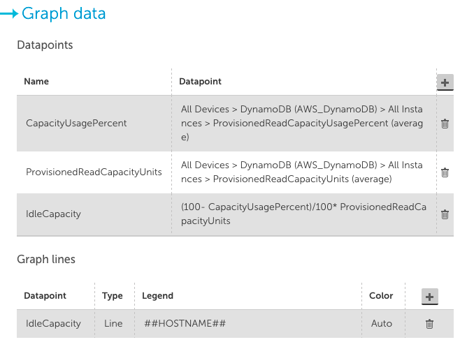
This takes the unused capacity as a percentage for a table, and weights it by the provisioned units, to give the idle capacity in terms of units. And lets you investigate the provisioning of the tables that are costing the most.
In our case, this view wasn’t as informative: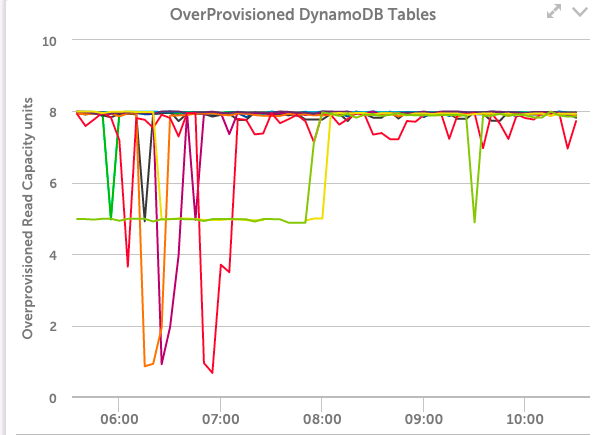
It showed that even among these tables that have the highest level of unused capacity, they were all using that capacity to a significant level during some short periods – so the dynamic capacity adjustment we use seems to be working correctly.
It’s easy to repeat these types of custom graphs for other AWS resource types. And you can identify which services to target by looking at the C0stByService graphs for your account in LogicMonitor, for a quick view of where your money is going. (At LogicMonitor, we also found many unused and no longer needed EBS volumes from this technique.)
Let us know if you have any other cost saving tips for AWS.