In the nascent stages of LogicMonitor, our founder created the LogicMonitor Manifesto, which proclaimed among its core tenets that your data matters, we will never deliver false alerts, and it’s better to have no tool than a broken tool. Each one of these ideas is rooted in our broader monitoring worldview: your data should be meaningful and useful. LogicMonitor believes data is useful when it is actionable, when you can draw conclusions about your environment’s current state, and when you can take necessary steps to remediate or innovate.
In this spirit, we recognize the prospect of drawing actionable data from a rabbit hole of millions of metrics seems daunting, so we spent much of this past year implementing the following innovative ways to display your data in order to maximize its clarity and utility:
Dashboards Made Easy
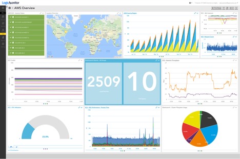
We have long extolled dashboards as a centerpiece of our platform. With over 16 highly customizable widgets, dashboards are the ideal manner of organizing and centralizing key data from across your account. Knowing the huge value of dashboards, we streamlined their implementation for our customers by taking a major stride toward dashboard automation with widget tokens. Now, one can automatically populate a dashboard template with their desired information simply by swapping-in preconfigured tokens. This is a huge time saver for individuals who use a standard format for their dashboards across teams, applications, or customers (if you are a service provider) and would like to avoid continually reconstructing dashboards from scratch. Here’s how it works:
Let’s say you are a service provider and have a consistent naming strategy across your devices, ie. CustomerA.pod1. By configuring your widgets with token ##customername##.pod1, one could simply change the token from CustomerA to CustomerB, and a new dashboard would populate with all of CustomerB’s information. If you have already put forth the time and energy into a dashboard format that works for your business, let widget tokens create the rest of your dashboards for you!
Dashboard Report
If it were not already clear, dashboards got a lot of TLC this past year. Our next major improvement to data visualization was our dashboard Report. We imagine many of our customers have been in one of the following positions:
- You have created a dashboard dedicated to a business-critical application, and would like to send that dashboard in-full to colleagues for purposes of issue or performance remediations
- You have a quarterly meeting with your executive staff and would like to send everyone a snapshot overview of your business metrics, information for capacity planning, or justifications for investment decisions.
- You are a SP and want to provide your customers with a monthly overview of their environment’s-and, thus, your-performance.
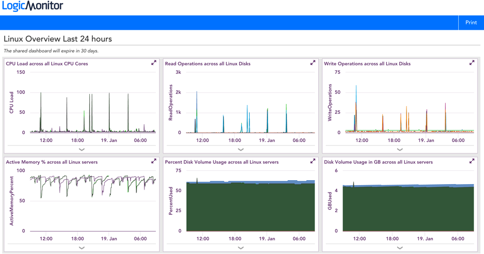
Lo and behold, dashboard Reports were created just for you. Released just this past December, you can now schedule a one-off or recurring email that sends your dashboard via an embedded URL. Information is only as good as the people who hold it, so LogicMonitor wants to ensure that your data is easily shareable to all who need it.
Alert Forecasting
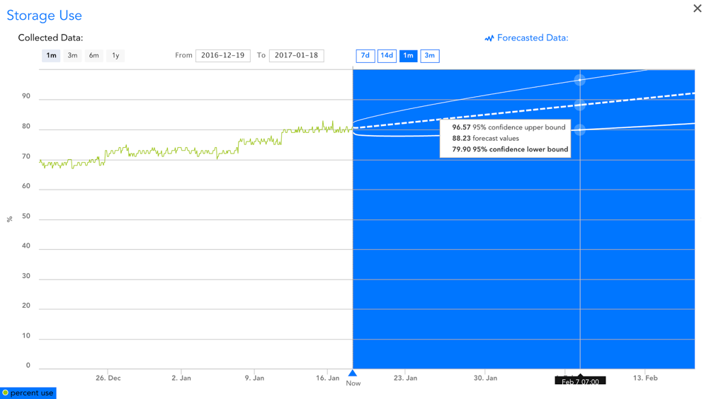
The best alert is one that is prevented. We at LogicMonitor want to help you proactively manage your environment rather than continually putting out fires. To do so, we introduced Alert Forecasting which uses statistical modeling based on your current data to project its future trends. Using this feature, questions that once hounded you such as “in how many days or months will my disk space become full?” or “at the rate we’re going, when will I max-out my allocated budget for AWS?” can now be answered with the click of a button. Read our blog for more information about specific use cases for Forecasting.
Whether you are troubleshooting an unexpected event in your environment or justifying upcoming expenditures to your boss, visualizations guide your way through the haze of data. Drop us a line and let us know how your team has benefitted from these changes over the past year! Also, stay tuned for the final post of our Year in Review blog series!