At LogicMonitor we take turns learning from each other in informal sessions. One week it may be developers talking about MySql and NoSQL; or marketing guys talk about lead generation and Adwords, etc. This time we’d arrived on the topic of programming languages, and how there is a trade off: between code speed and efficiency when using assembler or C at the expense of programmer efficiency; compared with much better programmer productivity at the expense of code efficiency when using languages with higher levels of abstraction, like Ruby on Rails or Python/Django.
Someone asked if that abstraction and inefficiency matters: as in most operational issues, it matters only if it matters. By which I mean if you are writing a system that is lightly used, or is on powerful hardware – it may not matter at all. But if you suddenly have an increased workload, it may matter a lot. (See the early occurrences of Twitter’s fail whale and RoR scaling.)
Then the question was asked, how can you know whether you are improving things when you change code? Trend it, of course. You probably know what will constrain your application performance. (If not, you need better monitoring.) For many sites, an obvious constraint is likely to be database queries per second. So plot database queries per web request over time
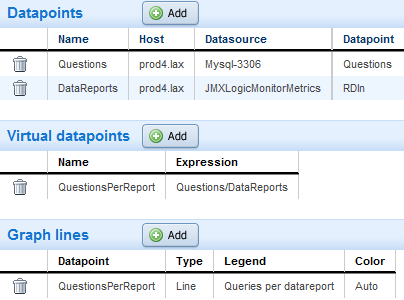
For example, at LogicMonitor, we track database activity, correlated with monitoring data being reported back from customers, with a custom dashboard graph defined like the below. It simply divides Mysql questions per second by the number of datasets being reported back per second:


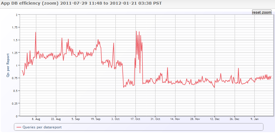
And the result is:


So it’s clear that in early October there was a code change that resulted in about a 50% reduction in the number of database lookups per reported dataset. Then another change that made things worse, that was reverted.
Graphs like these are essential for tracking the performance implications of code changes – given that this server has a constantly varying load, it’s harder to just look at the MySQL graphs – there may be a large change in Db Questions, but caused by changes to load, not code. By relating the load driver (web requests, or reported data) to the constraint (DB queries in this case), you can assess just the code impacts, not the load.
And the beauty of this approach is it lets you tie together your real inputs to various constraints. You could chart:
- web requests to web server CPU
- web requests to DB operations (i.e. like relating to questions, but only questions that the query cache could not answer).
- web requests to NetApp disk operations for the volume holding the main DB
- any primary input to any constraint you can think of.
You’ll see if you’re code is making your requests more or less efficient, and thus impacting your scalability. You’ll see if infrastructure changes (deploying memcached, say) are making significant differences.
If you want to scale, and do it without wasting a ton of money on hardware, and have real actionable information to take to your development teams to help improve code – this approach is a great step.
And of course, if you’re a LogicMonitor customer, and want help setting up this kind of trending or dashboards – we’ll work with you to set it up, free.
