
We take two things very seriously here at LogicMonitor: Data and Star Wars. So you can imagine what happened when we unleashed our best and brightest on the The Star Wars API (SWAPI) and offered uncontested bragging rights to whoever created the best Star Wars Dashboard.
We got some predictably amazing results – proving once and for all that LogicMonitor dashboards aren’t only for monitoring mission critical IT. Anything that reveals data can be pulled into an easy-to-read view. And the people and systems powering the epic struggle between the Empire and the Resistance are no exception.
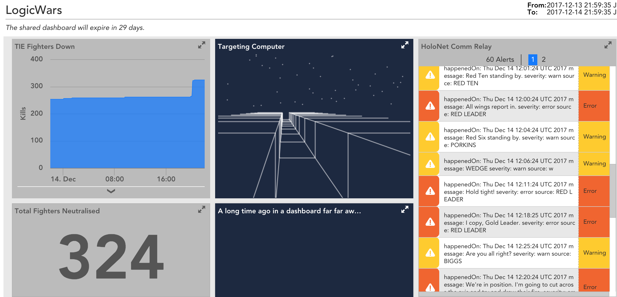
Integration Engineer, Jon Davis successfully blew our minds with a dashboard featuring a live-feed of conversations of the rebel forces from Episode IV and 2D Trench Run Game with a live count of TIE fighters destroyed. Check it – and the runners up – out below!
First Place: LogicWars
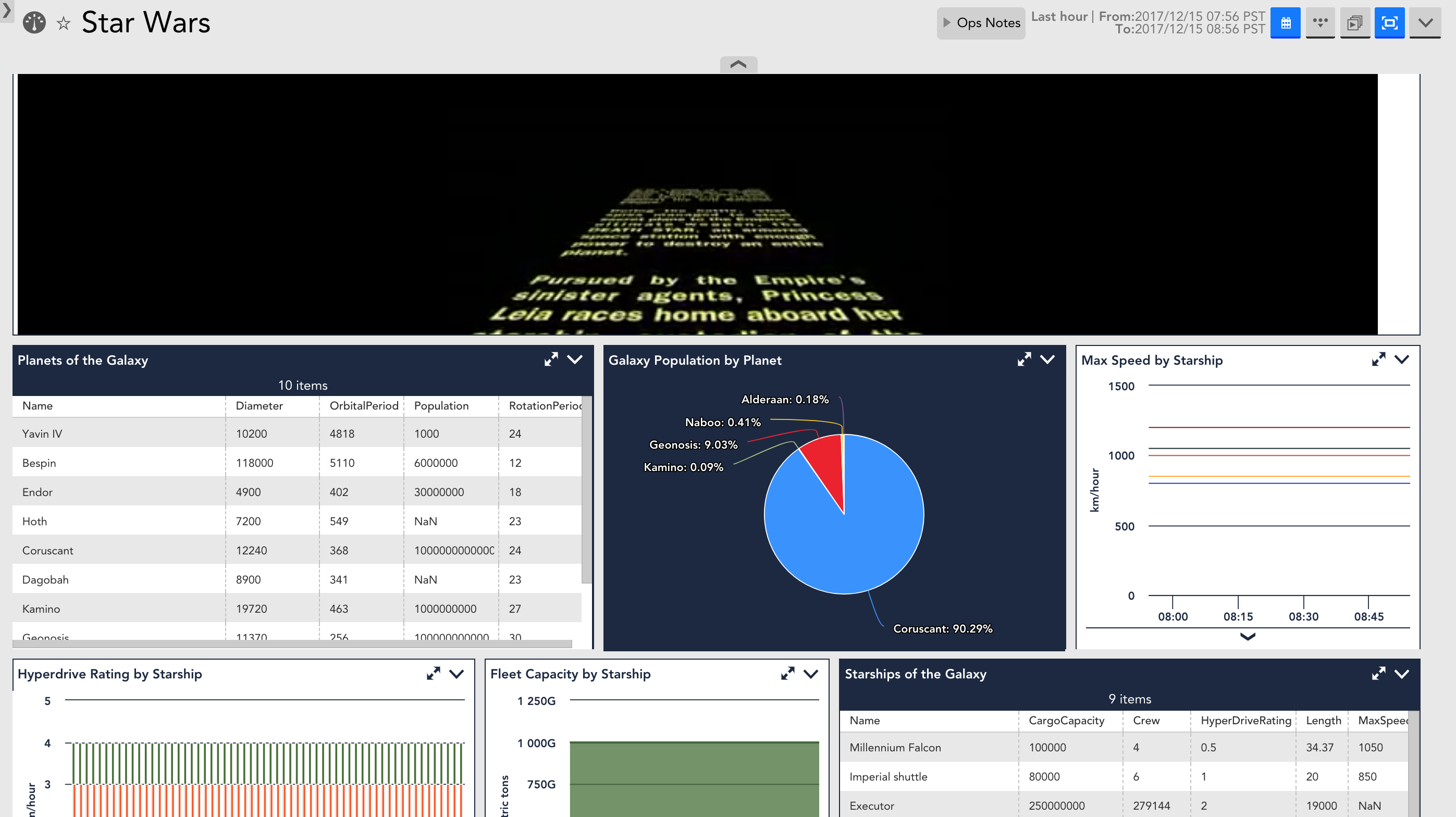
Runner Up: The entire Galaxy from a single pane of glass
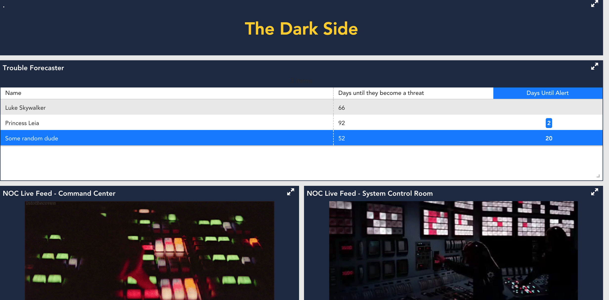
Third Place: forecasting trouble for the Dark Side
Some of the favorite “things monitored” in this competition include:
• Death Star Uptime
• Galaxy Population by Planet
• Yoda’s Age and Life Expectancy
• Fleet Capacity by Starship
• Strength of the Force within Luke and Leia
The ability to customize your experience with LogicMonitor is near limitless. Interested in learning more? Sign up for a free trial here and may the force be with you!