
Anomaly Detection Visualization
Last updated on 07 January, 2022FEATURE AVAILABILITY: LogicMonitor Enterprise
Anomaly detection identifies data that does not conform to expected (or usual) patterns. LogicMonitor uses machine learning algorithms to establish expected data patterns for datapoints so that it can then identify data that falls outside of these patterns. Anomaly detection provides another avenue of insight into resource behavior, allowing users to potentially catch issues before they escalate into more severe events.
The LogicMonitor platform leverages anomaly detection to:
- Automatically trigger alerts when anomalous values are present, as discussed in Enabling Dynamic Thresholds for Datapoints.
- Visually highlight expected data ranges (and any data that falls outside of these ranges) for any graph in the LogicMonitor interface, as discussed this topic.
Anomaly Detection Graphs
Similar to data forecasting, anomaly visualization is available from any graph in the LogicMonitor interface, regardless of whether it is being viewed from the Graphs tab, Alerts page/tab, or dashboard.
To display the anomaly detection version of a graph, click the dropdown arrow in the upper right corner of the graph and select “Anomaly Detection” from the dropdown menu that appears. A dedicated anomaly detection graph opens, with anomalies highlighted in red.
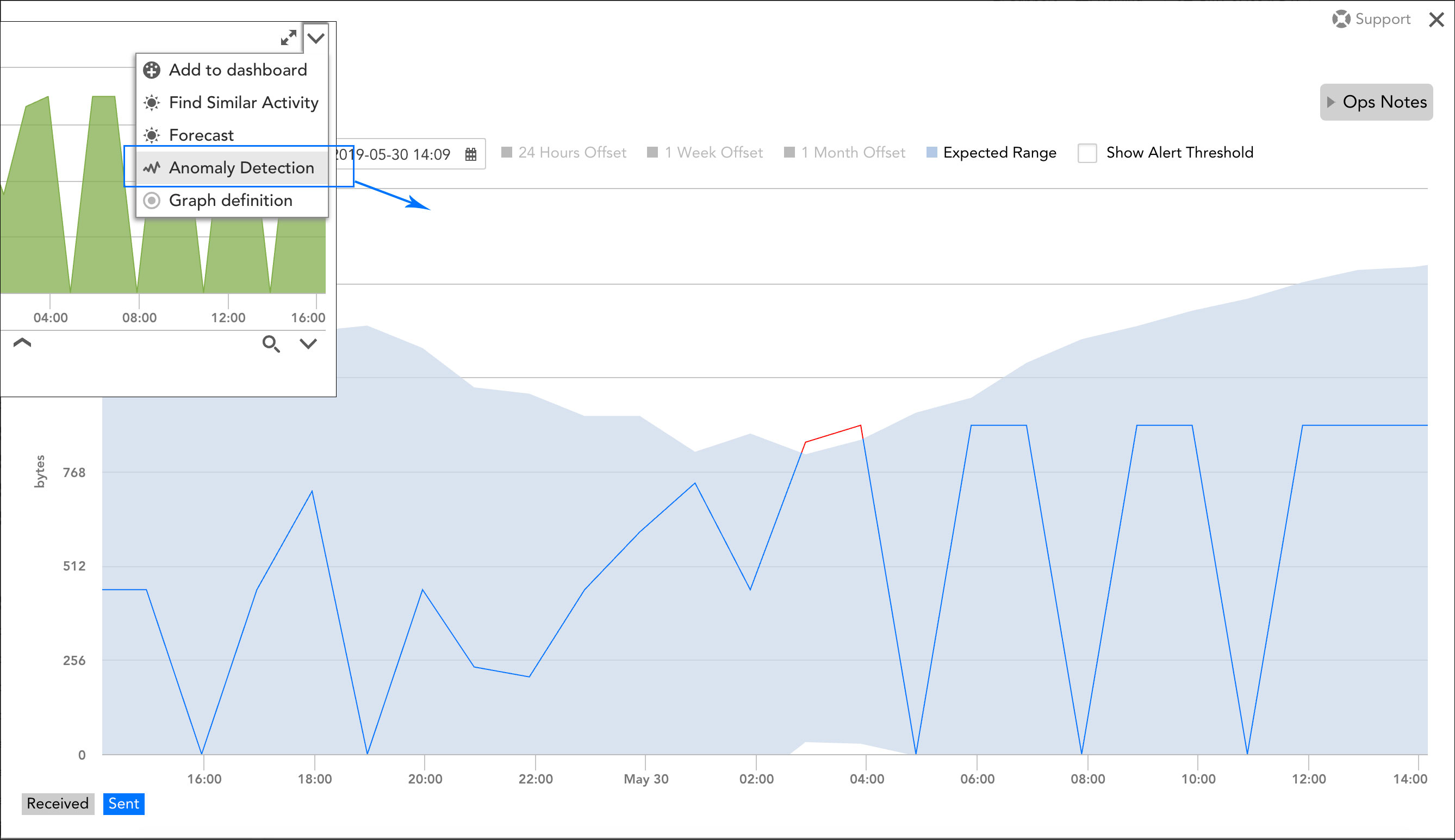
Note: Anomaly detection graphs can only visualize one datapoint or instance at a time. If your graph charts the signals of multiple datapoints (or multiple instances per datapoint), use the legend selections in the bottom left corner of the graph window to toggle between datapoints/instances.
As discussed in the following sections, there are several unique tools available on an anomaly detection graph that you can use to derive additional context from the data presented.
Expected Range
When enabled, the Expected Range option shades the area of the graph in which datapoint values are expected to fall. The expected range is based on the nine days of historical data immediately preceding the start of the graph’s time range; this historical data is fed into the anomaly detection algorithm to generate a forecast that is then projected onto the current time range.
Offsets
When enabled, an offset adds a historical signal to the graph to support a quick comparison with the current signal. LogicMonitor offers three offsets, allowing you to display signals that shift back in time by 24 hours, one week, or 30 days. For example, if you are analyzing a point in the graph that occurred on Wednesday at 3:09 p.m., the one-week offset point would represent 3:09 p.m. on Wednesday of the previous week.
Show Alert Threshold
The Show Alert Threshold option is available if a static threshold containing the “value” alert operator (e.g. the current datapoint value is directly compared to the threshold value) is set for a respective datapoint. When this option is enabled, all thresholds associated with the datapoint are overlaid across the graph. For more information on setting static datapoint thresholds, see Datapoint Overview.
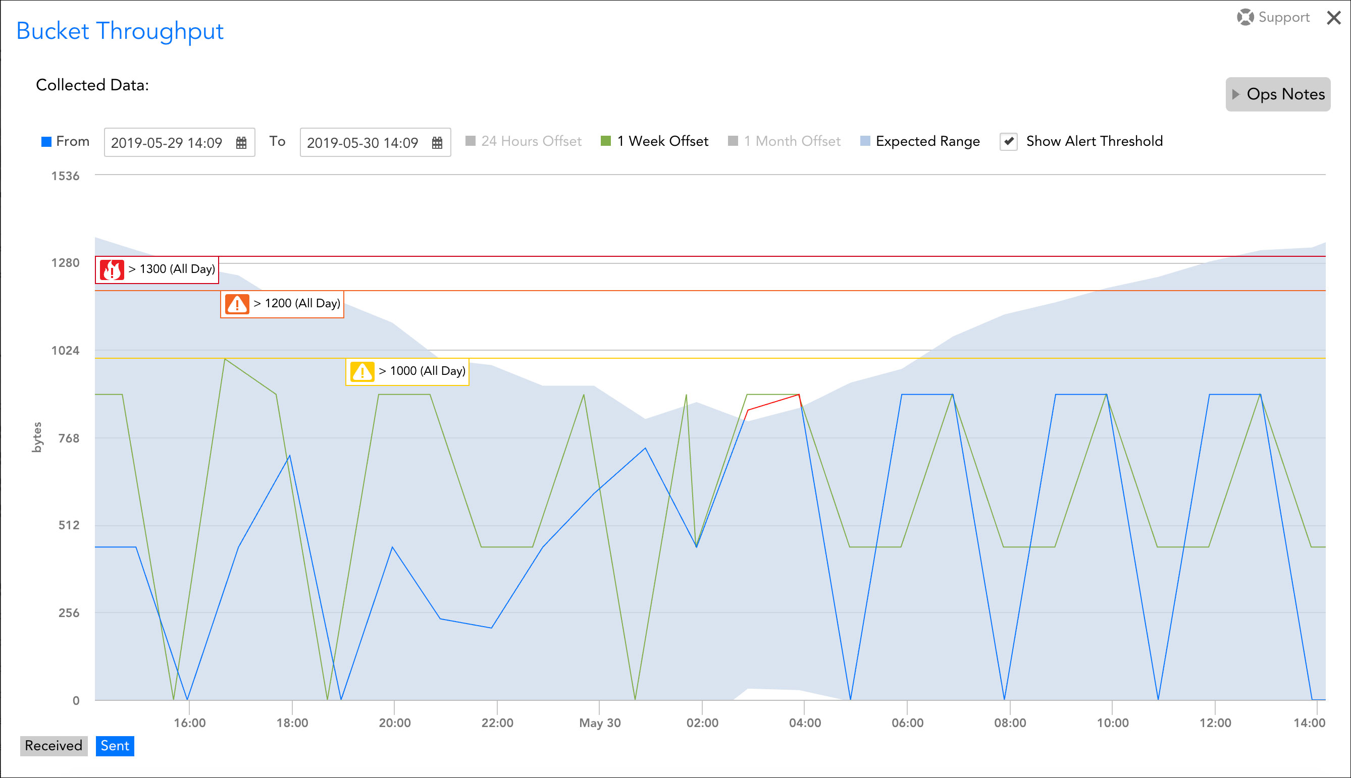
This anomaly detection graph indicates that anomalous conditions existed for a little over an hour over the 24-hour duration depicted. It features the light blue expected range overlay, alert threshold markers, and a one-week offset comparison (represented by the green line).
Time Range
By default, an anomaly detection graph preserves the time range that was set for its originating graph. This time range can be customized to the minute using the From and To fields.
Note: Anomaly detection graphs are based on aggregated (resampled) data, so their renderings of graph coordinates and expected ranges may reflect slight distortions. The potential for distortion increases as the graph’s time range increases because more resampling is required to fit the graph onto a finite screen size. Although this is rarely an issue on its own, it’s worth noting that, if dynamic thresholds are enabled for a datapoint, these graphs may not always perfectly align with the expected ranges that are used to trigger alerts when dynamic thresholds are active.
Ops Notes
The ability to add Ops Notes isn’t unique to this graph version, but it’s worth noting that users retain the ability to view and set Ops Notes from anomaly detection graphs. Ops Notes are time-stamped annotations that add context to graph data, notably context that serves to correlate anomalies in graph data with other events in your environment. For more information on Ops Notes, see Using Ops Notes.
Anomaly detection training window
The training time window for anomaly detection is 3 days. If you see the error, “Graph line has not enough or valid data”, there are two possible causes related to the training time:
- The datapoint was added recently and there has not been enough data collected to for the algorithm to generate an expected range for anomaly detection.
- The selected graph time range includes a significant gap in data collection in the beginning, middle, or end and there are not enough consecutive datapoints in the selected range for the algorithm to generate an expected range for anomaly detection. The selected graph time range should be adjusted to exclude such gaps in data collection so that the expected range can be calculated and the anomaly detection graph rendered.