Gauge Widget
Last updated on 10 August, 2022The Gauge widget enables you to present data on a relative scale, including peak values if desired. You can use the Gauge widget for metrics that have a relative or aggregated value.
Create a Gauge Widget
Click on the Add drop-down and select gauge widget from the list. The wizard for setting up the gauge opens. See these instructions for help filling out the title, description, dashboard and refresh frequency fields.
Gauge Datapoint
Begin by following our instructions for adding a datapoint to your Gauge widget. If you’re looking to create a virtual datapoint (perform a function on a datapoint) that is done slightly differently for this widget – first add a datapoint and then select the ‘perform function on this datapoint’ and enter an expression. Additional configuration options for each datapoint include Data Series, Legend, Gauge Minimum Value, and Gauge Maximum Value:
| Datapoint | Description |
| Data Series | Select how you would like to see the data represented on the gauge, as an average, maximum or minimum. |
| Legend | This field provides a place for explanation of the data displayed. |
| Perform Function on this Datapoint | The perform function enables you to change how the datapoint value is calculated. This is useful if you are looking to edit units, display the value as a percentage, or have other formulas typically utilized when displaying the datapoint type. |
| Gauge Minimum Value (0%) | The minimum value to be displayed on the widget. Commonly 0, but potentially a different value if you are looking at a limited subset or range. |
| Gauge Maximum Value (100%) | The maximum value to be represented on the widget. |
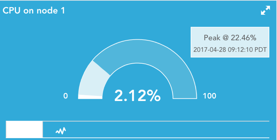
| Show Peak | Select this checkbox to display a peak value over a selected time range. While the Gauge widget is designed to display current value of a configured datapoint, the Peak option enables you to view the highest value of that datapoint over the last 1 hour to 1 year. |
Gauge Widget Display
Once you have configured your Gauge widget, it will appear on the designated dashboard. Note that the Gauge widget has two potential display modes: Gauge and History Graph.
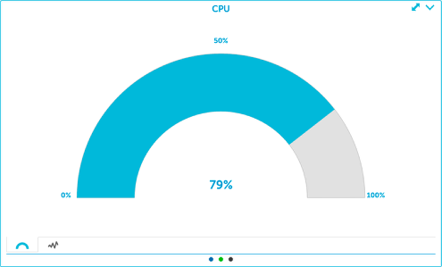
Gauge
This will display data as a gauge. In this mode, the most recently collected data will be displayed in the widget. This is a single, snapshot value. As such, the data series configuration field (display the max, min, or mean of collected data) will not impact the data’s display when the widget is set to “Gauge” mode. This mode is useful for displaying data as a percentage (ie. percent CPU usage on a node).
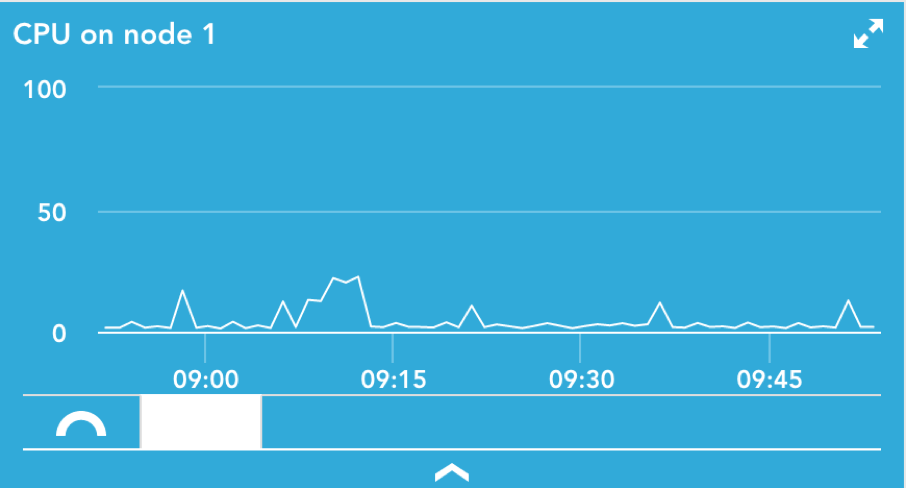
History Graph
This mode will display all raw historical data on a line graph. In history graph mode, the data series configuration field (display the max, min, or mean of collected data) will impact the displayed trending values.