Table Widget
Last updated on 12 March, 2021The Table widget lets you easily compare current datapoint values across multiple devices. You may find this widget particularly useful for comparing performance and capacity metrics across different device types. The Table widget also allows you to enable alert forecasting.
To create a Table widget, select “Add” from the dashboard toolbar and select Table widget. See these instructions for help filling out the title, description, dashboard and refresh frequency fields.
Table Options
The first configuration available in the Table widget is Custom versus Dynamic. A custom Table widget will enable you to select static datapoints for designated devices in your table, whereas a dynamic Table widget will display the Top or Bottom 10/Top or Bottom 25/All active instances available for the first configured datapoint [column] based on a glob expression. The dynamic table is ideal if you want real-time insight into which datapoints/devices are using the most or least available resources, such as CPU or Bandwidth.
The configuration for both custom and dynamic Table widgets are nearly identical. However, a dynamic selection will prompt you to select whether you want to display the Top 10, Top 25, Bottom 10, Bottom 25, or Show All active instances for your selected datapoints:
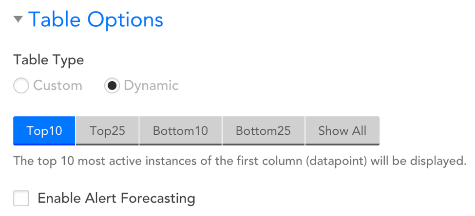
Enable Alert Forecasting
Selecting this option will display the projected number of days until a datapoint surpasses a designated alert threshold. See below for more details.
Adding Datapoints/Devices to your Table Widget
The Table Options section is where you will configure the data you’d like to be displayed in your widget. Simply add the devices whose metrics you’d like displayed as rows and add the datapoints (metrics) you’d like to see for each device as columns. You’ll need to add at least one column and at least one row (i.e. choose one datapoint and one device) to create your table widget.
Adding a Row
To add a row you’ll need to select a device. Once added, you can edit a row by selecting the device name. In the “Row Name” field, you can assign a custom name to the table row. If you do not fill-out this field, then it will default to the device’s name.
On the far righthand side of the displayed rows, you will see three icons indicating the following:
- Drag and drop rows to control the order in which they are displayed in the table
- Copy a row
- Delete a row
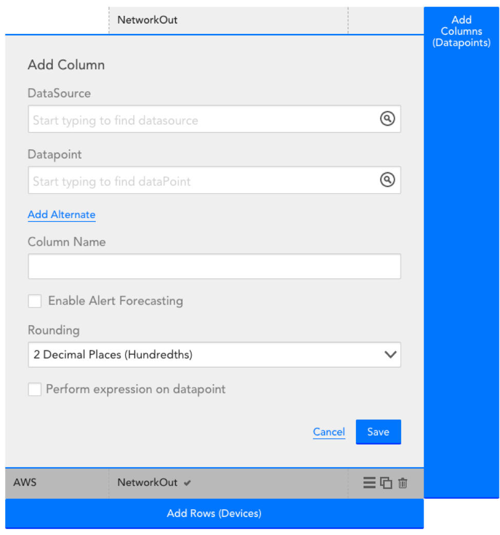
Adding a Column
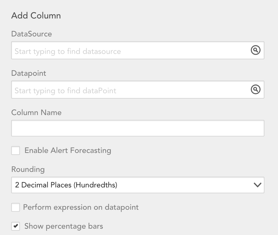
To add a column you’ll need to select a datapoint. Select a datasource first to get a list of datapoints for that datasource. You can edit an existing column by selecting the column name at the top of the configuration. You delete a column by selecting the column name and then selecting ‘delete’.
The “column” config will have the following additional options:
Rounding
Designate that rounding method that should be assigned to the datapoint’s value. Select from: No Decimal (whole rounded number), 1 Decimal, or 2 Decimal places.
Perform expression on datapoint
Embed a groovy script to perform an expression on the collected datapoint.
Note that:
- If you are selecting a datapoint that isn’t applicable to all the devices you’ve added to the table, consider adding an alternate datasource. When an alternate datasource is added and the primary datasource doesn’t apply to a device in the table, the alternate datasource will be used. For example, if you’re comparing CPU busy percent across 4 Linux servers and 1 Windows server, you should set the primary datasource as NetSNMPCPUwithCores and set the alternate datasource to WinCPU. You can add up to 5 alternate datapoints for each column
- If you select a datapoint for a multi-instance datasource, you’ll see a ‘Select Instance’ button. You then have the option to select an instance per device row in the table, or you can select the instance in one row and also check the ‘apply to all cells in this column’ option to look at the datapoint value for the same instance across all devices
- Once you’ve added datapoints (columns) to the table, a check mark will display to the right of the datapoint for every device that datapoint exists for. If a selected datapoint does not exist for a device, ‘no matching datasource’ will be displayed in the row for that device
The table configuration will indicate which datapoint values will be displayed for each device.
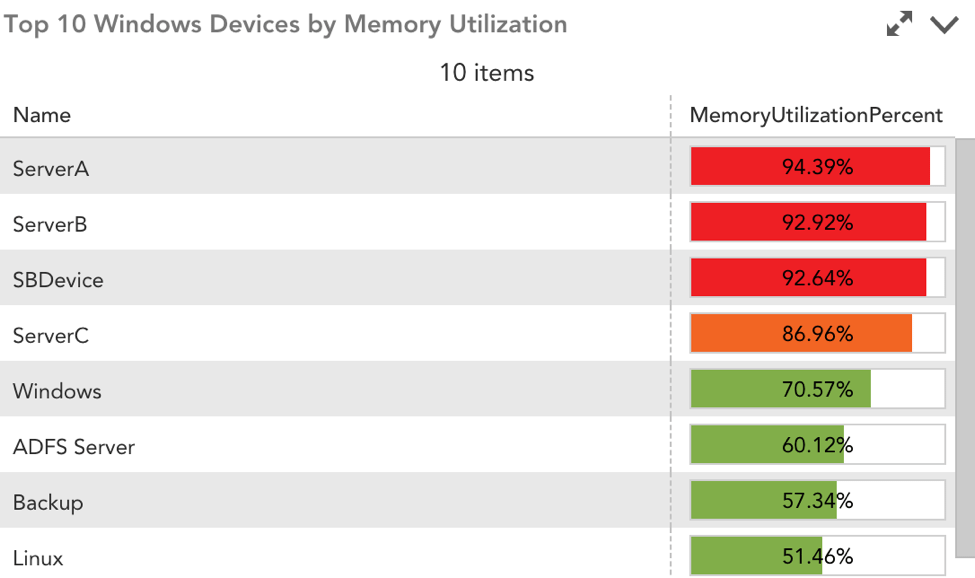
Show Percentage Bars
Selecting this option will enable you to color-code the value of datapoints based on a designated threshold. For instance, you can choose to highlight a datapoint cell as red or orange if it crosses a 90% or 85% threshold, respectively. This is ideal for at-a-glance views of your environment’s health. Please note this option will only display when the selected datapoint is represented by a percentage.
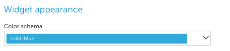
Widget Appearance
Select the color scheme for the Table widget:
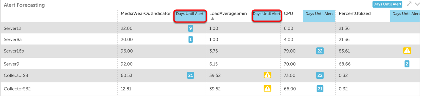
Alert Forecasting
Embedded in the Table widget is the option to enable Alert Forecasting, which uses predictive analytics to review datapoints’ past trends and plot their future trajectories. Using your predetermined alert thresholds, Alert Forecasting will display the number of days until a datapoint will surpass its designated threshold.
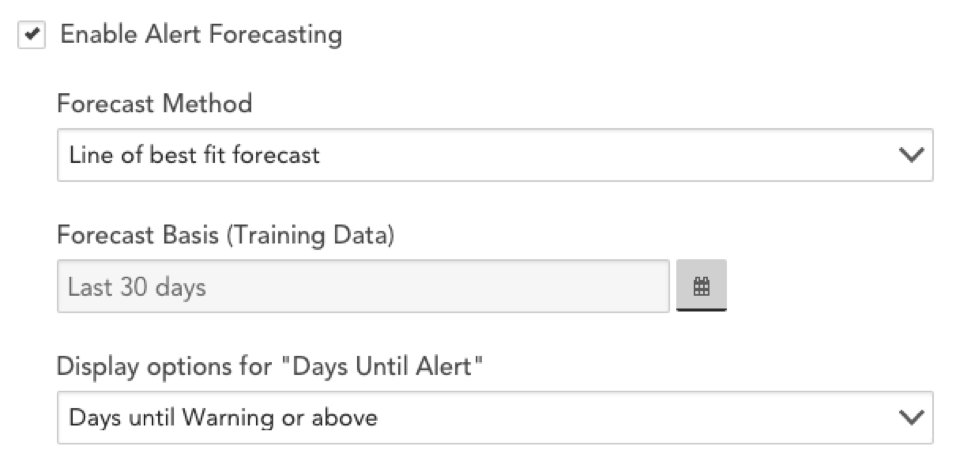
Alert Forecasting is enabled globally under the Table Options portion of the configuration menu. Once you have enabled forecasting globally, you can choose to disable it at the datapoint level. Checking the box next to “Enable Alert Forecasting” will reveal several configuration options:
Forecast Method
From the Forecast Method field’s dropdown menu, select from one of two forecast methods:
- Line of best fit forecast
- 95% confidence forecast
For more information on these forecasting methods, see Data Forecasting.
Forecasting Basis (training data)
This field allows you to designated the time range of data that we will use to predict future trends.
Display options for “Days Until Alert”
Select whether you want to display the number of days until a Warning, Error, or Critical alert (and above) is triggered. You will also have the option to add three columns to the Table widget, each showing the days until a Warning, Error, or Critical alert, respectively.
Minimum Confidence to Include
This option is only relevant if you selected 95% confidence forecast as the Forecast Method. In this field, you need to specify the minimum level of confidence LogicMonitor’s algorithm must have in order to predict an alert. For instance, if you choose a 70% minimum confidence, you are saying LogicMonitor’s forecasting algorithm must be at least 70% certain of a future alert before it can issue a prediction.
Once you have saved Alert Forecasting in the Table widget, it will appear on the designated dashboard.
The Table widget will display a column, “Days Until Alert,” which shows the number of days until the corresponding datapoint will surpass its alert threshold. If a datapoint is already triggering an alert, an icon indicating the alert severity will appear in this column.