Gauge Widget Overview
Last updated on 27 March, 2023The gauge widget enables you to present data on a relative scale, including historical peak values. You can use the Gauge widget for metrics that have a relative or aggregated value.
Gauge Widget Display
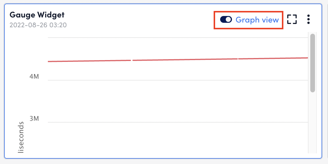
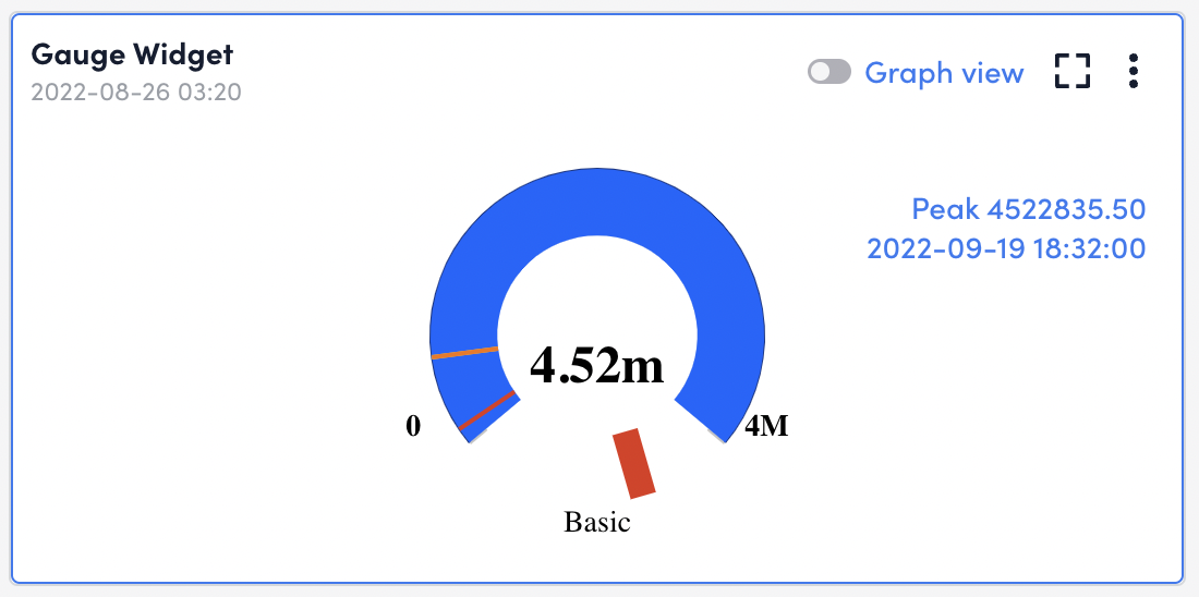
After you configure the Gauge widget it displays on your dashboard with two designated display modes:
- Gauge: the data displays as a gauge and the most recently collected data will be displayed on the widget. This is a single, snapshot value. The data series configuration field (display the max, min, or mean of collected data) will not impact the data’s display when the widget is set to Gauge mode. This mode is useful for displaying data as a percentage (i.e., percent CPU usage on a node).
- Graph View: The data series configuration field (display the max, min, or mean of a collected data) impacts the displayed trending values. This mode is useful for displaying all raw historical data on a line graph.