
Viewing, Filtering, and Reporting on NetFlow Data (Legacy UI)
Last updated on 17 August, 2023When the collection of network traffic flow data is correctly configured and enabled, as discussed in Configuring Monitoring for NetFlow, the Resources page displays an additional tab of data for the device, called the Traffic tab.
The Traffic tab consists of built-in tables, graphs, and charts that illustrate common network traffic flow statistics including top talkers, top flows, top source/destination endpoints, top ports, and more. The data can be filtered by a number of criteria and the individual data visualizations that display on the Traffic tab can be added as widgets to your dashboards.
Data Retention
LogicMonitor has a specific data retention policy for exported network traffic flow data. The policy is per interface, and data is sampled and retained according to the following schedule:
- Raw data is retained for up to five minutes.
- Every five minutes, the top 1000 flows are pulled from the current pool of raw data and retained for up to 30 minutes.
- Every 30 minutes, the top 1000 flows that have been retained for each of the five-minute intervals (at this point, there are six intervals total for up to 6000 flows) are combined and the top 1000 flows are pulled and retained for up to 24 hours.
- Every 24 hours, the top 1000 flows that have been retained for each of the 30-minute intervals (at this point, there are 48 intervals total for up to 48,000 contributors) are combined and the top 1000 flows are pulled and retained on a rolling basis for a maximum period of 400 calendar days, based on your account retention plan.
The following data is retained:
- FlowDirection
- SourceIP
- SourcePort
- DestinationIP
- DestinationPort
- Protocol
- StartEpochInSeconds
- EndEpochInSeconds
- TCPFlags
- InterfaceIn
- InterfaceOut
- PacketsReceived
- BytesReceived
- PacketsSent
- BytesReceived
- ApplicationName
- ApplicationCategory
Viewing Network Traffic Flow Data
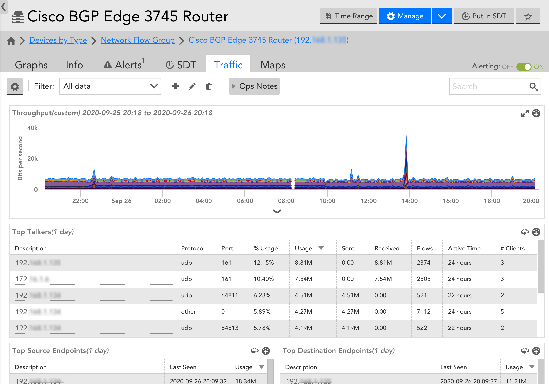
Network traffic flow data is viewed from the Traffic tab, which displays on the Resources page for devices that have been enabled to collect this data.
Viewing Data at the Device or Device Group Level
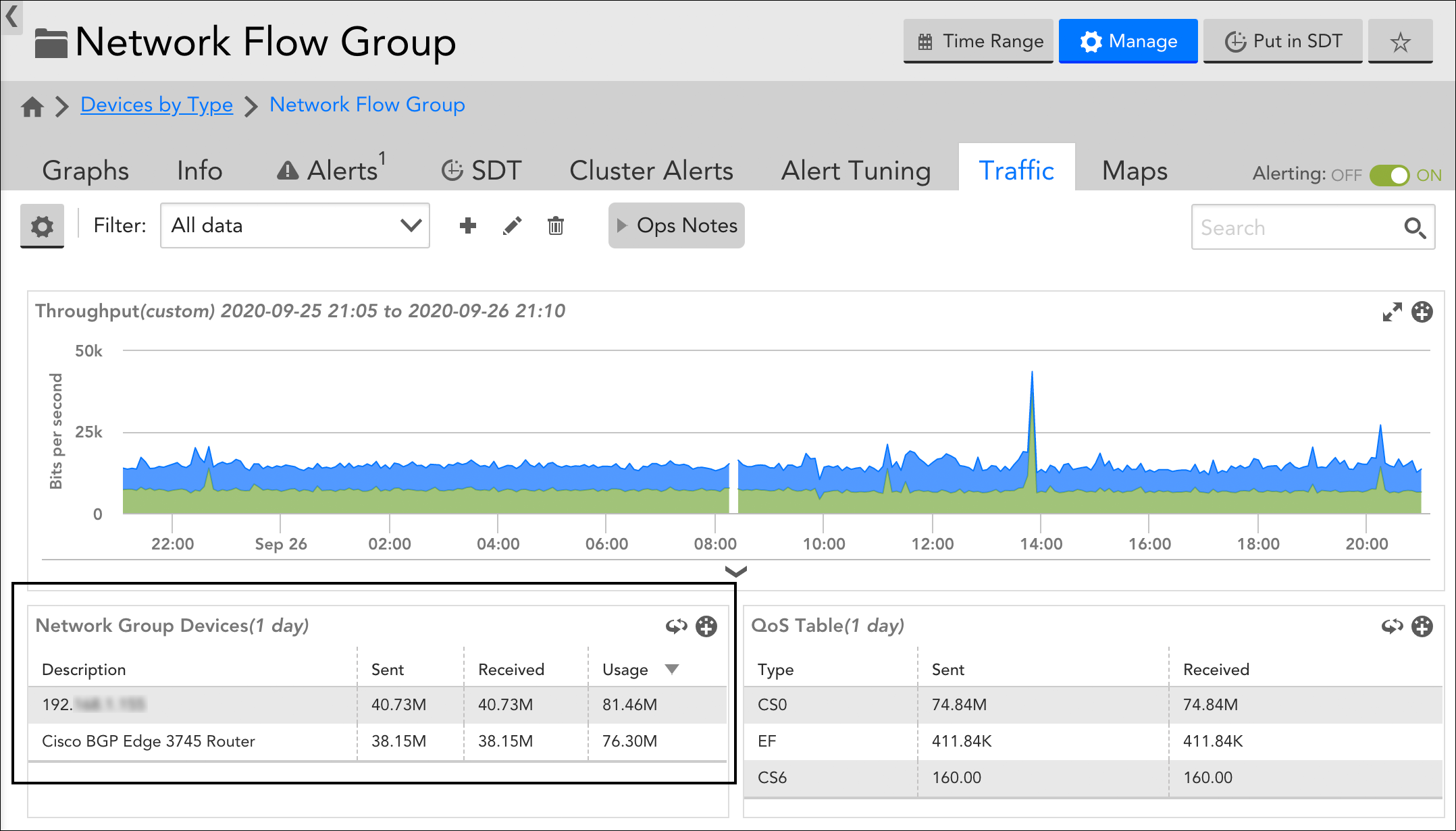
In addition to displaying network traffic flow data at the device level (in other words, per device), the Traffic tab also displays device groups that have one or more enabled devices as members.
At the device group level, the Traffic tab aggregates data coming from enabled devices in the group. Group-level aggregation is currently limited to 10 actively contributing network-flow-enabled devices per group. If there are more than 10 actively contributing members per group, the top 10 based on the bandwidth consumption are considered. Device IDs are stored in the system.deviceID property and are auto-incremented with each new device added into monitoring; device IDs cannot be manually updated.
Aggregated network traffic flow data can be very helpful in some use cases. For example, you can use group-level data to visualize network traffic on a per-office basis or per-datacenter basis. For more information on device groups, see Device Groups Overview.
Traffic Tab Data Visualizations
The Traffic tab displays widget, table, graph, and pie chart visualizations to illustrate commonly collected network traffic flow data. With the exception of the NetFlow Health widget, the time range of these visualizations is controlled by the universal time range currently set in your portal, as discussed in Changing the Time Range.
The Traffic tab consists of the following built-in data visualizations:
NetFlow Health widget. Provides an at-a-glance view of the health of your network traffic flow monitoring operations. This widget is located at the very top of the Traffic tab and can be statefully expanded or collapsed. For more information on the NetFlow Health widget, see Troubleshooting NetFlow Monitoring Operations.
Throughput graph. Displays throughput (as bits per second) for the device. If viewing at the device group level, this graph displays aggregate throughput for up to 10 devices in the group (these devices are listed in the Network group devices table/pie chart).
Note: You can manipulate the Throughput graph in many of the same ways other graphs throughout the LogicMonitor interface can be manipulated (for example, adding Ops Notes, downloading the graph data, customizing the legend, and so on). For more information, see Graphs Tab.
Top Talkers table/pie chart. Displays usage details for the top talkers on the device. If viewing at the device group level, this visualization displays usage details for the top talkers across a maximum of 10 devices in the group (these devices are listed in the Network group devices table/pie chart).
Top Source/Destination Endpoints table/pie charts. Available at the device level only, these two data visualizations display usage details for the top source and destination endpoint IPs.
Top Flows table/pie chart. Displays usage details for the top flows on the device. If viewing at the device group level, this visualization displays top flows for up to 10 devices in the group (these devices are listed in the Network group devices table/pie chart).
Note: The interface name is displayed when the interface index is present in Netflow data and if the same index matches from DataSource starting with snmp64_if.
Network group devices table/pie chart. Available at the device group level only. Displays a list of NetFlow enabled devices (maximum of 10) that are contributing to the aggregated flow data displayed at the group level. The devices shown in this visualization are the ones contributing data to all other visualizations at this group level.
Note: The devices are sorted first in alphabetical order based on the host display name to get 10 NetFlow enabled devices. After aggregating data, the devices are sorted again based on usage.
QoS table/pie chart. Displays quality of service (QoS) data for each differentiated service code point (DSCP) type. If viewed at the device group level, this visualization graph displays QoS data for up to 10 devices in the group (these devices are listed in the Network group devices table/pie chart).
Top ports table/pie chart. Available at the device level only displays the ports with the most traffic flow.
Top applications table/pie chart. Available at the device level only displays the applications with the most traffic flow (sourced from NBAR2).
Note: The Top applications visualization will show as empty unless you have specifically configured your device (and LogicMonitor) to collect NBAR2 data. The requirements and configurations for NBAR2 are discussed in Configuring Monitoring for NetFlow.
Viewing Data via Reports and Dashboard Widgets
In addition to viewing network traffic flow data from the Traffic tab, you can also view this data via reports and dashboards.
Dashboards
The majority of data visualizations that display on the Traffic tab can be added as widgets to one or more of your dashboards using the add to dashboard icon. Any current active filters on the Traffic tab will be preserved by the recipient dashboards; however, because the visualizations are added in the structure of the built-in NetFlow widgets, these filters can be updated from the dashboard at any time (independently of the Traffic tab).
Note: As discussed in Widget Overview, you can also build NetFlow dashboard widgets on a per-device basis from the Dash page. The built-in NetFlow widget offers the same filters as the Traffic tab.
Reports
LogicMonitor offers a dedicated report for network traffic flow data. See the NetFlow Device Metric Report for more information.
Configuring IP-DNS Mappings
If you’d like the Traffic tab (and any associated reports or dashboard widgets) to display DNS names in addition to IP addresses other than those that have already been resolved, you can provide explicit IP/DNS mappings—either individually or by uploading a CSV file.
Uploading Mappings Using a CSV File
If you want to upload mappings using a CSV file, then
- Click Settings in the upper left corner of the Traffic tab.
- On the Setup dialog box, click Upload Mapping CSV.
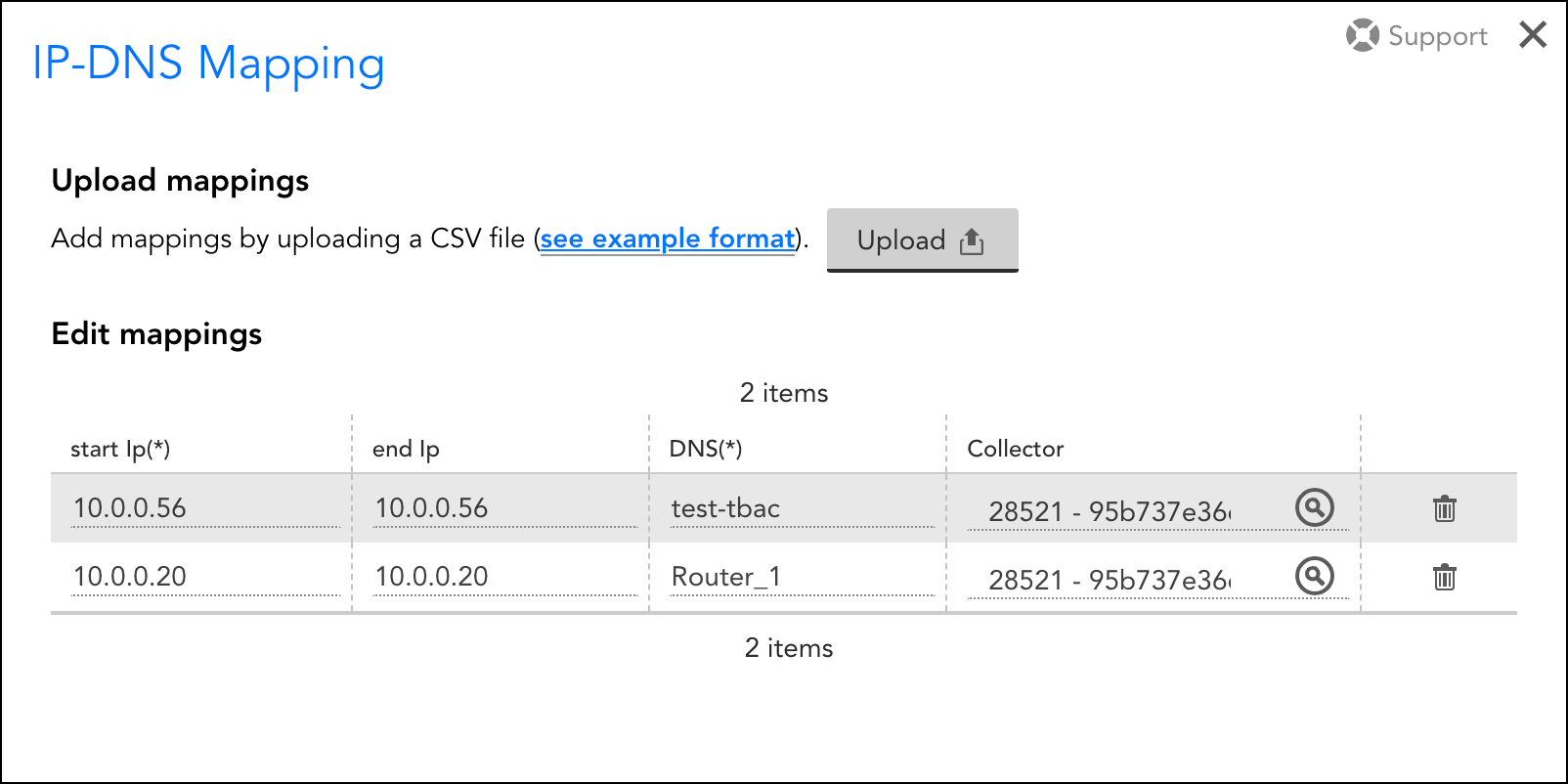
The following columns must be present in the CSV file:
IP-DNS Mapping CSV:
- start – Contains the starting IP address of the DHCP range.
- end – Contains the ending IP address of the DHCP range.
- dns – Contains the DNS name associated with the IP address(es).
- collector – (optional) Contains the Collector ID and allows you to configure mappings per Collector collecting network flow data. This is particularly useful for establishing differentiated mappings per collector or, globally.
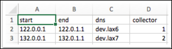
Note: You can also click see example format to download the template and fill in the required information and upload the CSV file.
Once you upload the CSV mapping templates, you can edit the mappings from the Setup dialog box.
Manually Creating Mappings
Mappings can be created (or edited) on the fly simply by placing your cursor into any value found in a visualization’s Description column, updating the value, and clicking the Save button that appears at the end of the row. This creates a new or updated entry on the IP-DNS Mappings dialog.
Filtering Network Traffic Flow Data
You can filter the traffic flow data that displays on the Traffic tab to optimize relevancy. An active filter is applied to all data visualizations on the Traffic tab.
Creating a Filter
Filters must be saved before they can be applied. To create and save a set of filter criteria:
1. Click the plus sign icon located to the right of the Filter field.
2. Select criteria for the set of available filters (available criteria are detailed in the next section).
3. Enter a name for the filter in the Filter Name field.
4. Click Save.
Once saved, the set of filter criteria is available for future selection using the drop-down arrow found within the Filter field. It can also be edited or deleted using the pencil or trash icon respectively.
Note: Filters are saved on a per-user and per-device (or per-device-group) basis. In other words, only the user who created the filter can access it in the future—and only from the device or device group that was active when the filter was created.
Filter Criteria
There are several individual filters that can make up a single saved filter set. Each filter’s function is briefly outlined next:
Interfaces. Use the Interfaces filter to restrict Traffic tab visualizations to a subset of interface(s).
Note: The interface name is displayed when the interface index is present in Netflow data and if the same index matches from DataSource starting with snmp64_if.
QoS Type. Use the QoS Type filter to restrict Traffic tab visualizations to a subset of QoS policies.
Top. Available at the device level only, Use the Top filter to restrict the data visualizations to the top 10, 20, 50, or 100 results.
Conversations. Use the Conversations filter to restrict to (or exclude) explicit conversations between one-to-one, one-to-many, many-to-one, or many-to-many endpoints. This filter supports the creation of multiple sets of criteria, which are joined using the OR operator.
Direction. Use the Direction filter to restrict Traffic tab visualizations based on traffic direction: ingress or egress.
IP Version. Use the IP Version filter to restrict Traffic tab visualizations based on the IP version being used: IPv4 or IPV6.
Protocols. Use the Protocols filter to restrict Traffic tab visualizations based on the protocol being used: UDP or TCP.
Destination Port(s). Use the Dest. Ports filter to restrict Traffic tab visualizations to a subset of destination port(s) (comma-separated values supported).
NBAR2 Application Names and App Type. Use the NBAR2 Application Names filter to restrict to (or exclude) a subset of applications, as provided by NBAR2. Use the App Type filter to restrict Traffic tab visualizations to a subset of application type categories, as provided by NBAR2.
Note: These two NBAR2-specific filters are always present; however, they will have no impact unless you have specifically configured your device (and LogicMonitor) to collect NBAR2 data. The requirements and configurations for NBAR2 are discussed in Configuring Monitoring for NetFlow.
Note: Multiple criteria within a single filter are joined using an OR operator; criteria across multiple filters in the same saved filter set are joined using an AND operator.