Earlier this year ‘MIT Center For Information Systems Research’ released a new research report on effectively using dashboards to jump-start your digital transformation initiatives. The research team found that companies with top quartile dashboard effectiveness significantly outperformed bottom-quartile companies on internal and external measures of performance. The topics discussed in this report apply well to IT monitoring initiatives as well.
Benefits of a Dashboard
Here are a few benefits of a dashboard and why it’s a critical component in building a successful monitoring practice:
- Dashboards help us consume vast amounts of metrics and data by bringing multiple data sources into a single interface. This allows users to have a detailed overview of the availability and performance of their applications.
- Dashboards provide a common space for various organizations, such as NOC, developers, and management to come together to understand, collaborate and fix issues.
- Business and executive dashboards help us to track our progress towards achieving goals and take corrective actions if we are not meeting our obligations.
There are many reasons why dashboarding is so effective, however, the most important aspect is about creating useful dashboards.
Vanity Metrics vs. Actionable Metrics
APM solutions provide lots of metrics, the most challenging aspect of creating effective dashboards is identifying which metrics to display. Dashboards should display metrics that truly indicate issues and must enable us to take corrective actions. For instance, a high CPU metric might seem relevant, but when we dig deeper, in many cases high CPU does not correlate with poor user experience and does not give clear direction to the user on finding the root cause. However, the response time metric of an important operation, such as ‘UpdateCart’, ‘PlaceOrder’ usually correlates well with poor user experience and provides valuable information to the user about the root cause.
Display Rates, Not Totals
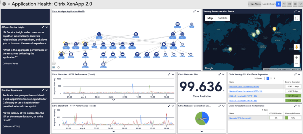
In addition to choosing the right metrics to display, it’s equally important to choose the correct way to display the metrics. Usually showing the rates is more actionable than showing totals. As an example, showing the number of transactions being performed as a count is less useful when compared to showing the rate at which the transactions are performed. The rate will indicate whether the system is improving or deteriorating over time. A time-series chart of transactions will also indicate when the issue started. Also, choosing the correct widget type helps with better conveying the meaning of a metric. A Topology Map widget shows the relationship between resources so that users understand how information is flowing among those resources and thus identify the root cause much sooner.
Make Dashboards More Interactive
The value provided by a dashboard can be significantly improved by making it more interactive. By adding drill-down links to the widgets, we can hand-hold users through a complex root-causing workflow and help them with resolving issues much faster. The ability to zoom in and zoom out, filter the data and interact with charts to see changes over time will allow users to understand the issues with much more clarity.
Communicate the Dashboard’s Value
Getting an entire organization to gainfully use the dashboard needs consistent communication. Each team member should know how to use the dashboard effectively and be involved in making the dashboard better over time.
Dashboards That Focus on Quantifying Progress and Value
To track the progress of a digital transformation project, it’s important to keep tabs on critical metrics that illustrate the progress made thus far so that the team can do course corrections to meet the goals. For instance, if the company is in the midst of re-architecting the application platform from monolithic to microservices architecture or migrating on-prem applications to cloud-based infrastructure, it’s important for team members to keep a tab on the progress made towards critical project objectives. Some of these objectives could be:
- Developer productivity
- Application scalability
- Release velocity
- Operation and maintenance costs
- Better uptime and application performance
Executive dashboards should include metrics that measure progress on these objectives.
LogicMonitor has sleek and modern dashboarding capabilities that go along with collecting humongous amounts of metrics from over 2000 pre-built logic modules. Dashboards can be created in minutes, shared with teammates and outsiders, and protected with advanced RBAC permissions. If you want to know more about transforming your IT monitoring with a modern observability platform, register for a free trial.