Visualizing NetApp disk performance and latency

LogicMonitor + Catchpoint: Enter the New Era of Autonomous IT

Proactively manage modern hybrid environments with predictive insights, intelligent automation, and full-stack observability.
Explore solutionsExplore our resource library for IT pros. Get expert guides, observability strategies, and real-world insights to power smarter, AI-driven operations.
Explore resources
Our observability platform proactively delivers the insights and automation CIOs need to accelerate innovation.
About LogicMonitor
If you have decent NetApp monitoring, you should of course be monitoring the thing that matters – and (for most applications) that is the latency of requests on a volume (or LUN.)
Easy enough to get – with LogicMonitor it’s graphed and alerted on automatically, for every volume. But of course when there is an issue, the focus changes to why there is latency. Usually it’s a limitation of the disks in the aggregate being IO bound. Assuming there is no need for a reallocate (the disks are evenly loaded – I’ll write a separate article about how to determine that), how can you tell when what level of disk busy-ness is acceptable? Visualizing that performance like the below is what this post is about.
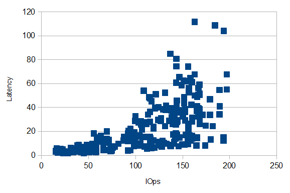
Disks may be rated to 250 IOps – but that doesn’t mean that latency won’t be affected well before that level. As the disks approach 100% busy, latency of each request increases. (Which makes sense – the only way to keep a disk busy is to have work queued up waiting for it – which of course will increase the response time for those requests.)
Having a plot of how that latency increases with workload in your environment is a good thing to have.
A quick example of how to follow this through:
Check if latency is really an issue (often people blame storage performance when that is not the issue.)
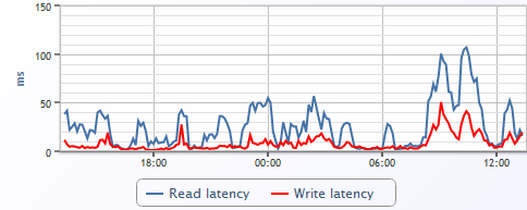
In this case, this volume is clearly experiencing periods of slow performance.
The next step in real troubleshooting here would be to verify whether the disks are balanced or if the aggregate needs a reallocate. Assuming the disks are balanced, that means you can use any disk in the aggregate (except the parity disks) as representative.
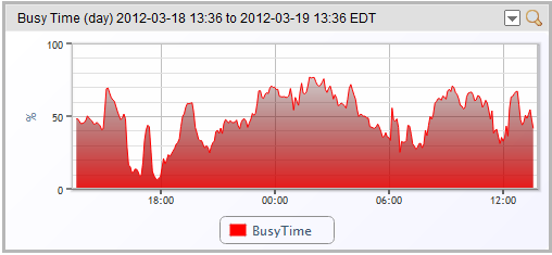
Looking at a disk in this aggregate, we see a disk that is busy – but not 100% busy:
We can also see the number of operations per second tracking the disk busy-ness:
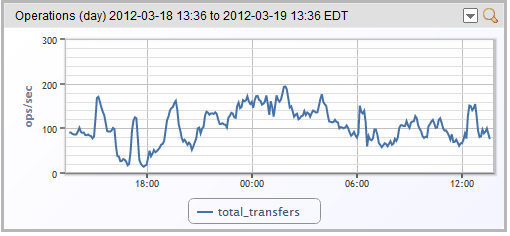
So eyeballing the above graphs, you can see that the disk busy-ness tracks latency – but it would be nice to get a clearer view of that.
So this is something LogicMonitor cannot do directly (yet) – but it can get help you get there. You need to create a dashboard custom graph showing both total latency for a volume and the disk operations for a non-parity disk on the same aggregate, defined like this:
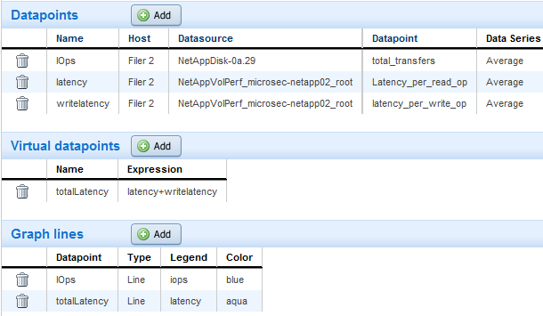
Then you end up with a graph like this:
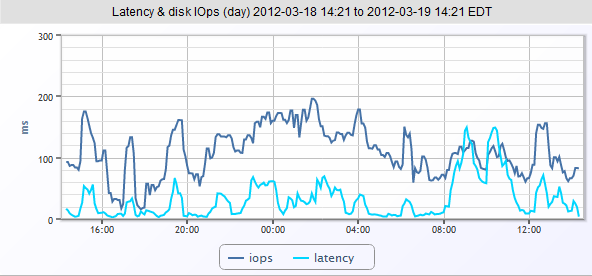
To convert this into a scatter plot, click the magnifying glass to view the SmartGraph, then download the data (via the handy Download button) in csv form.
Open the data in Excel or OpenOffice; sort by IOps; add a chart of type Scatterplot using the two columns IOps and Latency as the data range; first row is label but first column is NOT a label; give it some axis titles, and you should end with a nice plot like the below:

So you can see that on this NetApp, with this workload, performance is good until around 100 IOps per second, at which time latency becomes much more variable. So if performance is critical, keep each spindle less than 50% busy. Note that this performance profile is specific to the workload – ratio of reads to write; size of transfers, etc.
So what if you’ve done the analysis, and you’re seeing disk utilization in the range of IOps that adversely impacts latency? Well, if you are running VMware or other virtualization systems with their storage on your NetApps – make sure you have aligned the VM’s guest filesystem to NetApp’s expected 4K blocks.
Otherwise, you need to move your workload around – transfer volumes to other aggregates or filers; or add more physical disks to your aggregate. But having the data to back up your decisions is always a good thing.
© LogicMonitor 2026 | All rights reserved. | All trademarks, trade names, service marks, and logos referenced herein belong to their respective companies.
