Overview
FEATURE AVAILABILITY: LogicMonitor Pro and Enterprise
Topology Map widgets reflect the relationships among resources in your network environment. As discussed in Topology Mapping Overview, the visual context that LogicMonitor’s topology maps provide can be very beneficial to your monitoring operations, supporting efficient troubleshooting of alerts and auto-discovery of relationships among resources.
Creating Topology Map Widgets
Unlike the majority of LogicMonitor widget types, Topology Map widgets are not created from the Dash page. Rather, they are topology maps that have been created and saved on the Mapping page, as discussed in Mapping Page.
When you add a saved topology map to one or more dashboards (initiated via the add to dashboard (  ) icon on the Mapping page), you are presented with the Add to dashboards dialog.
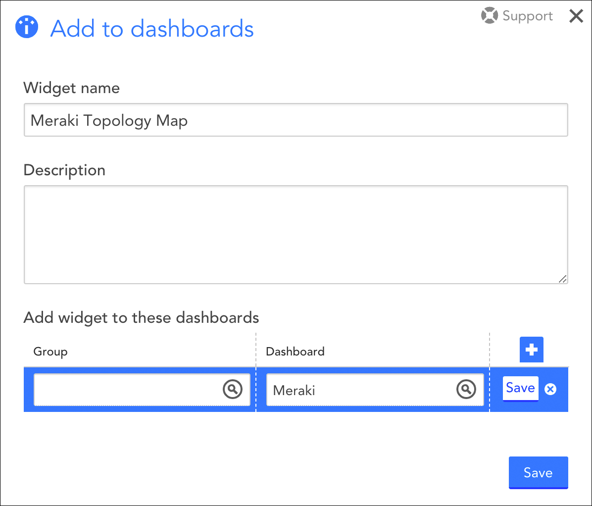
From the Add to dashboards dialog, enter a name and description for your Topology Map widget, and assign it to one or more dashboards. Once a topology map is added to a dashboard, it effectively becomes a Topology Map widget.
Managing Topology Map Widgets
From the dashboard, you can manage Topology Map widgets similarly to how you manage other widget types (e.g. clone, set refresh frequency, set color schema, move to another dashboard, generate embedded widget links, etc.). For more information on these configurations, see Adding and Configuring Widgets.
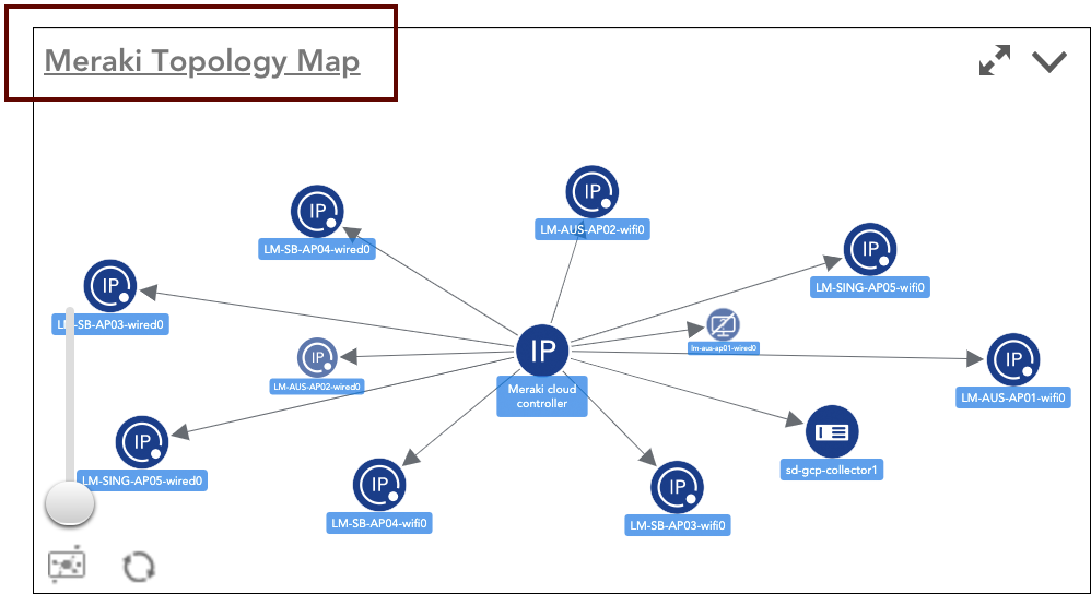
However, unlike most other widget types, you cannot manage the content of the widget from the Topology Map widget itself; changes to its content (i.e. scope of relationships displayed) as well as display settings (e.g. layout options, alert status display, etc.) must be made from the saved topology map. Since Topology Map widgets maintain a permanent connection with the topology maps they are based on, edits to the topology map automatically carry over to the widget. As shown next, you can easily link back to the topology map a Topology Map widget is based on by clicking its name in the upper left corner of the widget.
With the Text widget, you can add HTML text or images to your dashboard. This is particularly useful for creating To-Do lists for your team, posting project or company updates, including customer logos, or adding anything else you may find useful.
Configuring your Text Widget
To create a Text widget, you will need to select “Text Widget” from the “Add Widget” menu.
A configuration window with the following fields will open:
- Widget Name: A descriptive name of your new Text widget
- Description: A brief description of this Text widget indicating what it is or its purpose.
- Dashboard: Select the dashboard on which you want this Text widget to appear
- Refresh Frequency: The frequency with which the widget will update.
Text Options and Adding an Image
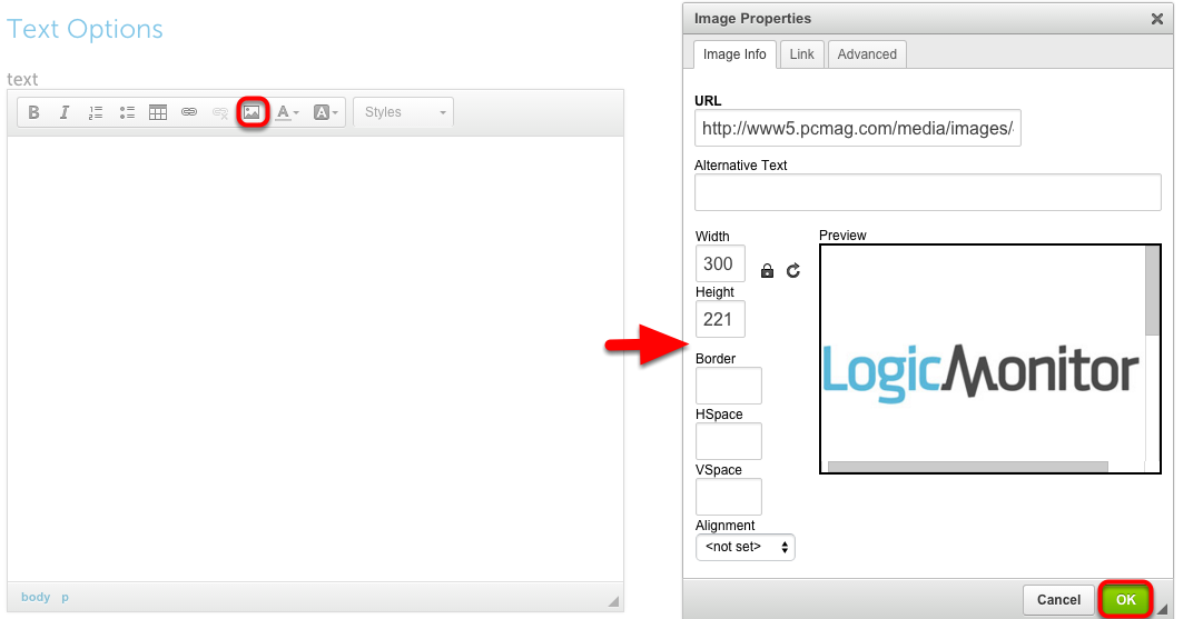
Once you configure the basic settings of your Text widget, you will use the Text Options field to either insert HTML text or add an image. A maximum of 65,535 characters are allowed.
If you choose to include an image (ie. a customer’s logo), click the “Add Image” button (boxed in red below). Then, a new window will open in which you can include the desired image URL as well as configure its height/width, HSpace, VSpace, and alignment within the widget. Once you have configured the image, click “Ok.”
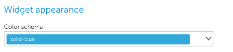
Widget Appearance
Finally, you can configure the color schema of your Text widget by clicking on the Color Schema dropdown menu. If you do not customize this section, it will default to border-gray.
Once finished, click “Save” and the Text widget will appear on its designated Dashboard.
The Table widget lets you easily compare current datapoint values across multiple devices. You may find this widget particularly useful for comparing performance and capacity metrics across different device types. The Table widget also allows you to enable alert forecasting.
To create a Table widget, select “Add” from the dashboard toolbar and select Table widget. See these instructions for help filling out the title, description, dashboard and refresh frequency fields.
Table Options
The first configuration available in the Table widget is Custom versus Dynamic. A custom Table widget will enable you to select static datapoints for designated devices in your table, whereas a dynamic Table widget will display the Top or Bottom 10/Top or Bottom 25/All active instances available for the first configured datapoint [column] based on a glob expression. The dynamic table is ideal if you want real-time insight into which datapoints/devices are using the most or least available resources, such as CPU or Bandwidth.
The configuration for both custom and dynamic Table widgets are nearly identical. However, a dynamic selection will prompt you to select whether you want to display the Top 10, Top 25, Bottom 10, Bottom 25, or Show All active instances for your selected datapoints:
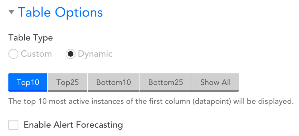
Enable Alert Forecasting
Selecting this option will display the projected number of days until a datapoint surpasses a designated alert threshold. See below for more details.
Adding Datapoints/Devices to your Table Widget
The Table Options section is where you will configure the data you’d like to be displayed in your widget. Simply add the devices whose metrics you’d like displayed as rows and add the datapoints (metrics) you’d like to see for each device as columns. You’ll need to add at least one column and at least one row (i.e. choose one datapoint and one device) to create your table widget.
Adding a Row
To add a row you’ll need to select a device. Once added, you can edit a row by selecting the device name. In the “Row Name” field, you can assign a custom name to the table row. If you do not fill-out this field, then it will default to the device’s name.
On the far righthand side of the displayed rows, you will see three icons indicating the following:
- Drag and drop rows to control the order in which they are displayed in the table
- Copy a row
- Delete a row
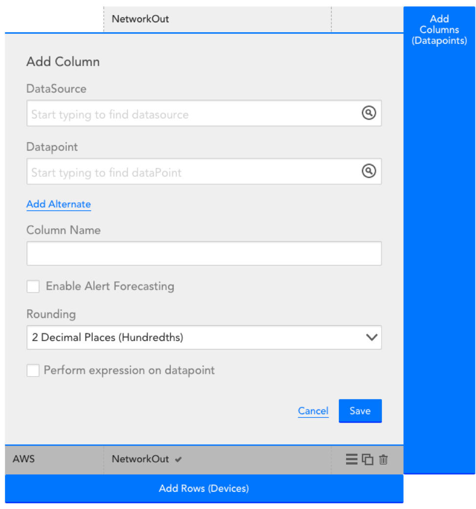
Adding a Column
To add a column you’ll need to select a datapoint. Select a datasource first to get a list of datapoints for that datasource. You can edit an existing column by selecting the column name at the top of the configuration. You delete a column by selecting the column name and then selecting ‘delete’.
The “column” config will have the following additional options:
Rounding
Designate that rounding method that should be assigned to the datapoint’s value. Select from: No Decimal (whole rounded number), 1 Decimal, or 2 Decimal places.
Perform expression on datapoint
Embed a groovy script to perform an expression on the collected datapoint.
Note that:
- If you are selecting a datapoint that isn’t applicable to all the devices you’ve added to the table, consider adding an alternate datasource. When an alternate datasource is added and the primary datasource doesn’t apply to a device in the table, the alternate datasource will be used. For example, if you’re comparing CPU busy percent across 4 Linux servers and 1 Windows server, you should set the primary datasource as NetSNMPCPUwithCores and set the alternate datasource to WinCPU. You can add up to 5 alternate datapoints for each column
- If you select a datapoint for a multi-instance datasource, you’ll see a ‘Select Instance’ button. You then have the option to select an instance per device row in the table, or you can select the instance in one row and also check the ‘apply to all cells in this column’ option to look at the datapoint value for the same instance across all devices
- Once you’ve added datapoints (columns) to the table, a check mark will display to the right of the datapoint for every device that datapoint exists for. If a selected datapoint does not exist for a device, ‘no matching datasource’ will be displayed in the row for that device
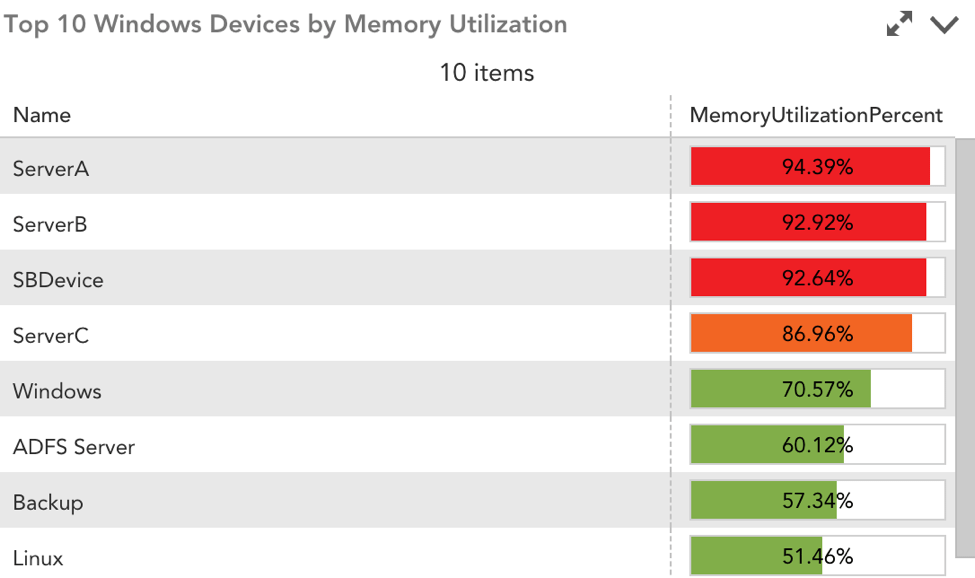
The table configuration will indicate which datapoint values will be displayed for each device.
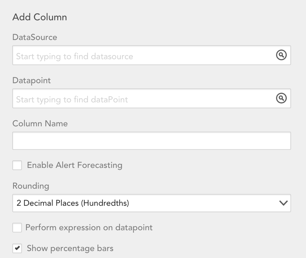
Show Percentage Bars
Selecting this option will enable you to color-code the value of datapoints based on a designated threshold. For instance, you can choose to highlight a datapoint cell as red or orange if it crosses a 90% or 85% threshold, respectively. This is ideal for at-a-glance views of your environment’s health. Please note this option will only display when the selected datapoint is represented by a percentage.
Widget Appearance
Select the color scheme for the Table widget:
Alert Forecasting
Embedded in the Table widget is the option to enable Alert Forecasting, which uses predictive analytics to review datapoints’ past trends and plot their future trajectories. Using your predetermined alert thresholds, Alert Forecasting will display the number of days until a datapoint will surpass its designated threshold.
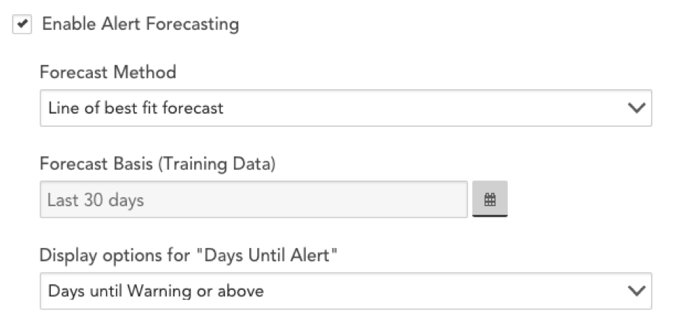
Alert Forecasting is enabled globally under the Table Options portion of the configuration menu. Once you have enabled forecasting globally, you can choose to disable it at the datapoint level. Checking the box next to “Enable Alert Forecasting” will reveal several configuration options:
Forecast Method
From the Forecast Method field’s dropdown menu, select from one of two forecast methods:
- Line of best fit forecast
- 95% confidence forecast
For more information on these forecasting methods, see Data Forecasting.
Forecasting Basis (training data)
This field allows you to designated the time range of data that we will use to predict future trends.
Display options for “Days Until Alert”
Select whether you want to display the number of days until a Warning, Error, or Critical alert (and above) is triggered. You will also have the option to add three columns to the Table widget, each showing the days until a Warning, Error, or Critical alert, respectively.
Minimum Confidence to Include
This option is only relevant if you selected 95% confidence forecast as the Forecast Method. In this field, you need to specify the minimum level of confidence LogicMonitor’s algorithm must have in order to predict an alert. For instance, if you choose a 70% minimum confidence, you are saying LogicMonitor’s forecasting algorithm must be at least 70% certain of a future alert before it can issue a prediction.
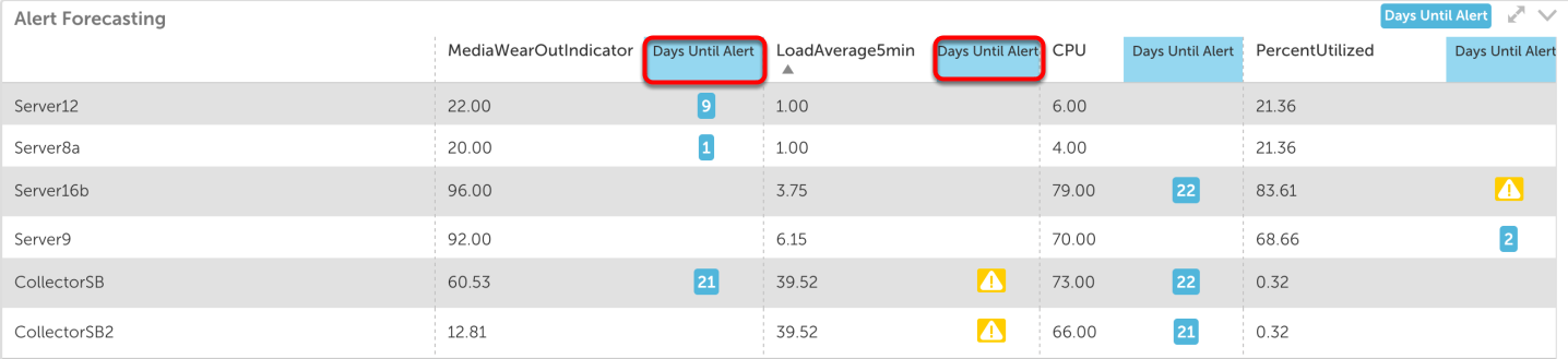
Once you have saved Alert Forecasting in the Table widget, it will appear on the designated dashboard.
The Table widget will display a column, “Days Until Alert,” which shows the number of days until the corresponding datapoint will surpass its alert threshold. If a datapoint is already triggering an alert, an icon indicating the alert severity will appear in this column.
Overview
The SLA widget calculates the percentage of time in which acceptable service levels were maintained for the resources or websites included in the widget. Acceptable service levels are defined in the widget’s configurations.
How Is the SLA Widget Calculated?
For each individual website or resource included in your SLA widget, the baseline calculation is quite simple. It is the amount of time the resource or website actually met its acceptable service levels as compared to the amount of time covered by your SLA.
However, if you would like your widget to ultimately display a single percentage that represents the overall SLA value for the websites or resources being monitored, there are additional calculations that take place. Depending upon whether you’re measuring performance across websites or resources, there are potentially two calculation options available to you.
Measuring Performance Across Websites
When generating an SLA widget for websites, the overall SLA summary value is calculated by averaging the percentage of time in which acceptable service levels were maintained by the individual websites. For example, consider that an SLA widget is measuring the availability of the following four websites over a one-day period:
- Website A: Unavailable from 8-9am; 95.83% (23/24 hours)
- Website B: Unavailable from 9-10am; 95.83% (available 23/24 hours);
- Website C: No unavailability; 100% (24/24 hours)
- Website D: Unavailable from 8:30-9:30am; 95.83% (23/24 hours)
The overall SLA summary value for websites A, B, C and D is 96.87%, which is the average of their individual availabilities.
Measuring Performance Across Resources
When generating the SLA widget for resources, there are two calculation methods available for determining the aggregated SLA value. One of the methods is the one described in the previous section (i.e. averaging the percentage of time in which acceptable service levels were maintained by the individual resources).
The other calculation method measures the percentage of time in which all resources concurrently met their individual thresholds for acceptable service levels. For example, consider that an SLA widget is measuring performance thresholds for the following four resources over a one-day period:
- Resource A: Fell below defined threshold of acceptable service level from 8-9am
- Resource B: Fell below defined threshold of acceptable service level from 9-10am
- Resource C: Met acceptable service level threshold all day
- Resource D: Fell below defined threshold of acceptable service level from 8:30-9:30am
Based on these metrics, the total window of time in which at least one resource was performing at a subpar level was from 8-10am, which evaluates to an overall SLA value of 91.67%. If these four resources were calculated using the average approach of the other calculation method, the overall SLA value would be 96.87%
Configuring an SLA Widget
To configure an SLA widget, open the dashboard you would like it to display on, click the v dropdown arrow located in the far right of the open dashboard’s header and select Add Widget | SLA. This opens the Add SLA Widget dialog, which allows you to configure various widget settings.
Note: The first two fields found in the widget dialog (Title and Description, along with the final configuration (Color Schema), are universal to all widget types. To learn more about these global widget settings, see Adding and Configuring Widgets.
In the SLA Settings area of the widget configuration dialog, shown and discussed next, specify settings particular to the SLA widget.
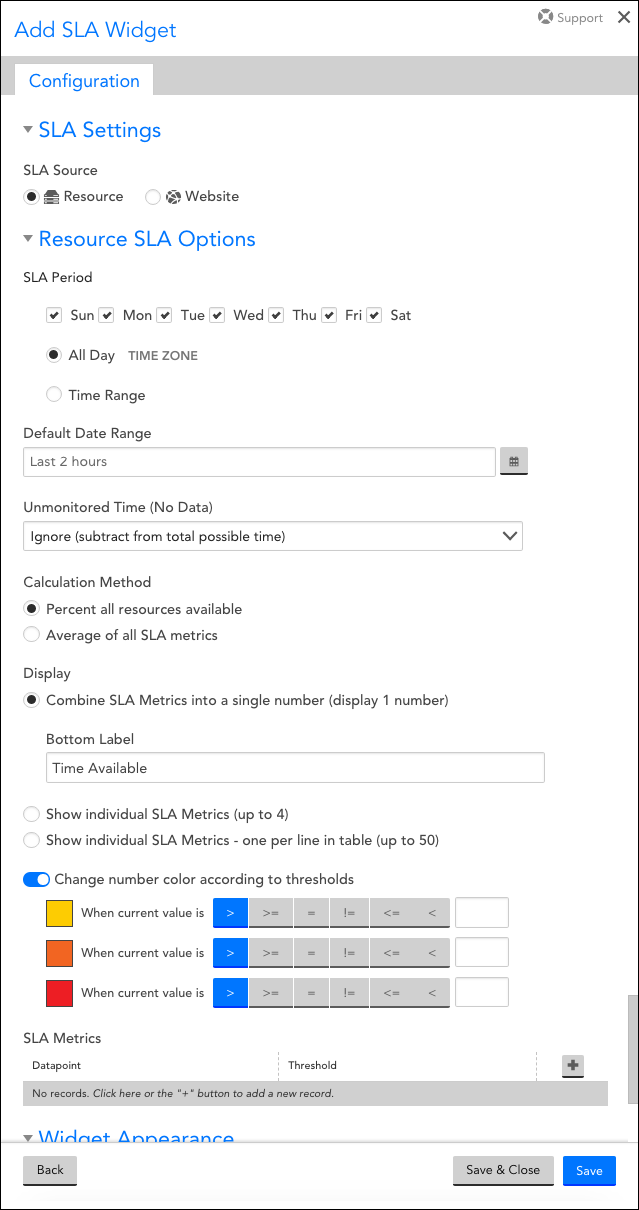
SLA Source
For the SLA Source option, indicate whether the widget will monitor SLAs for a set of resources or websites. Depending upon your selection here, you will see varying options dynamically appear.
Note: In the next few sections, we’ll cover those configurations that are common to both resource and website widgets, even though the sections may not match the order in which they appear in the configuration dialog; in the section titled Configurations Unique to Websites or Resources, we’ll branch off into the unique configurations available for each widget type.
SLA Period
Using the configurations under this heading, indicate the period (days and time) in which the SLA is in effect. Select the All Day option if your SLA spans all 24 hours of the selected days. If the SLA does not cover days in their entireties, select the Time Range option to indicate a window of time, down to the quarter hour, within each day that the SLA spans.
Note: This section should reflect the time range of your actual SLA, not the time range of the widget. The widget’s time range is determined in the configuration discussed next.
Default Date Range
Click your cursor into the Time Range field to display the options available for setting a predefined or custom duration of time for which data will be pulled for this widget.
Note: The range set at the dashboard level will take precedence over the widget’s specified range. To respect a widget’s range, make sure its parent dashboard’s time range is set to “Default time range (Varies per widget).”
Change Number Color According to Thresholds
Toggle the Change number color according to thresholds slider to the right to enable up to three varying color displays depending upon the current SLA value. For example, you could configure your SLA widget to display any SLA values lower than 97% in red. This is an excellent way to provide at-a-glance indicators for the general wellbeing of the resources or websites being monitored.
Configurations Unique to Websites or Resources
Depending upon your selection for the SLA Source field–either “Resource” or “Website,” you will see fields unique to that selection.
Configurations Unique to Websites
Websites Table
Click the + icon located at the top right of the Website table to identify the websites that will be tracked by this widget. Use the Group and Website fields in combination to add a website metric. Multiple metrics can be added, but they must be configured and saved one at a time.
Before saving a metric, check the Exclude SDT periods checkbox if you’d like scheduled downtime (SDT) to be removed from the SLA calculations.
Configurations Unique to Resources
Unmonitored Time (No Data)
The Unmonitored Time (No Data) field allows you to establish what impact, if any, the amount of time in which no data was reported for the resources has on the SLA calculation. There are three options available for selection from this field’s dropdown menu:
- Ignore (subtract from total possible time). This option does not include unmonitored time in its SLA calculations. For example, if your widget’s time range spans 100 hours, of which there are five hours of missing data, the widget will calculate the SLA value based on a total time range of 95 hours.
- Count as violation (subtract from uptime). This option will consider any unmonitored time as a violation against your SLA. For example, if your widget’s time range spans 100 hours, of which 15 of those hours represent performance that doesn’t meet SLA thresholds and five of those hours represent no data received, the widget will calculate SLA violation time as 20 hours, which results in an overall SLA value of 80%.
- Count as available (add to uptime). This option will consider any unmonitored time as meeting SLA requirements. For example, if your widget’s time range spans 100 hours, of which 15 of those hours represent performance that doesn’t meet SLA thresholds and five of those hours represent no data received, the widget will calculate SLA violation time as 15 hours, which results in an SLA value of 85%.
- Collector delay with no data: This option will only consider a “No Data” value as a violation. If there is a delay in the time we receive a datapoint that does not match the defined polling interval, this will not be considered a violation, as long as the datapoint is valid.
Calculation Method
As detailed in the How Is the SLA Widget Calculated? section of this support article, there are two calculation methods available when aggregating SLA values among multiple resources. The Percent of all resources available option measures the percentage of time in which resources concurrently met their individual thresholds for acceptable service levels; the Average of all SLA metrics option averages the percentage of time in which acceptable service levels were maintained by the individual resources.
Display
The SLA widget offers three display options:
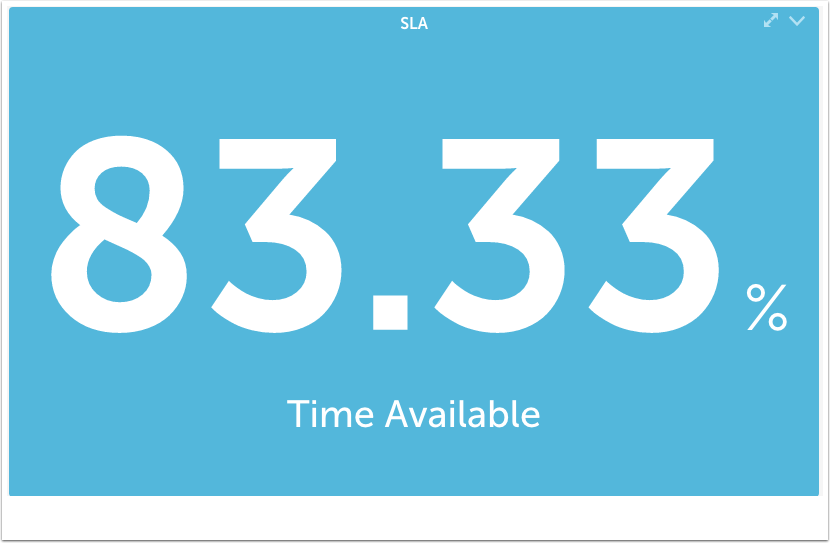
- Combine SLA Metrics into a single number (display 1 number). The widget will display a single SLA summary value for all websites or resources monitored, which will be calculated using the method selected in the Calculation Method field. If this display option is selected, you have the ability to update the label that displays under the value.
- Show individual SLA Metrics (up to 4). The widget will display up to four individual SLA metrics (as added/saved in the Datapoint table (discussed next)) in its display quadrants. If a metric has more than one resource associated with it, the resources will be aggregated into one overall SLA number using the calculation method selected in the Calculation Method field.
- Show individual SLA Metrics – one per line in table (up to 50). For even more granularity, the widget can display up to 50 of the lowest performing SLA items per datapoint. The quantity can be customized by clicking one of the quantity buttons that dynamically appears upon selecting this option.
If you select the calculation method as Percent all resources available and the Display type as Combined SLA Metrics, then the least SLA value among the resources is displayed.
For example:
There are two resources A and B. The SLA for resource A is 25%, and for resource B is 0%. The selected calculation method is Percent of all resources, and Display type is selected as the Combined SLA Metrics, then the least SLA value displayed is 0%. You may also select the Average of all SLA metrics options for getting the average value of all the resources.
Datapoint Table
Click the + icon located at the top right of the Datapoint table to identify the datapoints that will be tracked by this widget (along with corresponding SLA thresholds that must be met). From the dialog that expands, configure the following fields and options:
- Use the Group, Resource, DataSource, Instance, and Datapoint fields in combination to add a single metric. Multiple metrics can be added, but they must be configured and saved one at a time.
- For each datapoint, specify the DataSource SLA Threshold using the dropdown operator menu and field immediately to the right of it. If you’d like to refer to the global thresholds (warning, error, and critical) already established for this datapoint for help in determining the threshold for this widget, click the View current Global Thresholds (for reference) hyperlink to display them.
- Check the Exclude SDT periods checkbox to remove scheduled downtime (SDT) from the SLA calculations. SDT exclusion can be set at the resource or group level. If the exclusion is set at the resource level, then only SDT set at the resource level will be excluded from the SLA calculation. Any SDT set at the group level for those resources will NOT be excluded in this case. If the exclusion is set at the group level, then only SDT set at the group level will be excluded from the SLA calculation. For example, consider that you have SDT set for a group from 8-9pm each Wednesday. One of the resources in the group additionally has SDT set for 5-6pm each Thursday. If this option is configured for the resource level, the Thursday 5-6pm SDT will be excluded. If this option is configured for the group level, the Wednesday 8-9pm SDT period will be excluded.
- If you selected either of the Show individual SLA Metrics options, use the Label field to add a custom display label for the current metric.
The Custom Graph widget is the most powerful Dashboard widget and by nature the hardest to configure. The Custom Graph widget permits glob expressions in its configuration, enabling aggregate and top ten data to be displayed.
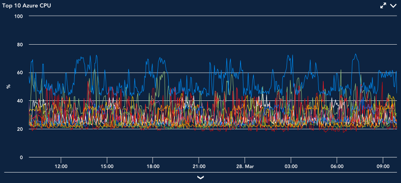
One of the most common uses for the Custom Graph widget is to see top 10 values of a specific datapoint across devices, as shown in the following screenshot. This could be memory, CPU, throughput, or any other metric you are interested in across your infrastructure. It is an easy way to compare performance of any metric across devices.
Note: The Custom Graph widget has a 100-line limit.
Once configured, there are several ways in which you can manipulate the output and display of Custom Graph widgets from your dashboards, including viewing Ops Notes, expanding legends, viewing forecast conditions, or visualizing anomalies. These options are standard across most areas of the interface in which graphs display and are talked about in detail in Graphs Tab.
Creating Custom Graph Widgets
To create a Custom Graph widget, open the dashboard you would like it to display on and either click Add | Widget | Custom Graph from the Dashboard tree or click the drop-down arrow (v) icon located in the far right of the open dashboard’s header and click Add Widget | Custom Graph. This opens the Add Custom Graph Widget dialog box, which is divided into three configuration categories:
- Basic Information
- Display Settings
- Widget Customization
Basic Information
For instructions on completing the first few universal fields displayed at the top of the Add Custom Graph Widget dialog box (i.e. Widget Title, Description, and Refresh Frequency), see Adding and Configuring Widgets.
Graph Data
The Graph Data section is where you will configure the datapoints to be included in the graph. There is no limitation on the types of datapoints that can be included, but as the values are all displayed on one graph with a single Y axis, it is recommended that they be of a similar data type.
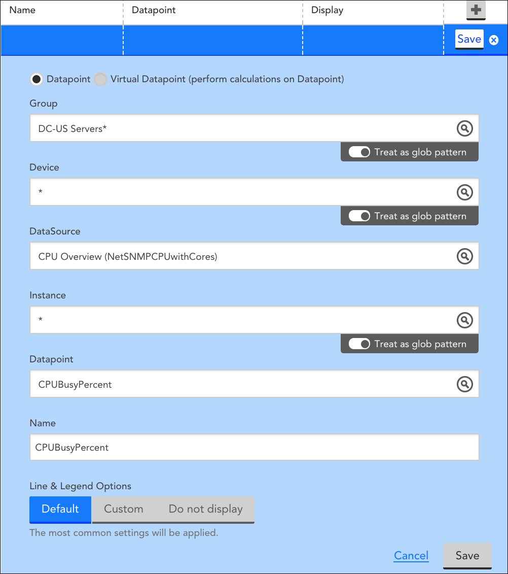
Begin adding datapoint(s) to your graph by following our instructions for configuring widget datapoints. The following screenshot features a sample datapoint configuration that displays the top 10 average values for CPUBusyPercent for all servers in the group DC-US Servers.
Lines and Legends
Once datapoints and virtual datapoints have been configured, graph lines are created. This is a two-step process to allow for the configuration of virtual datapoints.
You will need to create a graph line for each datapoint you wish to have graphed. When configuring the graph line, you can select from three line and legend options:
- Default: Standard color, display type (Line), and legend (host, DataSource, and Instance names) information will be assigned to the graph line.
- Custom: Selecting this option will display several new configuration options.
- Legend: Insert tokens that will populate with datapoint-specific information. This expands the amount of relevant information viewable within the graph’s legend. See below for the full list of tokens available as Legend Variables.
- Display Type: Choose the manner by which your graph will display data (Line, Area, Stack, or Column).
- Consolidation function: This option is only relevant when the Use Visual Average option is selected in the Widget Customization area. It’s used to control how the data is displayed when you view the graph data over a longer time period. For example, consider a datapoint ‘aborted_clients’ that returned a value of zero for every sample interval during a day, expect for one sample where it instead returned 100:
- With a Consolidation function of Max, when you look at the graph over a month-long view including the day described above, the day will have a value of 100 (the max value of all samples in the day)
- With a Consolidation function of Min, when you look at the graph over a month-long view including the day described above, the day will have a value of 0 (the min value of all samples in the day)
- With a Consolidation function of Average, when you look at the graph over a month-long view including the day described above, the day will have a value of 0.5 (the average value during the day)
- Color: The line color that displays in the graph for this datapoint configuration. Selecting “auto” will randomly assign a distinct color to the line.
Note: If a glob expression is used in any of the datapoint configuration fields and the graph type is not set to aggregate (graph type is discussed in a following section), the Color field is disabled and remains locked at “Auto.” This is because one datapoint configuration could potentially generate multiple graph lines and one single color assignment would prevent you from distinguishing between these lines.
- Do not display: the datapoint will not display on the graph. This is used when you want to configure a datapoint solely to be referenced in a virtual datapoint configuration.
Legend Variables
For custom graphs, variables are supported in the Legend field. The supported variables are:
- ##HOSTNAME##: The name of the device whose data is being graphed
- ##DATASOURCENAME##: The display name of the DataSource being graphed.
- ##INSTANCE##: The instance being graphed by this line.
- ##DSIDESCRIPTION##: The DataSource instance description (if any) of the line.
- ##DEFAULT##: this is equivalent to ##HOSTNAME##_##DATASOURCENAME##-##INSTANCE##
Note: You can change the Legend to any text you want, but you must have at least one token present in the legend. If you do not use a token, the default legend will be appended, distinguishing which device/DataSource/instance is associated with the line.
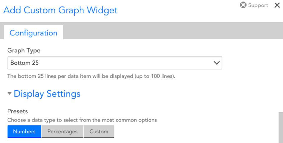
Graph Type
After adding a datapoint configuration, a Graph Type section will appear if glob expressions were used for any of the settings. This section allows you to configure whether the graph displays the top or bottom 5, 10, 25, or 100 lines per datapoint or, alternately, aggregates each datapoint to one line. As shown next, when Aggregate is selected, you will be prompted to determine whether the aggregate is calculated based on the average, max, min, or sum of the datapoints.
Display Settings
The following settings influence the refresh and display of your graph:
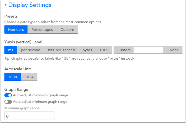
Presets
This will determine the datatype that will display on your graph. You can choose from Numbers, Percentages, or a Custom option you provide.
Note that this selection will determine the options available for your Y-axis (vertical) Label.
Y-axis Label
This will determine the unit of measurement displayed for the graph’s Y-axis.
- If “Numbers” was chosen as your preset datatype, you will be able to select from the following Y-axis labels: ms, per second, bits per second, bytes, IOPS, Custom [which you will have to denote], or None.
- If “Percentages” was chosen as your preset datatype, you will be able to select from the following Y-axis labels: percent, %, percent used, Custom [which you will have to denote], and None.
- If Custom was chosen as your preset datatype, you will simply have to manually denote the Y-axis label.
Autoscale Unit
Choose whether you want your units to autoscale to 1000 or 1024.
Note that this option will default to 1024 when your Y-axis is set to “bytes.” For all other Y-axis labels, it will default to 1000.
Graph Range
There are two toggles you can select from: auto-adjust maximum graph range and auto-adjust minimum graph range. These options ensure that your graphs adjust to fit the full scope of your displayed data.
By default, auto-adjust maximum graph range will be toggled on and auto-adjust minimum graph range will be toggled off, meaning the default minimum value on your Y-axis will be 0.
Widget Customization
There are two options for consolidating data in your Custom Graph widget:
- VaST (Visually Significant Trending): VaST calculates the significant inflection points of our time series data and preserves them. You will want to use VaST for more detailed views of your data, particularly when dealing with longer time frames.
- Visual average: will consolidate the view of your data based on the Consolidation Function specified in your datapoint configuration (min, max, or average). Select this option when dealing with shorter time frames or to smooth-out data peaks for easier trend analysis.
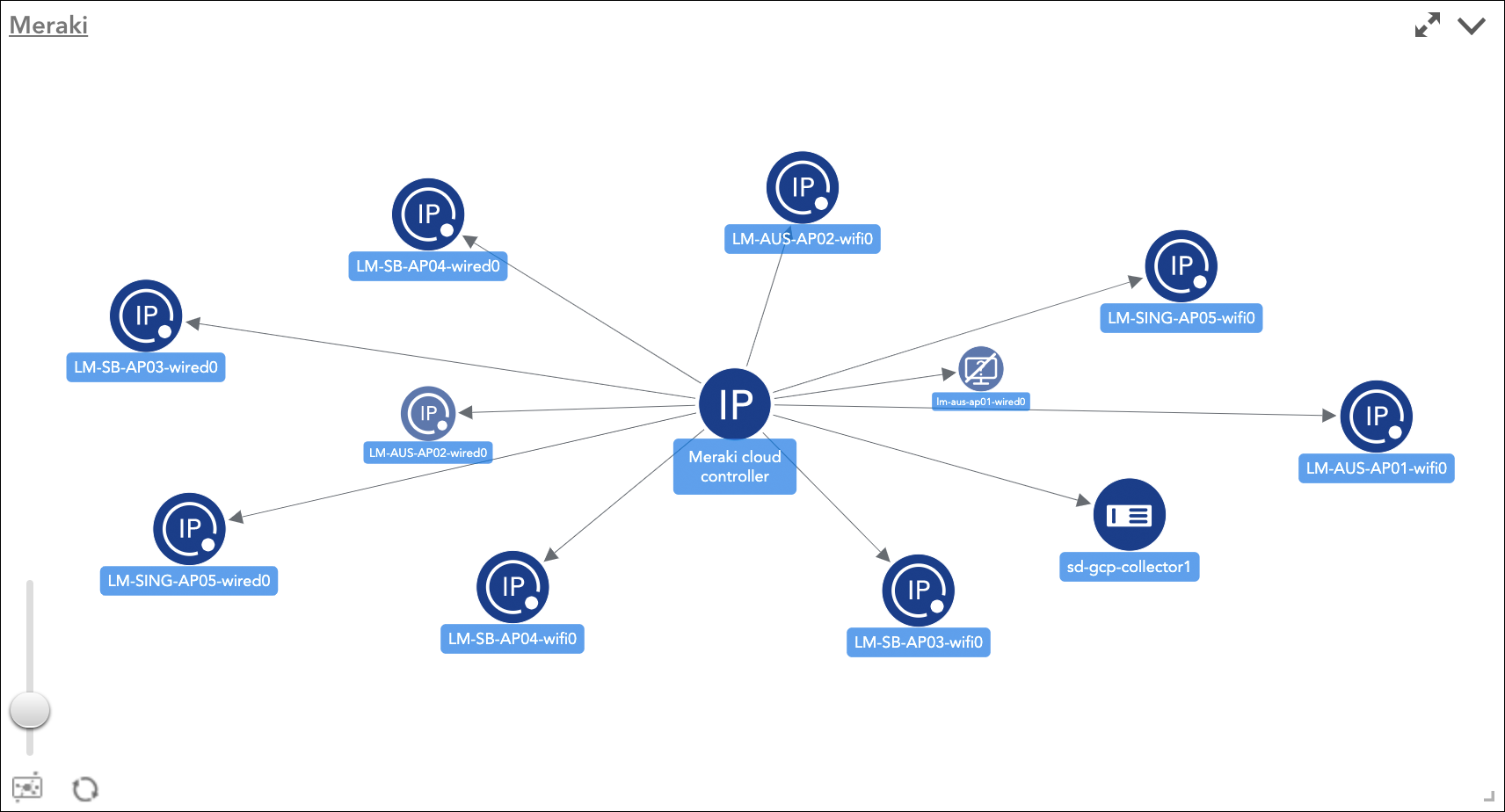
The Website Status widget displays the status of multiple testing locations verifying the availability for either one or multiple websites. Each line in the graph represents a specific testing location status.
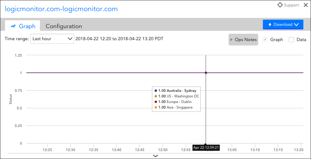
The above screenshot displays the individual statuses of the LogicMonitor website from all selected external testing locations.
Creating a Website Status Widget
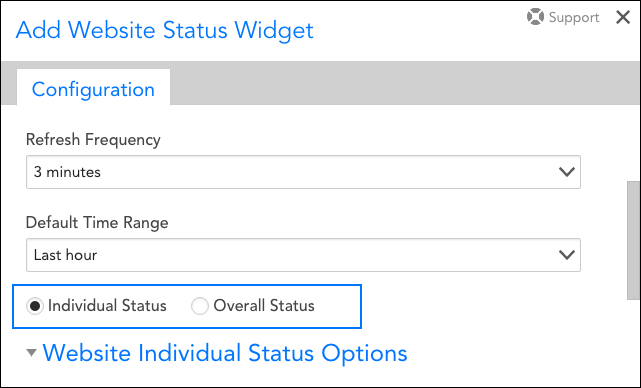
To create a Website Status widget, open the dashboard you would like it to display on and either click Add | Widget | Website Status from the Dashboard tree or click the drop-down arrow (v) icon located in the far right of the open dashboard’s header and click Add Widget | Website Status. This opens the Add Website Status Widget dialog, which is divided into three configuration categories:
- Basic Information
- Website Individual/Overall Status Options
- Widget Appearance
Basic Information
For instructions on completing the first few universal fields displayed at the top of the Add Website Status Widget dialog (i.e. Widget Title, Description, and Refresh Frequency), see Adding and Configuring Widgets.
Default Time Range
From the Default Time Range field’s drop-down menu, specify the length of time over which you would like website status to be represented by the graph.
Individual or Overall Status
Select either the Individual Status or Overall Status option. Individual status displays the status of multiple testing locations for one website; each line in the graph represents a specific testing location. Overall status displays the status of multiple websites in one graph; each line in the graph represents a specific website.
Website Individual/Overall Status Options
The second configuration category on the Add Website Status Widget offers different configurations based upon whether you selected the Individual Status or Overall Status option above. The two variations are discussed next.
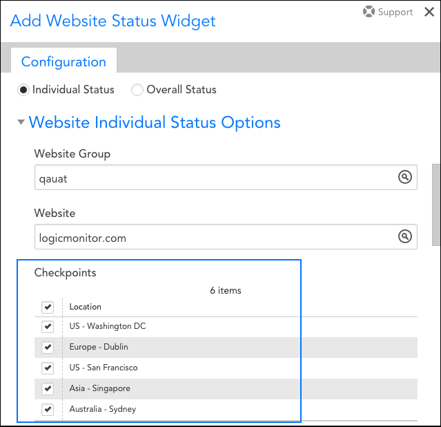
Website Individual Status Options
When graphing a website’s individual status (i.e. graphing the status of multiple testing locations for one website), the following fields are available for configuration.
Website Group
From the Website Group field’s drop-down menu, select the website group to which the website belongs. A specific value from the drop-down menu is required.
Website
From the Website field’s drop-down menu, select the website you would like to graph. A specific value from the drop-down menu is required.
Checkpoints
Select one or more checkpoints. The status for each testing location selected will display as a separate line in the widget’s graph.
Website Overall Status Options
When graphing multiple websites’ statuses (i.e. each line in the graph represents a specific website), the following fields are available for configuration.
Group/Website
Click the + button to add a website to your widget’s graph display. The Group field’s value filters the values available under the Website field’s drop-down menu.
You will notice that the Group field auto-populates with the ##defaultWebsiteGroup## token. If you leave this default value in place, your widget will populate with the website group information specified at the token’s dashboard level. If you are not using dashboard tokens, you can simply delete this default value and select the website group of your choosing. For more information on dashboard tokens, see the Using Dashboard Tokens section in the Creating Dashboards support article.
Check the Exclude SDT periods option if you do not want scheduled downtimes to impact your website’s status display.
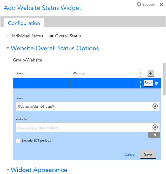
After selecting a website group, website, and what impact SDTs have on the display, click the Save button to save the website as one line of your widget’s graph display. To begin again with another website, click the + button.
Widget Appearance
As with the first few universal fields displayed at the top of the Add Website Status Widget dialog, the Color Schema field is also common across widgets. For more information on this field, see Adding and Configuring Widgets.
Whether your business measures success based on the current value of a single metric, the aggregate value of metrics across devices, a value from your database, or a combination of any of the above, you can represent it in an at-a-glance view with the Pie Chart widget.
Overview
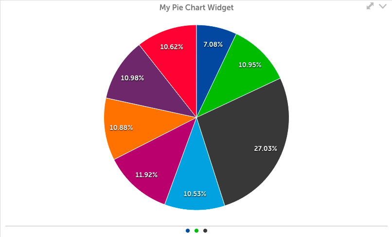
Creating a Pie Chart widget is a multi step process, similar to Big Number and Custom Graph widgets. First, select the datapoints you wish to include. These can be values of a datapoint on a single instance, values of datapoints across instances, or the top ten or aggregate value of a datapoint across instances.
Once your datapoints have been selected, you can create virtual datapoints if desired. This gives you the ability to change units of measure, combine values, or perform a function on the value prior to display. You can also add two values together to create a single value, although ensuring the values are in the same unit of measure is recommended.
The final step is to select which values will appear in the pie widget. This is a separate step to allow for the use of virtual datapoints, which may rely on a datapoint that will not be displayed individually in the widget.
Create a Pie Chart Widget
Click on the Add drop-down and select pie chart widget from the list. The Configuration form for setting up the widget will be displayed. See these instructions for help filling out the title, description, dashboard and refresh frequency fields.
Datapoints
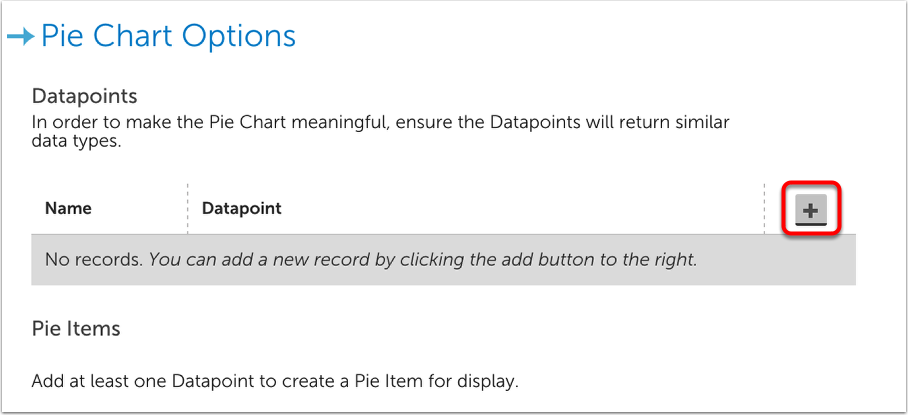
The next step is to add datapoints to be used for Pie Items. As with other widgets, you can select individual Groups, Devices, and Instances, or use glob expressions to include many. A specific datapoint must be selected.
You will have the choice of selecting the following types of datapoints:
- Datapoint: the raw datapoint value will be displayed
- Virtual datapoint: a calculation involving multiple datapoint values from a DataSource will be displayed
- Device Count: this datapoint will return the number of devices that matches any AppliesTo expression
If multiple groups, devices, or instances are included you can also choose to only display top ten values, aggregate the values as Max, Min, or Sum, or display all. If Top Ten was selected, ten items will be calculated among the total 100% of the pie. If Aggregate was selected, or a distinct datapoint, it will be one value calculated as part of the 100% of the pie.
Follow these instructions to add datapoints to your Pie Chart widget. You’ll also need to specify a Name for each datapoint:
Name
Provide a name for this datapoint.
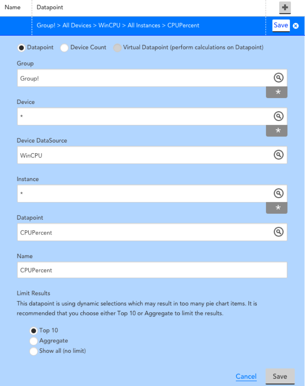
Example Datapoint Configuration
In the following example, data will be included for:
The CPUPercent datapoint on all instances of Win CPU or all devices in groups with a name starting with Group1. The Top 10 values will be used.
If this is the only datapoint added to the Pie Items section, the top 10 values would appear as a relative 0-100% of the pie.
Pie Items
You will need to configure the appearance of the pie chart based on the datapoints you have configured for this widget:
Datapoint
Select from the dropdown of datapoints that were configured in the previous “datapoint configuration” section.
Legend
Enter the text you would like to see for this datapoint. Tokens are provided to allow each datapoint to be displayed with the appropriate label. Legends are displayed in the following ways.
- When you hover over a pie slice.
- At the bottom of the widget under the pie.
- As a label when “Show labels and lines” is selected.
Color
Select the color for each datapoint. Multiple datapoints from one line of the Pie Items chart will display as the same color if you choose a specific color. If you choose Auto for this line, each datapoint will be displayed as a different color.
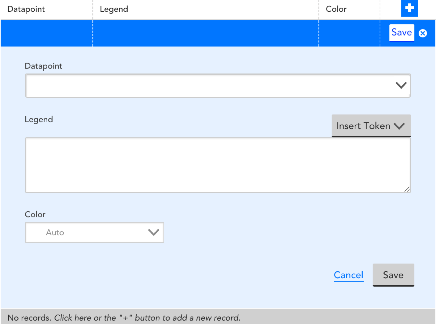
Show labels and lines
Select this checkbox to show the legends as labels connected to the pie chart with lines.
Hide Items at 0%
If any of the datapoints are 0% of the total, then selecting this option will hide the metric from the pie chart.
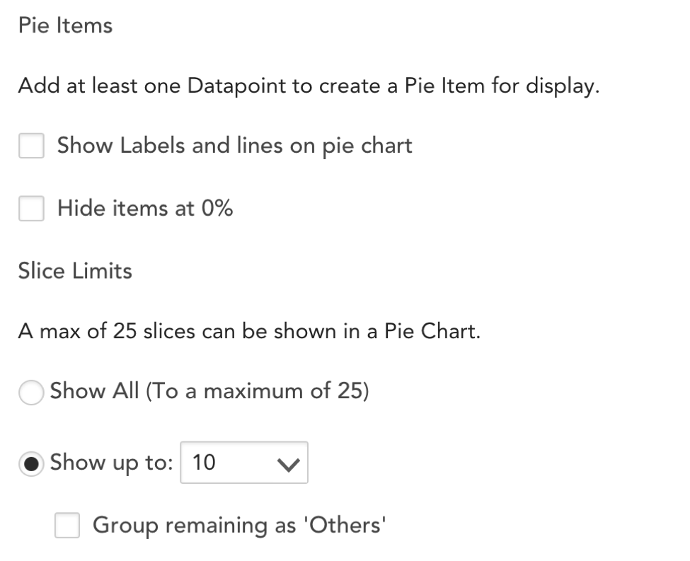
Slice Limits
Select whether you’d like to limit the number of slices displayed in the pie. A maximum of 25 slices will be enforced regardless of your choice. If you select ‘Show up to’ and limit the displayed slices, you can choose to display all slice values that won’t be included in the specified limit as a sum with the label “Others”.
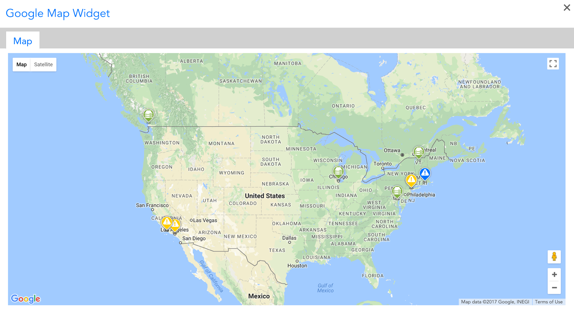
LogicMonitor can display the location of your offices and hosts on a Google map, along with their alert statuses. This feature uses the Google Maps API and depends on a custom location property being set per host that you wish to display. For more information on creating properties, see Resource and Instance Properties.
Creating a Google Map Widget
For instructions on initiating the creation of a Map widget and establishing setting that are universal to all widgets (e.g. title, description, refresh frequency, schema, etc.), see Adding and Configuring Widgets.
Configuring Unique Map Widget Settings
Google Map Options
In this section, you will select the devices and alert severities you wish to see on the map. Click on the + icon to add a row to the table. Save the row when you are finished.
The location property that is established for a device group or individual device is used to determine physical location. The value assigned to this device can be any location recognized by Google, such as a street address or latitude/longitude coordinates. For more information on creating properties, see Resource and Instance Properties.
Note: A maximum of 400 location points can be added per Map widget. The node animation will be disabled when there are over 100 items.
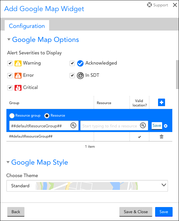
Alert Severities to Display
Select which alert severities should display on your map. If an alert is emanating from a selected device, but does not match the selected alert severity, it will not display.
Resource Group and Resource
To limit the Map widget display to one or more groups of devices or individual devices, click the + icon to select a resource group and, optionally, an individual resource, as shown in the previous screenshot.
Google Map Style
LogicMonitor supports multiple Google Map stylings. Select the desired style from the Choose Theme field’s dropdown menu.
The NOC widget provides at a glance insight into the health of a group, device, application, or website. You can:
- Select specific alert levels for display.
- Include device groups, devices, DataSources, instances, datapoints, websites, and website groups
- See entities that are functioning in the normal ranges represented with green.
- Include custom information in item names.
Create a NOC Widget
Click on the Add drop-down and select NOC widget from the display. The Configuration form for setting up the widget will be displayed. See these instructions if you need help filling out the title, description, dashboard and refresh frequency fields.
NOC Options
The real power of the NOC widget comes from the NOC options. NOC options allow you to add your NOC items and choose how they should be displayed. Select which alert severities should be displayed and how NOC items should be sorted. When adding NOC items you can choose what each NOC item should represent using the Group By field (each NOC item can represent a group, device, datasource, or instance)
Alert severities
Select which alert severities & statuses should be displayed in the NOC widget:
- Warning (will display as yellow)
- Error (will display as orange)
- Critical (will display as red)
- Acknowledged (will display with a blue checkmark)
- In Scheduled Down Time (will display with the SDT icon)
The displayed statuses for entities in a NOC widget will only reflect the selected alert severities/statuses (entities without an alert that matches a selected alert severity/status will be displayed as green).
Sort by
Selecting Name will display the items in the widget in alphabetical order. Selecting Alert Severity will display items starting with any alerts in the top left corner, listing them in order of severity. The remaining items with no alerts will be listed after.
NOC Items- Devices
If you want to include Devices in the NOC widget, begin by following our general instructions on adding datapoints to your widget. You have the additional option to set the datapoint field to all – this will show the status for all datapoints. Additional configuration options for each NOC item include Group By and Name:
Group By
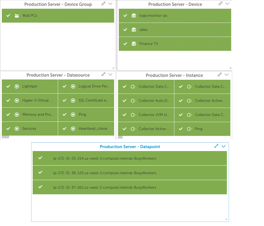
This field determines how the data is displayed on the widget. The choices range from Device Groups to individual datapoints. For example, if All Devices (*) are selected for a particular Device Group and Group By is set to ‘Device’ a separate NOC item will be created for each Device in the Group.
Name
This field can contain any text. However, NOC items are not automatically named, so the Insert Token function can add the appropriate context to the item. Inserting the token associated with your Group By selection will display the associated names of the entity you chose in Group By.
Initially, you may find it easier to keep this field in sync with the Group By field.
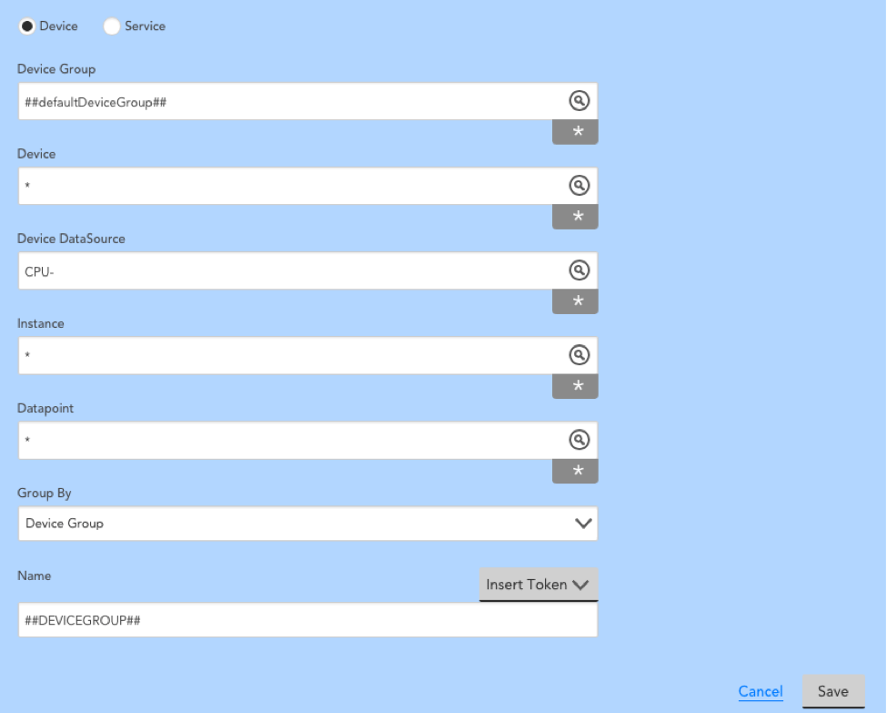
Example Configuration for Adding Devices
The following configuration will display each device in Subgroup1 as a NOC item. The name of each item will be the device name, based on the token selected.
NOC Items- Websites
If you wish to add a website(s) to your NOC widget, begin by selecting one or all groups to filter the website field. Then select a website to add.
Group By
This field determines how the data is displayed on the widget.
Select Website Group to display all websites in that group as one item on the widget. If any of the websites in the group have an alert, the NOC item will reflect the alert. If multiple websites in the group have alerts, the most severe alert will display.
Select Website to display all websites within that website group in alphabetical order.
Name
This field can contain any text. However, NOC items are not automatically named, so the Insert Token function can add the appropriate context to the item.
Initially, you may find it easier to keep this field in sync with the Group By field.
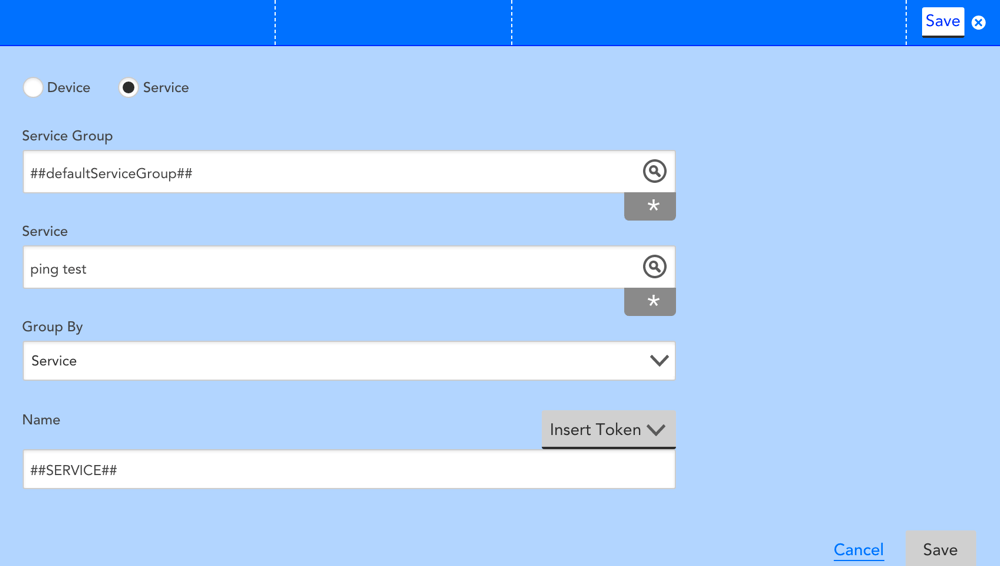
Example Configuration for Adding Websites
Max Display Columns
This field sets the number of columns of NOC entities that will be displayed in the widget. If there are more entities in your widget configuration than can fit in the number of columns you have selected, a horizontal scroll bar will be included in the widget display to enable viewing of all items.
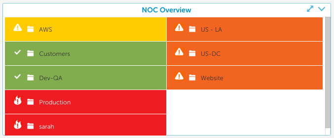
Example NOC
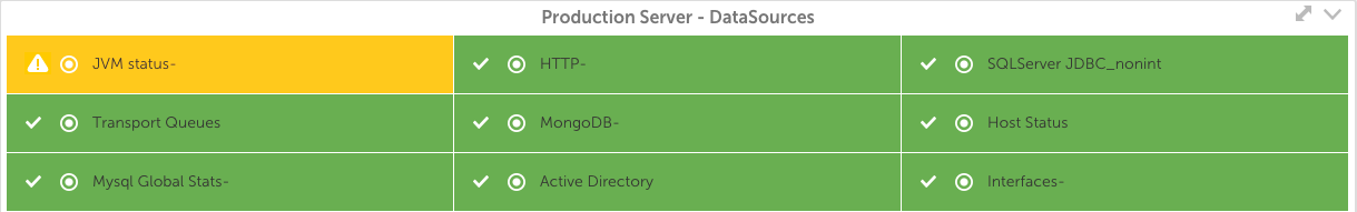
The following NOC widget is configured to display the alert status for all top level groups in the account:
Whether your business measures success based on the current value of a single metric, the aggregate value of metrics across devices, a value from your database, or a combination of any of the above, you can represent it in an at-a-glance view with the Big Number widget.
Overview
Creating a Big Number widget is a multi-step process. First, select the datapoints you wish to include. These can be values of a datapoint on a single instance or values of datapoints across instances.
Once your datapoints have been added, you can create virtual datapoints if desired. This gives you the ability to change units of measure, combine values, or perform a function on the value prior to display. You can also add two values together to create a single value, although ensuring the values are in the same unit of measure is recommended.
The final step is to select which values will appear as numbers in the Big Number widget.
Create a Big Number Widget
Click on the Add drop-down and select Big Number widget from the list. The Configuration form for setting up the widget will be displayed. See these instructions for help filling out the title, description, dashboard and refresh frequency fields.
Big Number Options
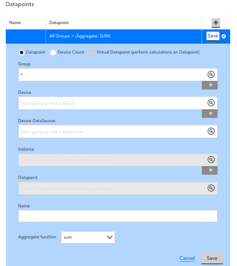
Begin adding datapoints and virtual datapoints by following our instructions for configuring datapoints to be displayed in your widget. Additional configuration items for each datapoint include Name and Aggregate function:
Name
Provide a name for this datapoint configuration.
Aggregate function
This field displays only for real datapoints that have been set to monitor more than one individual instance. It allows you to choose the max, min, or sum of the values from the multiple instances.
Example Configuration
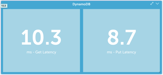
When configuring the Big Number widget, you first need to select the datapoints which will be represented in the widget. The following configuration will give you the value of the CPUutilization datapoint for an AWS EC2 instance :
Numbers
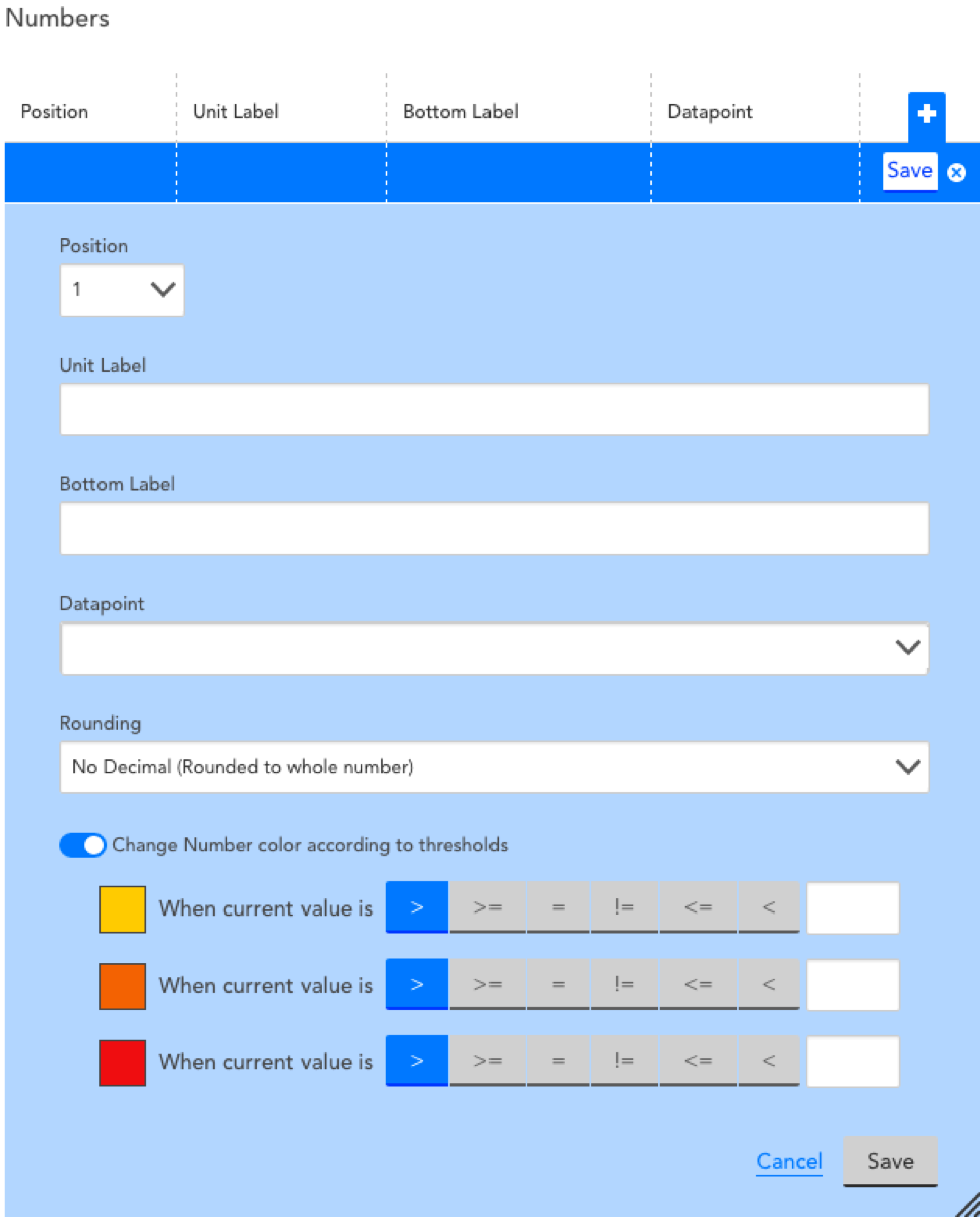
Once you have configured the individual datapoints, you will be able to configure the “Numbers” section, which determines how the datapoints will be displayed:
Position
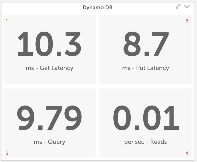
Assign where the value should display in the widget. In the example Big Number widget displayed below, you can see that position 1 displays in the upper lefthand quadrant, position 2 in the upper righthand quadrant, position 3 in the lower lefthand quadrant, and position 4 in the lower righthand quadrant.
Unit label
Enter text to clarify the unit of measure for the number displayed.
Bottom label
Enter the text you would like to see as the bottom label for the value.
Datapoint
Select the data point whose value you want to display on each number section. You will be able to choose from all the data point and virtual data points you configured under Big Number Datapoint Options. Additionally, selecting the “Device Count” datapoint will return the number of devices that match any AppliesTo expression.
Rounding Change
Round to the nearest whole number, tenth (one decimal place) or hundredth. For values with more decimal places, a virtual datapoint is recommended.
Change Number color according to thresholds
Toggling this option on will allow you to change the color of a datapoint’s dedicated quadrant to yellow, orange or red as soon as it meets the criteria of a specified alert threshold. This is an excellent way to provide an at-a-glance warning about the status of your metrics’ values.
Example Big Number Widget