Manage cloud costs without sacrificing performance
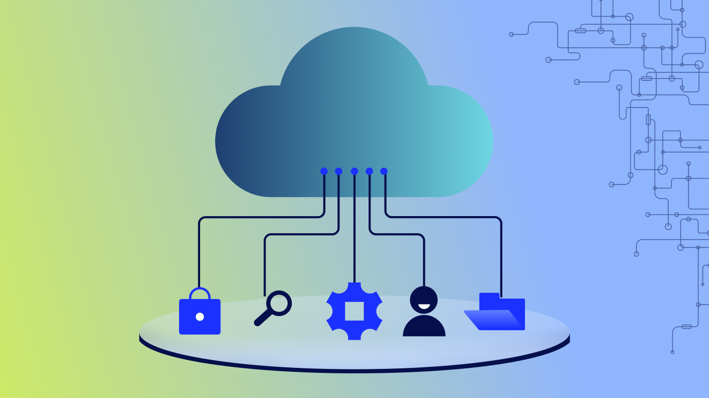
Cloud costs aren’t going anywhere but up. Underutilized or overprovisioned resources increase costs and can easily go unnoticed. Empower your operations teams with proactive, AI-powered cost savings recommendations into Azure and AWS compute and storage environments. Maintain performance, get detailed multi-cloud billing visibility, and provide elevated service levels with the reassurance of always-on monitoring.
Speaker
Charlie Wolfe
Charlie Wolfe is a Senior Product Manager at LogicMonitor, specializing in Cost Optimization and Cloud Observability solutions across multi-cloud environments. As a FinOps Certified Practitioner and Engineer, he implements cost optimization strategies that have saved millions in cloud spending.
At Expedia Group, Charlie reduced cloud and SaaS costs by 20% while consolidating data across 22 brands. His product initiatives have improved cost and performance for thousands of applications through FinOps principles.
A recognized voice in the FinOps community, Charlie has presented at multiple events, including FinOpsX, where he pioneered discussions on applying FinOps to SaaS and AI costs (2023) and led a chalk talk on Cloud Cost Forecasting (2024).
Prior to tech, Charlie served for 20 years in Naval Intelligence, most recently at Naval Special Warfare Group ONE. He holds an MBA in Business Data Analytics and a certificate in Product Strategy from Northwestern’s Kellogg School of Management.

Video Transcript
“Hi there. I’m Charlie Wolf, and I’m the product manager at LogicMonitor responsible for our cost optimization tools.
Today, I’ll be talking you through how to use LogicMonitor to optimize your cloud costs while using our trusted recommendations, which are designed to help you lower the cost without any effect to your performance.
How many people out there have gotten a nasty surprise in your cloud bill at the end of the month or a visit from your CFO maybe telling you to decrease your cloud spend without having any understanding of the workloads that you’re currently running on your infrastructure?
When I was at Expedia Group, I had that experience more than a few times.
As organizations adopt the cloud at scale, cost can spiral out of control.
It’s no longer just about uptime and performance, although those are still very important, metrics for success. Now cost has also become one of your critical metrics.
But here’s the catch. Cutting your cost blindly often leads to degraded performance, and the real challenge becomes maintaining operational excellence while optimizing your spend. That’s where logic monitor and FinOps comes in.
FinOps is a term that was coined in about twenty sixteen and is, at its core, a cultural practice. It’s all about teams working together to maximize the business value of your cloud.
It hinges on five core principles, collaboration between engineering, finance, product, operations, ownership, where every team is accountable for what they use, accurate data delivered in as near to real time as possible, business value alignment decisions have to reflect impact. You have to understand where your money is being spent and then understand why your money is being spent.
And then finally using the variable cost model of the cloud to your advantage.
This isn’t just finance’s job anymore. Engineers and operators are now directly accountable for their cloud costs. If there’s a spike, ops teams will be the first teams questioned.
You need to stop working in silos.
Performance and cost have to be treated as shared KPIs.
And cross functional collaboration is key to success in this new landscape.
Operations must work together with other teams to optimize resource utilization, ensure performance, and control spend.
FinOps breaks the cost optimization journey down into three phases.
The first stage is inform, understanding where your spend is happening, which services, who’s creating costs, what teams are are utilizing your resources.
The next stage then is to move into optimizing.
And in that case, you identify idle or underutilized or oversized resources, and then right size and reclaim those resources. Stop or downsize without affecting performance.
And the final phase is to move into operating. That’s where you have ongoing governance where you monitor budgets, validate increases, and align your spend with business goals.
Logic monitor enables each of these steps.
How does logic monitor enable this? Well, in the inform phase, LogicMonitor has purpose built cost optimization dashboards to start you off.
Then you can integrate cost data into your existing dashboards using pie, bar, or area charts and slice and dice that cost data right alongside your performance data.
Then when you move into optimizing, we surface your idle compute, your unattached storage, and other under underutilized resources.
And finally, in operate, you get exportable reports, which you can build using dashboards and tailored to your finance, dev, or ops teams, and alerting is coming via your normal LM alert workflow later this year.
How do we do it?
So to start off, we have a very simple onboarding flow. It’s incredibly smooth. And if you’re already monitoring your cloud accounts with LogicMonitor, monitor, cost recommendations begin populating immediately.
There’s also a cost specific wizard that makes connecting your billing data into the tool very easy. Most existing customers start seeing useful insights within hours rather than weeks or months.
When you first open cost optimization billing, there’s no associated data. So first, you need to click add billing data.
Then you choose between providers. So in this case, Azure, AWS, or GCP.
We’ll select AWS.
Enter a display name for your bill and any description data.
And then for permissions, you can very simply choose to copy from an existing AWS resource, or you can create a new role in your AWS environment.
Navigate to your AWS I’m page and use this associated information to create a role there.
Once you created the role in AWS, you come back here, add in the role ARN to your logic monitor environment.
And then after setting up your current exports within AWS, you enter the s three location for your exports and add the export data here.
You can check your property normalization to make sure you’re ingesting all of your tags properly and that those are normalized within the environment.
And then you verify and you add your export.
And within the next one to three hours, you’ll begin to see all of your billing data pulled directly into logic monitor for analysis.
To get the best recommendations, your data has to be complete. And to maximize savings, we run a health check on your environment.
We validate the presence of key metrics, like EC2 memory, and then highlight any gaps and guide your team in how to fill those. This ensures that every recommendation is both safe and high impact.
Now you’re in recommendations, and something is obviously not right. I’m not seeing any Azure recommendations.
But with health check, you see your setup is in an error status up there on the top right of the screen.
Once you click it, you can see that your error is a missing data point.
And I can navigate straight to the logic module to make any changes that are needed within that logic module.
Go down.
Check through your data points. I’m not gonna make the change now. But if you needed to make any change, you would do it here. Go back into the tool, and then you have the option to validate that that worked by rerunning the status check. Or you could just move on, and tomorrow, the health check will run again. It runs automatically every twenty four hours.
Next is building cost awareness. One of the biggest wins is helping teams see the impact of their usage.
By integrating your cloud billing directly directly into your dashboards, you can visualize cost directly alongside your performance and reliability data. That makes accountability and action much easier. You can track spend on services like e c two and s three in real time, enabling direct comparison with performance and usage metrics for smarter decision making.
Let me show you how easy it is to add a widget.
From cost optimization, we then choose to move into your dashboards.
And there’s, now a new widget type called billing.
Once you create that widget, you choose a name, in this case, something very simple.
And then for your visualization type, you can select from different visualization types. Right now, what we’re offering is the area graph, column chart, stacked column, donut charts, and group tables.
Add a stacked column chart here.
And you can choose to filter by any dimension data, that exists in your billing data. And here we’re gonna choose to filter down to just what we’re spending in AWS.
So you would select your provider and then filter to AWS. Then you choose the billing dimensions that you wanna use in your analysis.
And same deal, you can choose from any billing dimension that exists anywhere in your billing data. But here, we’re just going to choose region.
And then we’re gonna wanna be able to zoom in and see the resource types within that region, and then maybe we wanna see the resource type detail. Then you choose your time range. You see we’ve added some new ranges to what we normally provide in dashboards.
So we see previous calendar month, which in this case is March.
Select your aggregation granularity. We only give you the options for what works within your selected time range. In this case, I think weekly would probably make the most sense.
And I always like to group remaining as all others, but we leave that up to you.
Once you save that widget, it’ll pop into your dashboard.
Let me expand this thing out. I like my bar charts a little wider than this.
And you can hover over the various parts of your chart so you understand the actual underlying data, and then you could choose to drill down into your resource type. In this case, we’re going to resource type. Right? Only in the US west two. And then within US west two, we wanna understand the detail.
So we select resource type of AWS Cloud WAN and the detail.
And then if you wanna work your way back out of it, you just follow the breadcrumbs.
Here, we’ll go back home.
You can also add a recommendations widget right alongside of it to see where you could save money. And, again, you can filter by any billing dimension. And now that everything’s on one dashboard, you can choose to filter down.
In this case, we’re not gonna add any filters, But we can go up into the dashboard filter.
And then we can filter it down to, say, just one account.
And it would apply to everything on your dashboard.
We understand that not all recommendations are equal. So our life cycle approach gives users the flexibility to take action when ready while keeping a record of all those decisions. This improves auditability and team communication.
Each recommendation that you get goes through a life cycle. You see here that you start with a new recommendation, then you validate it against your performance data, then choose to acknowledge Rex that you are going to take action on or snooze Rex that you will take action on later or ignore Rex that you will never take action on.
Adding notes tracks decisions transparently, which is great for audits and collaboration.
See how easy that is. I’ll walk you through a sample recommendation flow.
This is our recommendations page. And on the default page, your recommendations are broken into categories, such as idle AWS e c two, underutilized AWS EC two, unattached EBS volumes, and unattached Azure disks.
So in this case, we’re gonna take a look at the underutilized AWS EC two instances because you those are usually the most complex of recommendation types.
Expand that out.
You can see here that this first one is asking me to switch from a t3 large to a t three a large, which will save approximately seventy dollars per year.
And if you trust that recommendation, you can navigate directly into your AWS environment by clicking on the icon right here, Or if you want to further validate the recommendation, you can expand this, and you see that you have your CPU utilization and network throughput graphs right here in the recommendations tab. And if those two pieces of data aren’t enough for you, then you can navigate into more resource graphs.
Here we go. And dig into that EC two resource. There you go.
And now you have access to every graph on that resource.
Once you check your data and you’ve made your decision, you can come back into recommendations, and now you can take action. And in this case, you might want to acknowledge a recommendation that you’re gonna take action on or ignore a recommendation that you’re never going to, I think here we’ll select to snooze a recommendation that you might take action on later.
Once you choose to snooze a recommendation, you can do so for whatever your selected duration would be and then select a reason for the snooze.
In this case, we’re gonna choose other, and then you can add in a note as to why you snoozed this.
All right, and now you can go up and check, deselect all of your active recommendations.
And now you see that it falls within your snoozed recommendations.
And if you want additional information, you can click on the status, and you can see who snoozed the recommendation, and when that snooze started, and when it will end, the total duration, the reason, and any notes that were added to it.
But in this case, you decide you actually do want this to be active, so you can go back into it, set the status right back to active, and it brings in your existing note, which you can choose to amend that note or just delete it and add a completely new note, confirm your change, turn active recommendations back on, and you can see it’s back into that active status.
So we put our own tools to work at LogicMonitor.
And in the first year that we ran this tool, LogicMonitor saved over seven hundred and fifty thousand dollars, which at our list price, would be five point five x, the cost of the tool. So it would have saved us quite a bit of money over over our investment.
Inline performance validation gave us the confidence to act incredibly fast, and our team actually avoided a surprise two hundred thousand dollar billing hit, by catching the spike early before, somebody came down and and started asking questions about it.
We did achieve over seven hundred and fifty thousand dollars in annual savings, as I said, and recently found another hundred and fifty thousand that we actioned just last week.
Our ops has been empowered to monitor their own cost spikes and catch surprises before they even hit.
One of the most powerful enhancements that we’ve made so far is integrating memory utilization, which isn’t available to other tools via AWS’s APIs.
And so tools without our local collector won’t provide this for you. This context ensures that our recommendations aren’t just cost effective but are operationally safe, and that’s the power of full stack observability.
This recent enhancement was a game changer. And by incorporating memory utilization for EC two, we saw in our demo environment, more recommendations, two point four times higher annual savings, and, fewer, close calls with, you know, potentially unsafe recommendations based on the default memory utilization. That’s a two hundred and forty two percent increase in value and safer recommendations just from beta better data. So memory context equals better recommendations and equals safer decisions.
So what are the next steps for you? Well, first off, if you’re a current LogicMonitor customer, you can ask your CSM to generate your estimated savings in the background.
We can pull up exactly what our annual estimated savings would be for your entire estate.
And then you can request a demo in preview mode where you’ll see one recommendation type one recommendation per recommendation type live in your portal to see how you’d be able to take action and validate our recommendations.
Thank you.”