LogicMonitor dashboards are truly customizable — customizable enough to allow users to visualize virtually anything. Dashboards provide our users with a wide array of capabilities, from capacity planning and service availability notifications to root cause analysis and IT spend forecasting capabilities. We’ve seen LogicMonitor users get radically innovative when it comes to creating unique dashboards that add value to their lives both in and outside of work.
Have you ever wondered how you can display alerts in a fun way? Or how to keep track of something that fluctuates frequently, like currency rates? Jon Davis, an Integration Engineer at LogicMonitor, doesn’t have to wonder because he’s built dashboards for that. While Jon has plenty of practical dashboards that make his workday easier, he’s shared some unique ones that make his day more fun. Maybe some of these will inspire you to create unique dashboards of your own.
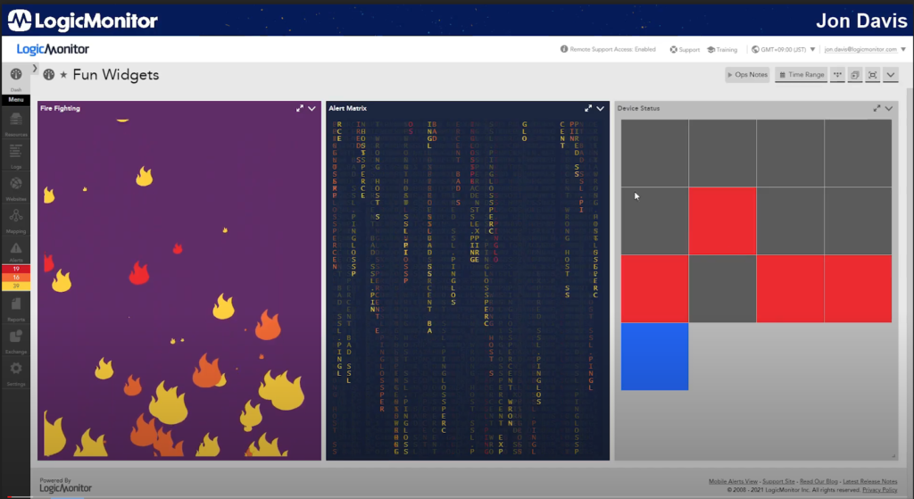
Dashboard #1- Fun Widgets
First up is the Fun Widgets dashboard. This dashboard includes widgets that keep track of alerts and devices. The fire fighting widget (left) shows all active alerts at a glance. Each color-coded flame symbol represents an alert. Red flames represent critical alerts, orange flames represent errors, and yellow flames represent warnings.
The alert matrix widget (middle) shows a stream of alerts. If you look closely, you can see the alert message spelled out. This one isn’t exactly practical or useful, but it’s a fun way to display alerts.
On the other hand, the device status widget (right) is quite useful. Each square represents a device. Grey squares are devices that are no longer active, blue squares are devices with no alerts, and red squares are devices with alerts. The squares are color-coded to represent the worst alert state, meaning all of the red squares are devices with critical alerts. The device status widget is a good way to see how things are functioning with only a quick glance. It can be easily customized to add more devices and change the size of the boxes.
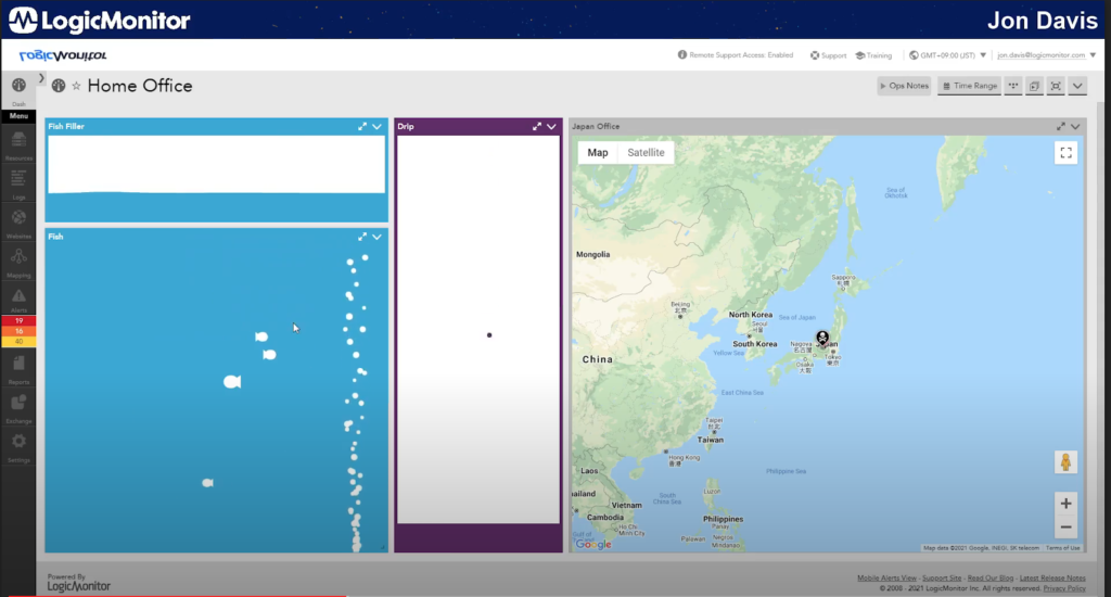
Dashboard #2- Home Office
The next dashboard is Jon’s main dashboard from back in the day. For customers that have been with LogicMonitor for a while, this is a throwback to the old UI. The fish widget (left) displays fish swimming around. This one is really just for something interesting to look at in the background. Initially, the idea for this widget started off as a Tamagachi-style approach, where if you don’t check your dashboards every day, your fish will die.
To the right of the fish widget is the drip widget. If you have a volume of discs or just a singular disc, this graph is a visual indicator of how full each disc is and the rate at which it is filling up. Each drop of water represents a disc, and how fast the water drips indicates how fast the disc is filling up. The water level at the bottom shows how full a disc is.
The map to the right is a default map and it shows where Jon’s office is located.
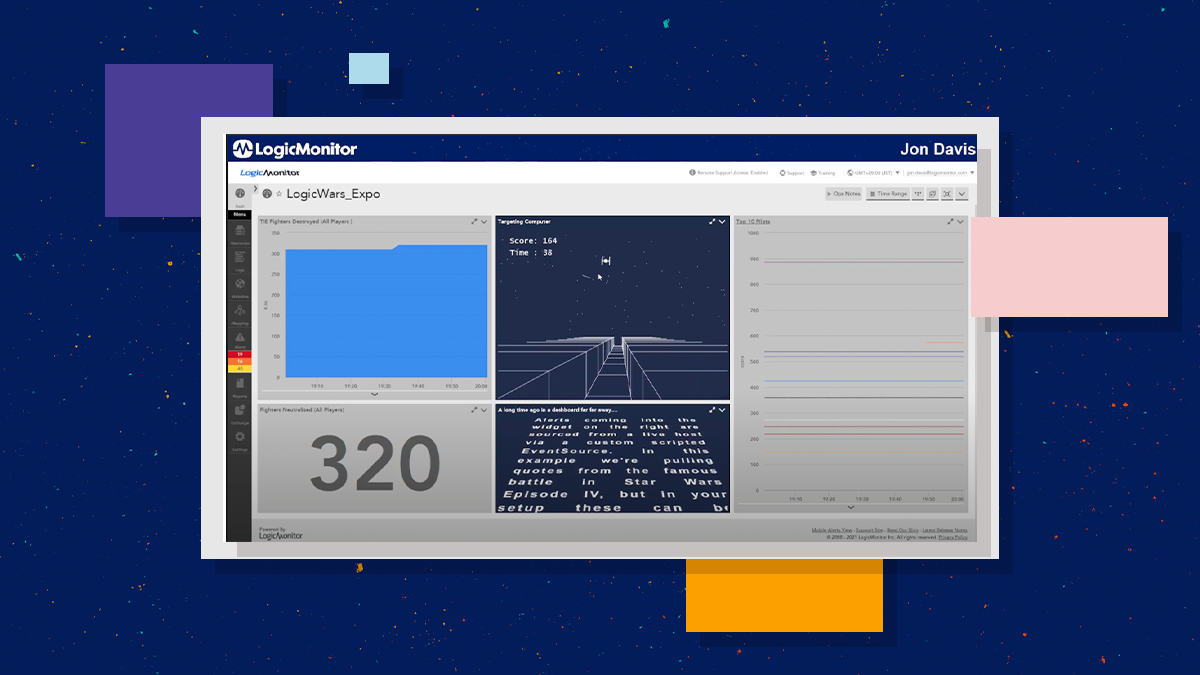
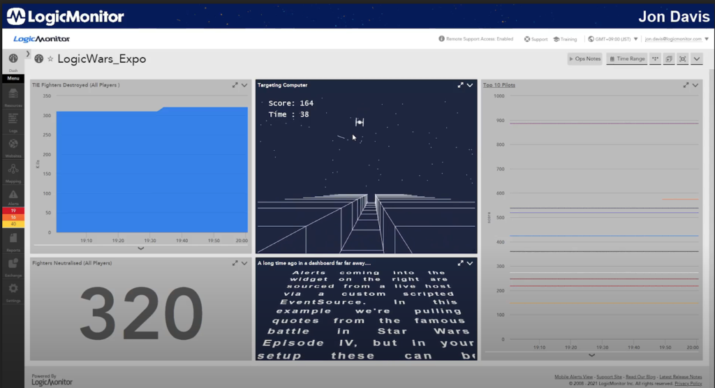
Dashboard #3- LogicWars
Dashboards don’t need to be boring! The third dashboard shows just how extensible and customizable LogicMonitor dashboards can be. The LogicWars dashboard is a take on a retro videogame and shows how custom HTML can blend seamlessly with the rest of your reporting.
The HTML widget in the center is used to shoot as many TIE Fighters as possible before the time runs out. The more accurate you are, the more points you get. Jon used HTML5 canvas line drawing to give everything the retro feeling of the classic Star Wars arcade games. Metrics for TIE Fighters shot down are collected by a LogicModule polling a web server and stored within LogicMonitor. These are displayed via our graphing widgets to the left of the page.
Alerts coming into the widget on the right are sourced from a live host via a custom scripted EventSource. The top 10 scores are displayed, making it a fun competition between coworkers. All widgets in the dashboard are updated automatically after each game.
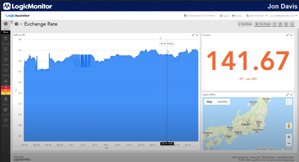
Dashboard #4- Exchange Rate
The final dashboard keeps track of the exchange rate for GBP to JPY. Jon set up alerts that notify him when the numbers are high, meaning that it is the best time to buy. This type of customizable dashboard can be used to track anything that fluctuates and you can use predictive analytics to forecast future numbers.