
One of the improvements our new proprietary Time Series Database allows for is better visualization of long term data trends – a crucial component of proper enterprise monitoring.
When you’re viewing the trend of data for a long period of time (say a week or more) the system has to deal with how to present a lot of data. If you’re storing data every minute, then even a week’s worth of data is over 10,000 datapoints – way more points than can be shown even on a retina display. The situation becomes worse if you’re looking at a month or a year’s worth of data.
In the past, we condensed data in the same manner used by all Round Robin Database (RRD)-based systems out there. This is done by calculating the average of all values for a time period and using that as the display point. For example, if we want to show a graph of a week’s worth of data, and we have decided to show 500 pixels on this graph, then each pixel is going to represent just over 20 datapoints. So for each 20 minute period, we’d get all the datapoints, average them, and use that as the value to plot for that pixel. (RRD aggregation doesn’t quite work that way – it’s more like an average of averages – but this is close enough.)
This works well to condense a lot of data, but loses a lot of meaning and significance in the process.
For example, look at this one-day graph of one of our switch interfaces:
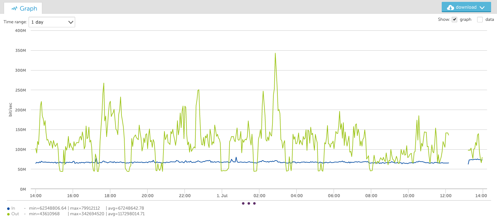
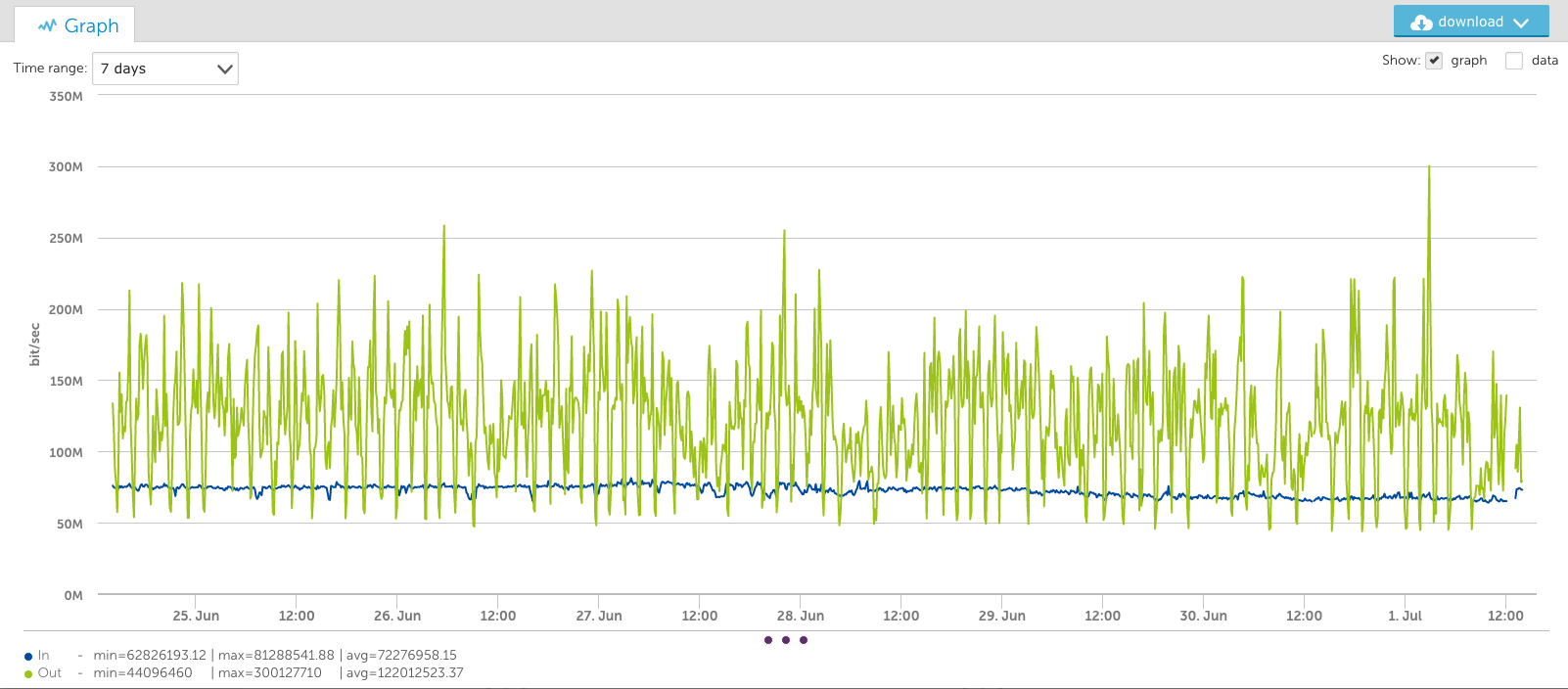
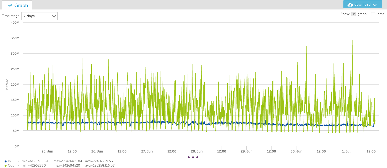
You’ll note the output data peaks at almost 350Mbps in the graph above, but in the view of this interface for the last week (below), the peak appears to be just 300Mbps. This is because it’s an average of the consolidated period:
And in a 3 month view (below), the bandwidth seems to only peak at 140Mbps:
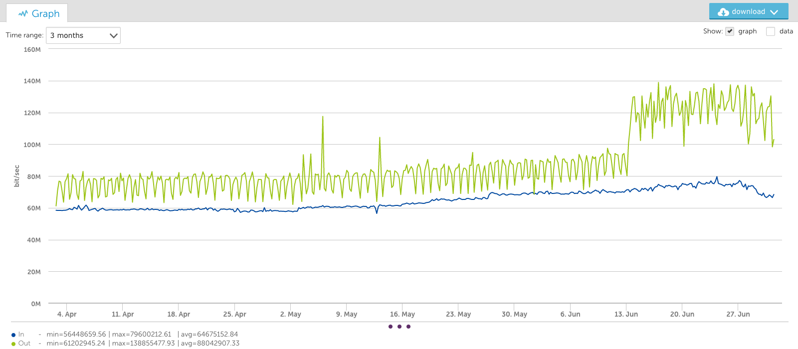
This averaging out of peaks could lead people to underestimate their long term capacity demands.
Introducing the VaST Algorithm
Our DataScience team could tackle this problem now that we have the all the raw data via TSDB – so they did. They implemented what we are calling the VaST algorithm: VisuAlly Significant Trending. The name VaST is appropriate, given it works by dealing with the vast amounts of data inherent to enterprise monitoring. Using complex math that is over my head, VaST can pick out the significant inflection points of the time series data and preserve them, regardless of the amount of data or the pixels by which the data has to be represented.
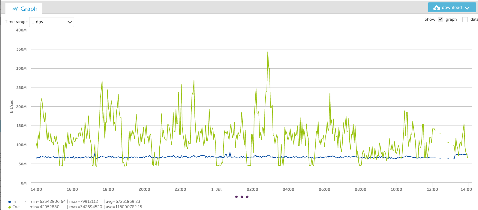
Looking at the same data as above, but using the VaST algorithm instead of the average algorithm, results in very different trending. The one day view is almost identical, as the data has not had to be consolidated a great deal:
The one-week view shows a very different picture, however. Note that the peaks stay at the true value:
And the 3-month view below also maintains the peaks:
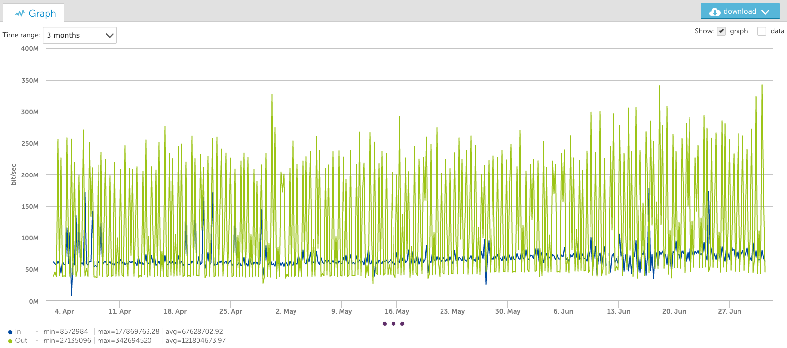
You’ll notice that for longer time periods (such as the 3-month views) different information is conveyed by the different aggregation methods.
VaST vs. Average: A Comparison
The average consolidation makes it easier to see broader trends over time and to observe the increased average over the last two weeks. The VaST consolidation makes it apparent that the required bandwidth went from 250Mbps to 350Mbps over the same time period – information not evident without zooming in on specific time ranges with the average consolidation.
So both methods of presenting data are useful – and necessary – for different use cases. LogicMonitor is rolling out options for VaST support in the current release, starting with Custom Graph Widgets on dashboards, with other graphs coming later.
Recommended Use
Our recommendations as to when you should use VaST for graphs, and when to use average, as a part of your enterprise monitoring are:
– If you are looking at short time ranges (less than a week) it doesn’t matter, as the output will be very similar.
– For longer time frames, if you are concerned about peak utilization, use VaST
– Otherwise, use average, to smooth out the peaks for easier trend analysis.