
Recently, we ran an internal challenge at LogicMonitor to see how many blog posts we could get in a week. We didn’t quite get to the 100% participation that would have led to Kevin (the C.E.O.) and I taking a ballet lesson in tutu’s in the street front window – but we got a good response. Here’s the first of the series, in no particular order, from Philip Schorr, one of our great support engineers.
LogicMonitor is a great tool, and everyday as I chat with different clients, everyone has a different use case; certain clients may use monthly reports to keep track of trends while others stay on top of database status, or create a view that allows one to finely tune their application’s performance.
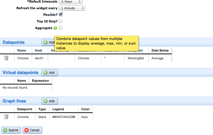
I want to show everyone one feature of LogicMonitor that is handy in all sorts of ways to correlate and interpret their performance data. That feature is the “custom graph widget”. These flexible custom graphs let you make use of powerful regular expressions and can combine data from any metric (from any components of any device) that LogicMonitor is collecting.
In this example I have a datasource that only grabs performance of all the “chrome” processes on a host – since this a flexible graph, I can use a wildcard (*) to graph every process, as processes come and go. (I could also use a wildcard or regex in the host or group field, to see data across all, or a part, of our infrastructure.) The feature I want to point out specifically is the “Aggregate” option. If this is turned on, every line on the graph will be combined into a single line representing the sum. If the option is turned off, each instance will be displayed as its own line. Here’s the kicker – combine no aggregation with a “Stack” type line and you get a graph that will show each constituent, but when stacked, you can visually see them represented as a whole.
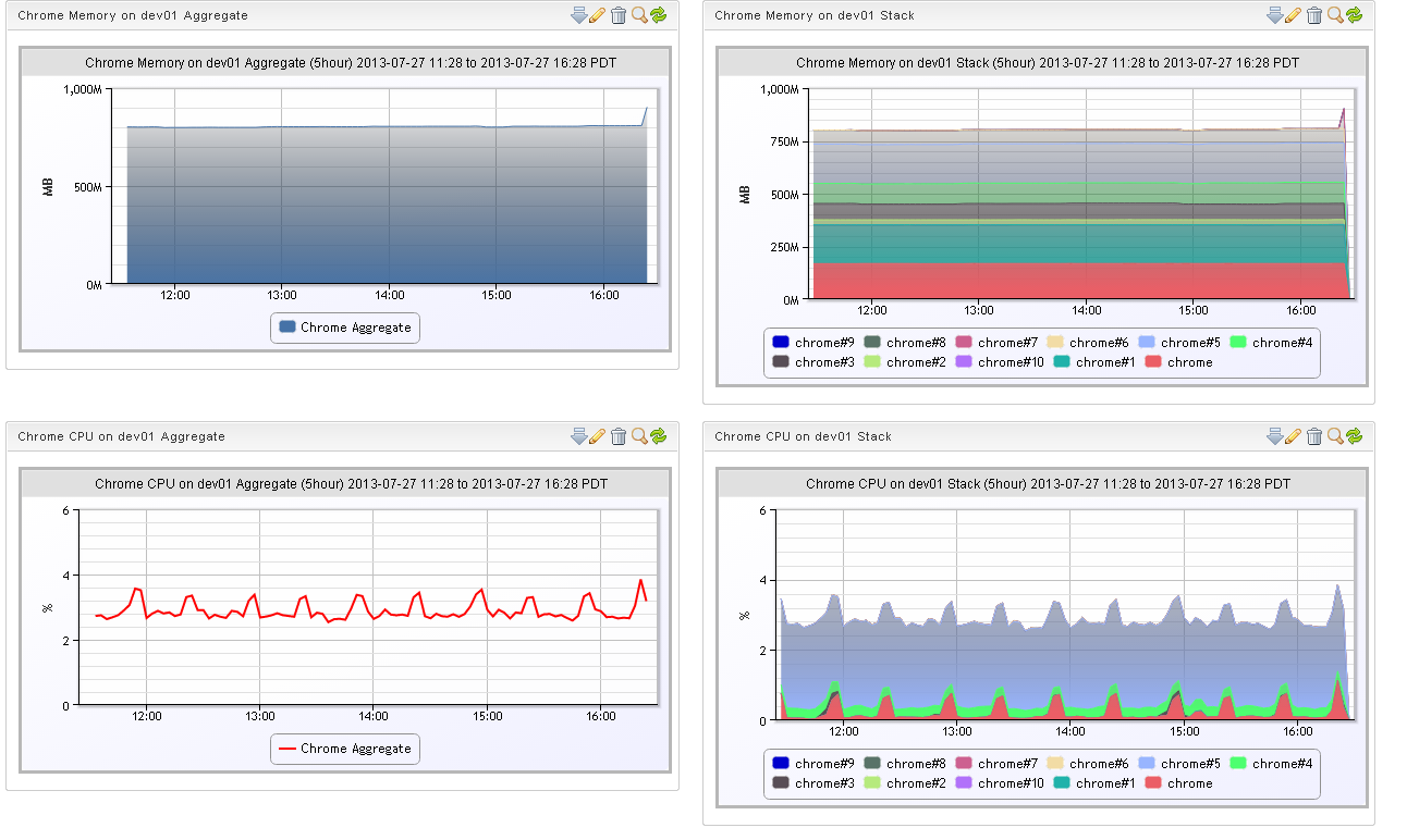
I encourage you to try this out and make some really interesting graphs. Think monitoring storage usage across all storage arrays, broken out by business unit. Or bandwidth by ISP aggregated across multiple datacenters. Enough custom views, and your dashboards will become the central place where you can immediately see your system’s aggregate performance at a glance.