
Disclaimer: This content applies to the legacy UI and is no longer maintained. It will be removed at a future time. For up-to-date content, see Custom Graph Widget Creation. At the time of removal, you will automatically be redirected to the up-to-date content.
Custom Graph Widget
Last updated - 24 July, 2025
The Custom Graph widget is the most powerful Dashboard widget and by nature the hardest to configure. The Custom Graph widget permits glob expressions in its configuration, enabling aggregate and top ten data to be displayed.
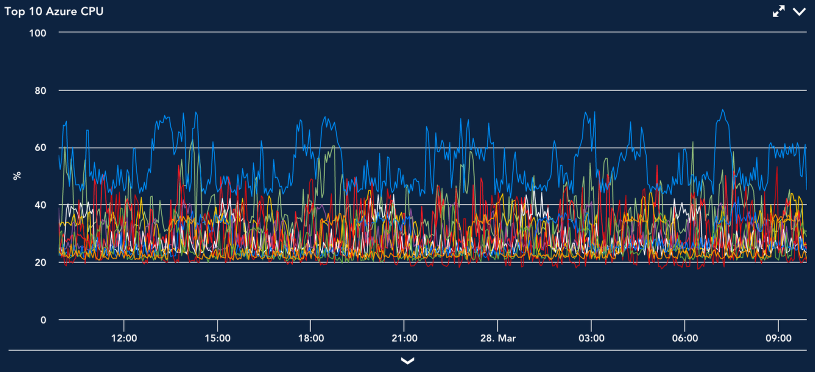
One of the most common uses for the Custom Graph widget is to see top 10 values of a specific datapoint across devices, as shown in the following screenshot. This could be memory, CPU, throughput, or any other metric you are interested in across your infrastructure. It is an easy way to compare performance of any metric across devices.
Note: The Custom Graph widget has a 100-line limit.
Once configured, there are several ways in which you can manipulate the output and display of Custom Graph widgets from your dashboards, including viewing Ops Notes, expanding legends, viewing forecast conditions, or visualizing anomalies. These options are standard across most areas of the interface in which graphs display and are talked about in detail in Graphs Tab.
Creating Custom Graph Widgets
To create a Custom Graph widget, open the dashboard you would like it to display on and either click Add | Widget | Custom Graph from the Dashboard tree or click the drop-down arrow (v) icon located in the far right of the open dashboard’s header and click Add Widget | Custom Graph. This opens the Add Custom Graph Widget dialog box, which is divided into three configuration categories:
- Basic Information
- Display Settings
- Widget Customization
Basic Information
For instructions on completing the first few universal fields displayed at the top of the Add Custom Graph Widget dialog box (i.e. Widget Title, Description, and Refresh Frequency), see Adding and Configuring Widgets.
Graph Data
The Graph Data section is where you will configure the datapoints to be included in the graph. There is no limitation on the types of datapoints that can be included, but as the values are all displayed on one graph with a single Y axis, it is recommended that they be of a similar data type.
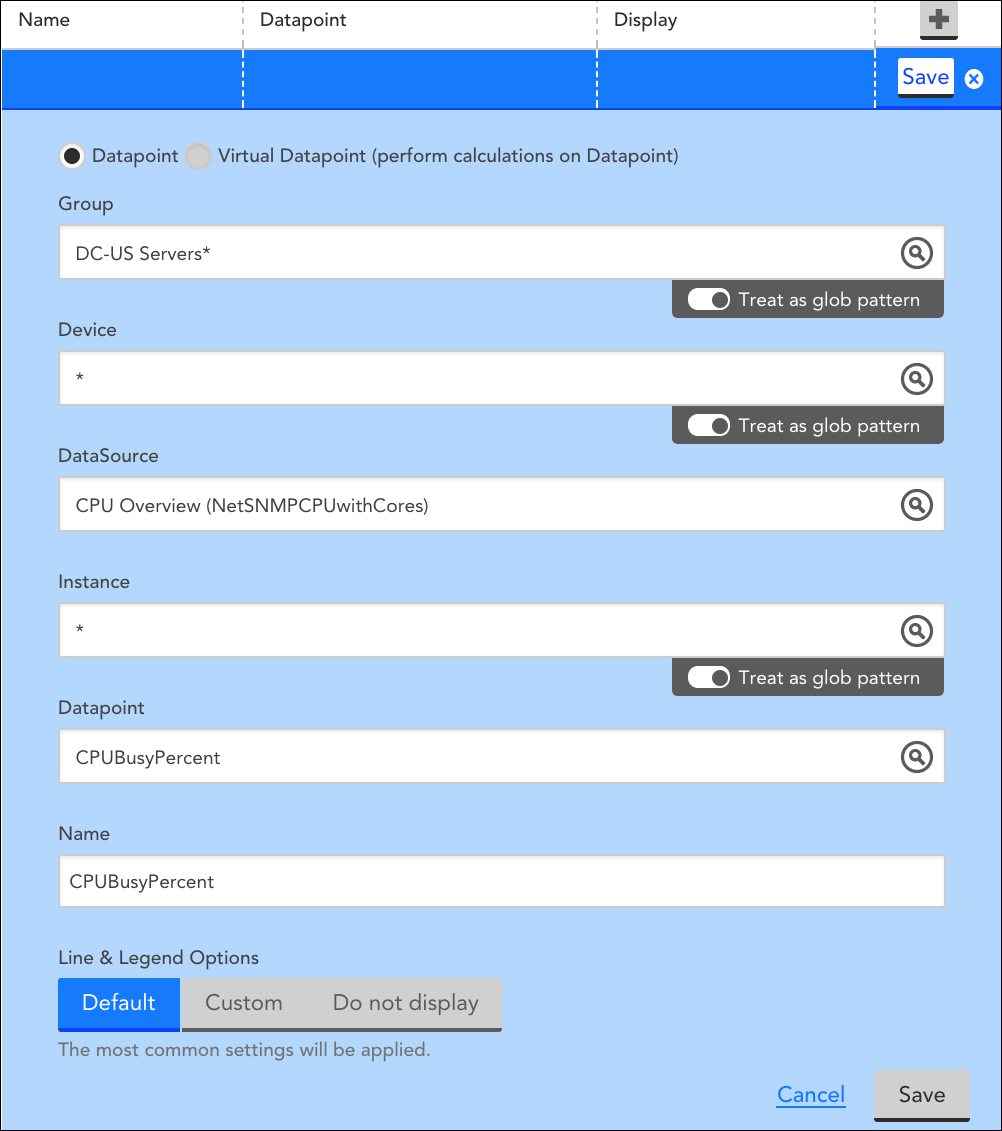
Begin adding datapoint(s) to your graph by following our instructions for configuring widget datapoints. The following screenshot features a sample datapoint configuration that displays the top 10 average values for CPUBusyPercent for all servers in the group DC-US Servers.
Lines and Legends
Once datapoints and virtual datapoints have been configured, graph lines are created. This is a two-step process to allow for the configuration of virtual datapoints.
You will need to create a graph line for each datapoint you wish to have graphed. When configuring the graph line, you can select from three line and legend options:
- Default: Standard color, display type (Line), and legend (host, DataSource, and Instance names) information will be assigned to the graph line.
- Custom: Selecting this option will display several new configuration options.
- Legend: Insert tokens that will populate with datapoint-specific information. This expands the amount of relevant information viewable within the graph’s legend. See below for the full list of tokens available as Legend Variables.
- Display Type: Choose the manner by which your graph will display data (Line, Area, Stack, or Column).
- Consolidation function: This option is only relevant when the Use Visual Average option is selected in the Widget Customization area. It’s used to control how the data is displayed when you view the graph data over a longer time period. For example, consider a datapoint ‘aborted_clients’ that returned a value of zero for every sample interval during a day, expect for one sample where it instead returned 100:
- With a Consolidation function of Max, when you look at the graph over a month-long view including the day described above, the day will have a value of 100 (the max value of all samples in the day)
- With a Consolidation function of Min, when you look at the graph over a month-long view including the day described above, the day will have a value of 0 (the min value of all samples in the day)
- With a Consolidation function of Average, when you look at the graph over a month-long view including the day described above, the day will have a value of 0.5 (the average value during the day)
- Color: The line color that displays in the graph for this datapoint configuration. Selecting “auto” will randomly assign a distinct color to the line.
Note: If a glob expression is used in any of the datapoint configuration fields and the graph type is not set to aggregate (graph type is discussed in a following section), the Color field is disabled and remains locked at “Auto.” This is because one datapoint configuration could potentially generate multiple graph lines and one single color assignment would prevent you from distinguishing between these lines.
- Do not display: the datapoint will not display on the graph. This is used when you want to configure a datapoint solely to be referenced in a virtual datapoint configuration.
Legend Variables
For custom graphs, variables are supported in the Legend field. The supported variables are:
- ##HOSTNAME##: The name of the device whose data is being graphed
- ##DATASOURCENAME##: The display name of the DataSource being graphed.
- ##INSTANCE##: The instance being graphed by this line.
- ##DSIDESCRIPTION##: The DataSource instance description (if any) of the line.
- ##DEFAULT##: this is equivalent to ##HOSTNAME##_##DATASOURCENAME##-##INSTANCE##
Note: You can change the Legend to any text you want, but you must have at least one token present in the legend. If you do not use a token, the default legend will be appended, distinguishing which device/DataSource/instance is associated with the line.
Graph Type
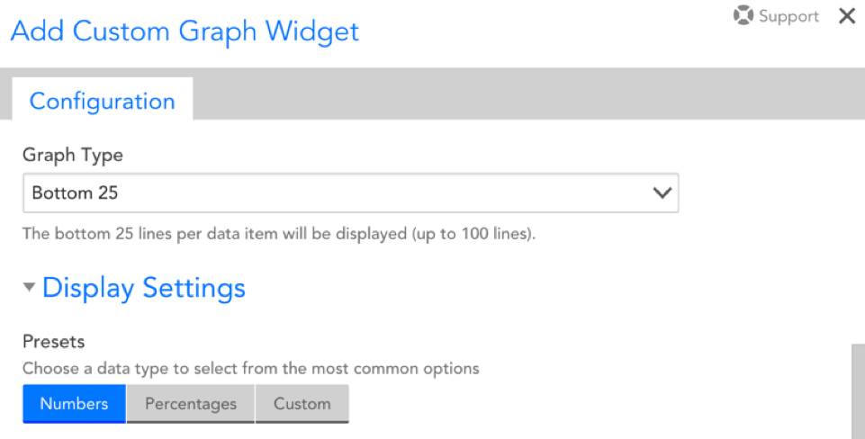
After adding a datapoint configuration, a Graph Type section will appear if glob expressions were used for any of the settings. This section allows you to configure whether the graph displays the top or bottom 5, 10, 25, or 100 lines per datapoint or, alternately, aggregates each datapoint to one line. As shown next, when Aggregate is selected, you will be prompted to determine whether the aggregate is calculated based on the average, max, min, or sum of the datapoints.
Display Settings
The following settings influence the refresh and display of your graph:
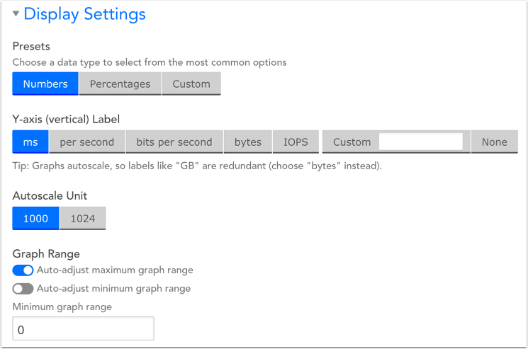
Presets
This will determine the datatype that will display on your graph. You can choose from Numbers, Percentages, or a Custom option you provide.
Note that this selection will determine the options available for your Y-axis (vertical) Label.
Y-axis Label
This will determine the unit of measurement displayed for the graph’s Y-axis.
- If “Numbers” was chosen as your preset datatype, you will be able to select from the following Y-axis labels: ms, per second, bits per second, bytes, IOPS, Custom [which you will have to denote], or None.
- If “Percentages” was chosen as your preset datatype, you will be able to select from the following Y-axis labels: percent, %, percent used, Custom [which you will have to denote], and None.
- If Custom was chosen as your preset datatype, you will simply have to manually denote the Y-axis label.
Autoscale Unit
Choose whether you want your units to autoscale to 1000 or 1024.
Note that this option will default to 1024 when your Y-axis is set to “bytes.” For all other Y-axis labels, it will default to 1000.
Graph Range
There are two toggles you can select from: auto-adjust maximum graph range and auto-adjust minimum graph range. These options ensure that your graphs adjust to fit the full scope of your displayed data.
By default, auto-adjust maximum graph range will be toggled on and auto-adjust minimum graph range will be toggled off, meaning the default minimum value on your Y-axis will be 0.
Widget Customization
There are two options for consolidating data in your Custom Graph widget:
- VaST (Visually Significant Trending): VaST calculates the significant inflection points of our time series data and preserves them. You will want to use VaST for more detailed views of your data, particularly when dealing with longer time frames.
- Visual average: will consolidate the view of your data based on the Consolidation Function specified in your datapoint configuration (min, max, or average). Select this option when dealing with shorter time frames or to smooth-out data peaks for easier trend analysis.
