Disclaimer: This content applies to the legacy UI and is no longer maintained. It will be removed at a future time. For up-to-date content, see Dashboards Overview. At the time of removal, you will automatically be redirected to the up-to-date content.
What are some common dashboards?
Last updated - 24 July, 2025
Dashboards are powerful and customizable, and uses can vary greatly depending on how your business measures success. There are a few common uses that can help get you started.
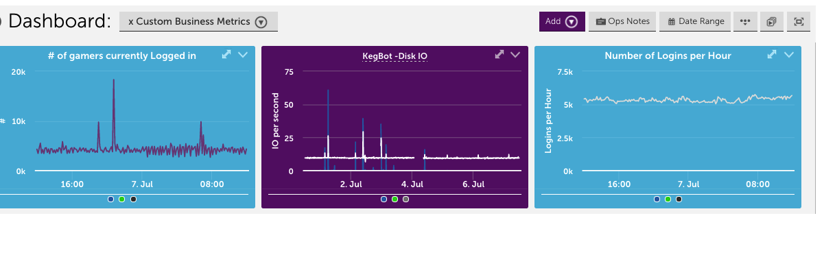
Business / Executive Metrics
How does your business measure success?
If the answer to that question can be found in a database, internal website, or via monitoring metrics, it can be displayed in a dashboard. Custom datasources can be used to bring in details from a database, such as revenue earned by day, or from another tool such as Google Analytics.
With the wide variety of widgets available, you can easily provide meaningful metrics to your team. Whether it is the status of an application, number of emails in queue, or the flow of beer from your kegerator.
Device Dashboard
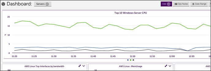
One of the most common uses for dashboards is an overall view of how similar devices are performing across groups, customers, or locations.
Some common Custom Graph widgets that are often created include:
- Network devices – Top 10 Cisco switch CPU across all Cisco
- Network devices – Top 10 interface utilization across all snmp64 interfaces
- SQL – full table scans across all SQL servers
- SQL – latch and lock wait times across all SQL servers
- SQL – lock timeouts across al SQL servers
- SQL – Transactions across all SQL servers
- Windows servers – Active Dir – Replication across all Windows servers
- Windows servers – Active Dir – Sessions across all Windows servers
- Windows servers – CPU across all Windows servers
- Windows servers – Exchange – messages submitted across all Exchange servers
- Windows servers – Files opened across all File servers
- Windows servers – IIS – total requests across all IIS
- Windows servers – Memory across all Windows servers
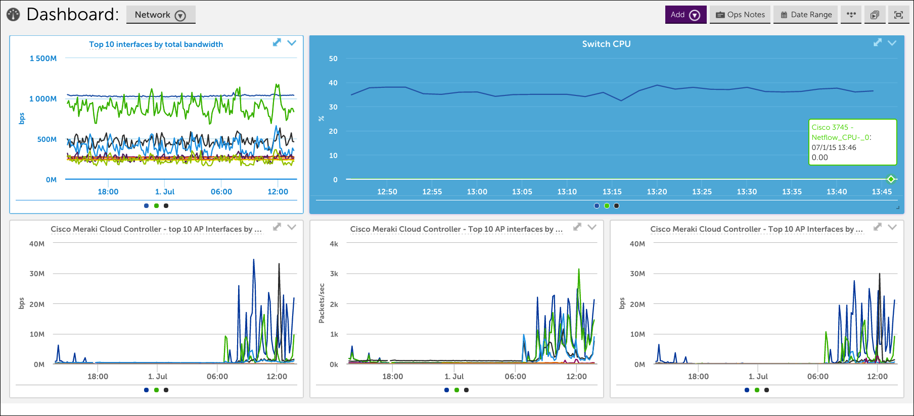
Network Dashboard
A dashboard can be a great way to keep tabs on what is happening with your network. Common widgets include:
- Alert status of network components
- Top 10 interfaces by total bandwidth
- Top applications (pinned from Network Traffic Flow Analysis)
NOC Overview
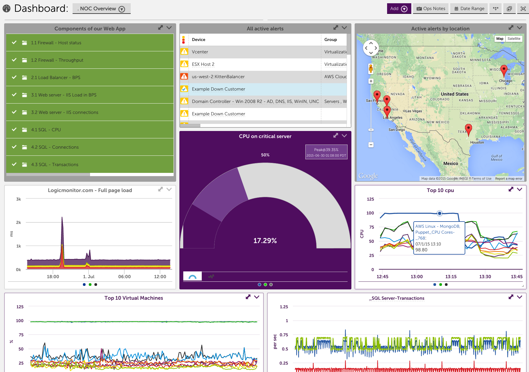
“Green is good.”
To make sure you’re the first to know if an issue arrises with a customer or application, set up a NOC overview dashboard. Recommended widgets include:
- Device NOC widget – Configured by customer, device group, or application
- Alert widget – sorted by severity
- Map widget – quick view of status based on location
- Custom Graphs for top 10 based on datapoints critical to your business
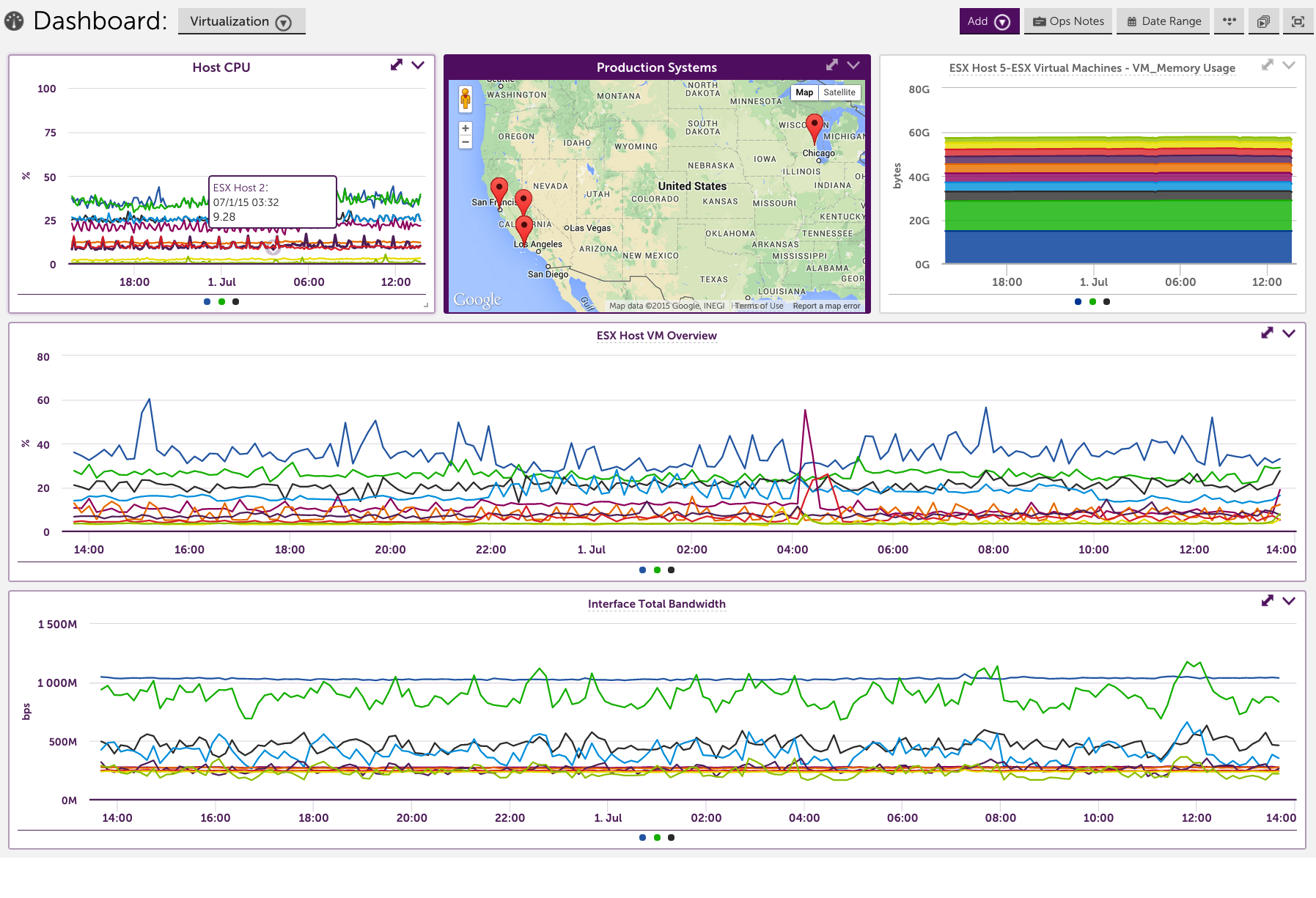
Virtualization
Virtualization is powerful, but keeping tabs on what is happening can be tricky. Dashboards are often used for an at a glance view of VM performance and status. Common widgets added for ESX Devices:
- ESX – Top 10 CPU across all VMs/ESX hosts
- ESX – Top 10 Disk Ops across all VMs/ESX hosts
- ESX – Top 10 Memory across all VMs/ESX hosts
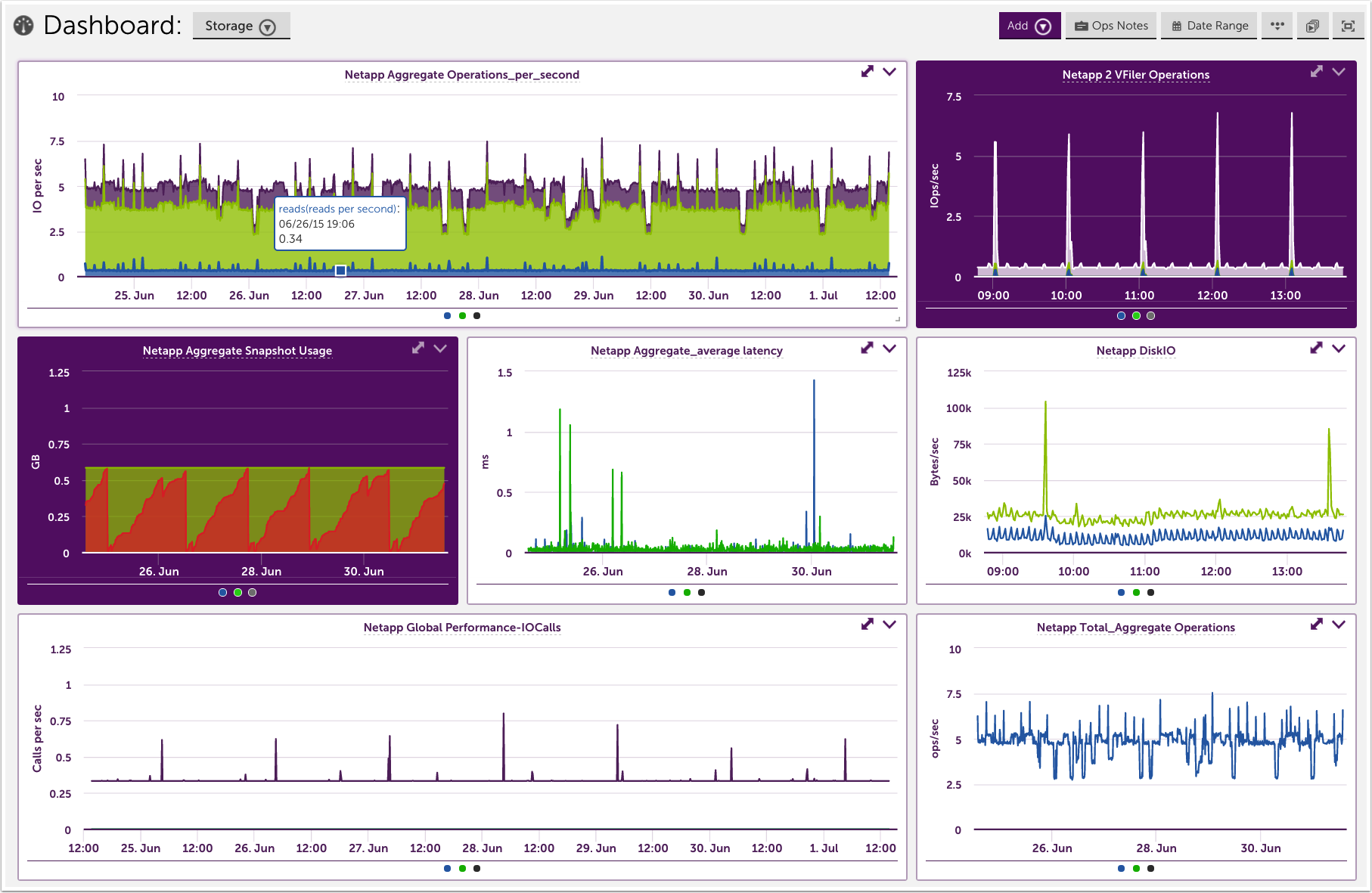
Storage
Storage is a specific example of a Device Dashboard, but given the number of customers who take advantage of our Netapp monitoring it is worth its own mention. See the example below for some helpful widget ideas.
Keep in mind that this is taking advantage primarily of the Custom Graph Widget. If you’re looking for an individual or specific aggregate metric, the Gauge or Big Number Widget may be more powerful.