Traces Landing Page Overview
Last updated - 17 March, 2026
The Traces landing page displays summarized information about your instrumented application. The information includes application topology, namespace, and member service RED metrics.
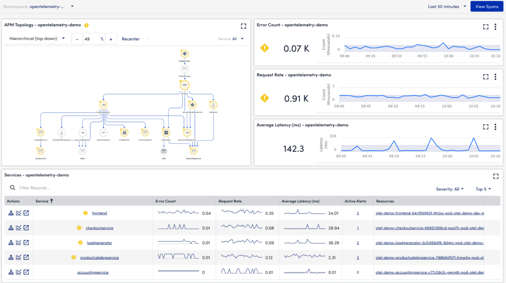
The Traces landing page is structured into Topology, Namespace RED metrics, and Services sections, which comprise the following:
- APM Topology
- Namespace RED Metrics
- Error Count
- Request Rate
- Average Latency
- Services
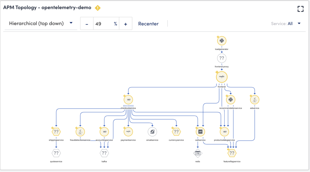
APM Topology
The APM topology widget enables you to visualize your complex application services and navigate based on topology relationships. Double-clicking each service redirects you to the Resources page. You can right-click each service and perform application analysis, view details, view alerts, and view logs actions. For more information, refer to Application Topology Overview.
RED Metrics
The Error Count, Request Rate, and Average Latency widgets are considered RED metrics.
Note: You can zoom the RED metrics widgets by selecting the required time range on the graph.
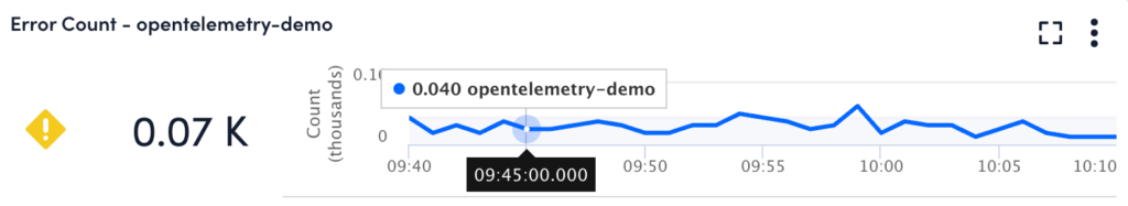
Error Count
This widget displays a graphical representation of the number of error counts in thousands for a given time. For example, the error count was 0.040 (thousands) at 09:45 hours.
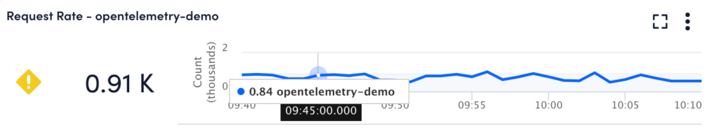
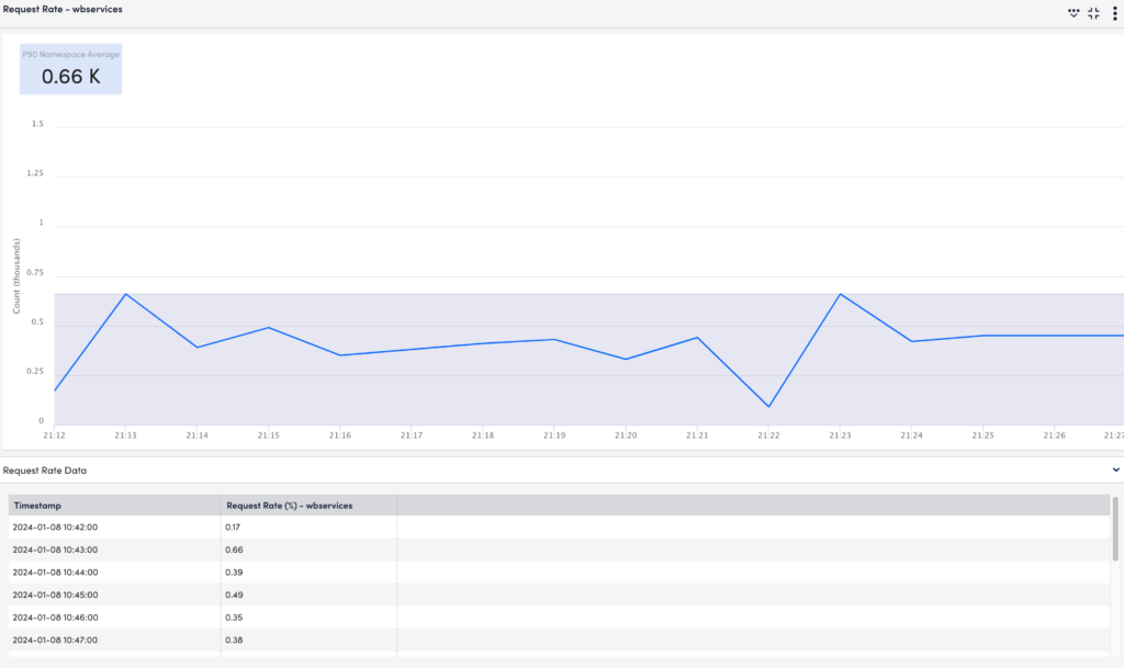
Request Rate
This widget displays a graphical representation of the number of request counts received for a given time. For example, the request count was 0.84 (thousands) at 09:45 hours.
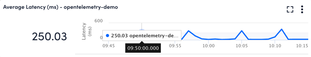
Average Latency
This widget displays a graphical representation of the average span duration (average latency of spans) in milliseconds (ms) within the total number of spans instrumented for a given time. For example, the average latency was 250.03 ms at 09:50 hours.
Services
This widget displays detailed information on the services such as the health of the service, error rate, request volume, average latency, and active alerts. You can select the services based on Top 5, Top 10, Top 15, Top 20, and Top 25 entries. In addition, you can filter by severity or by typing the service name.
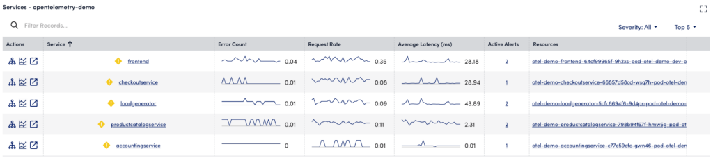
The services table displays the following details:
| Field | Description |
| Service | Displays the name of the service. In addition, displays the health state icon of the service. |
| Error Count | Displays a sparkline of the total number of errors detected for the individual service. |
| Request Rate | Displays a sparkline of the total number of requests generated for the individual service. |
| Average Latency (ms) | Displays a sparkline of the total duration of the operation in milliseconds. |
| Active Alerts | Displays the total number of alerts generated for the individual operation. |
| Resources | Displays the resources under which the service is located. |
In addition to the specific operations of a trace, under the Actions column, in the traces table, you can perform the following:
- (Open topology map)
 —opens a topology map that describes conceptual information about the application. For more information, see Application Topology Overview.
 - (Add to application analysis)
 —adds the service to the application analysis for comparison with other services.
 - (Open in new tab)
 —opens the span information in a new tab.
Comparing Multiple Services Data
You can select services from the Topology widget or Services table and view the impact analysis of services on the overall application under the RED metrics widgets. For example, if you have emailservice, cartservice, checkoutservice, and adservice running and want to compare the impact of each service on the application. You can visually compare them on the Traces landing page.
Some of the benefits of using this feature are:
- Allows you to see the impact of an individual or multiple services on the application.
- Visually compare the multiple services data for a given time range.
Do the following:
- In the APM Topology Widget, select the required service.
- Right-click on the service and select Add to Application Analysis.
or - In the Services widget, under the Actions column, select (Add to application analysis) against the required service.
The overlay graphs display the details of the multiple services for that time range.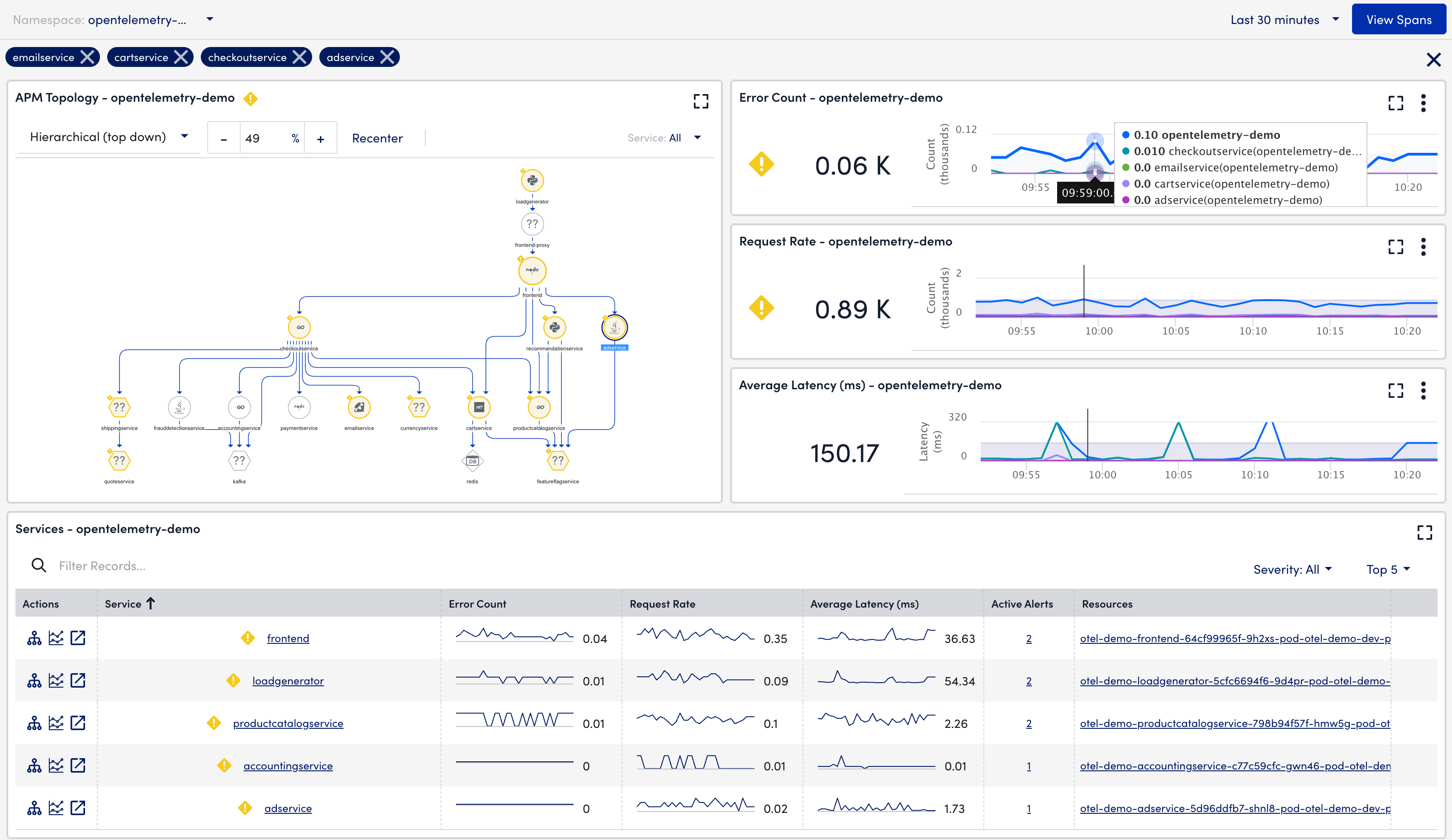
Note:
- You can add a maximum of four services to the application analysis.
- You can also remove the services from the application analysis by canceling the required service displayed above the APM Topology widget.
View the RED Metrics in FullScreen
You can view Error Count, Request Rate, and Average Latency metrics in fullscreen mode. Select (FullScreen)  from the Error Count, Request Rate, or Average Latency widget. The fullscreen mode displays a graphical representation of the number of request counts received for a given time and a tabular representation following the graph.
You can select (FullScreen)  to exit the fullscreen mode.
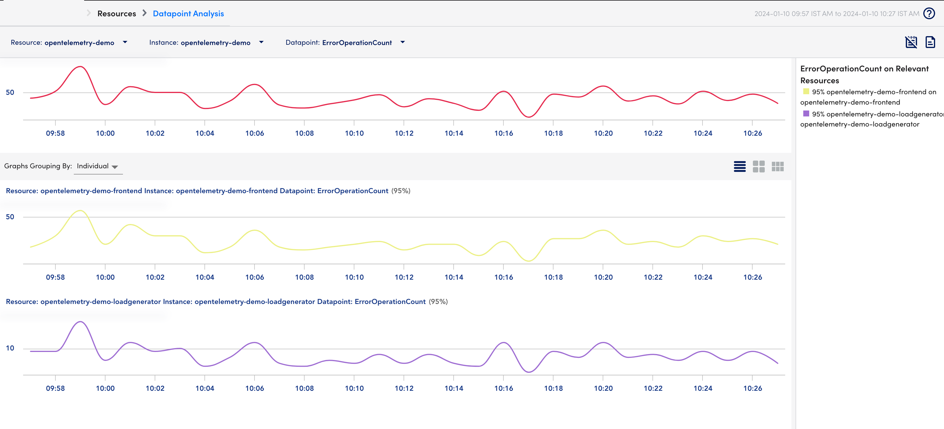
Viewing Datapoint Analysis of RED Metrics
You can view the Datapoint analysis for Error Count, Request Rate, and Average Latency from their respective widgets. The datapoint analysis offers a correlation between the namespace and individual services.
To view the Datapoint analysis, do the following:
- Select (Overflow)
 from the RED Metrics widget (Error Count, Request Rate, or Average Latency).
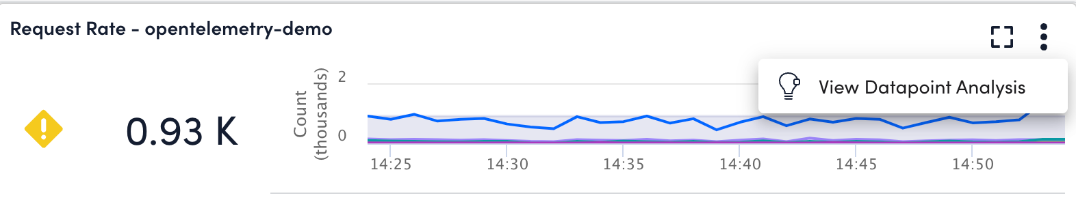
- Select View Datapoint Analysis.
You are redirected to the Datapoint Analysis page.