
Disclaimer: This content applies to the legacy UI and is no longer maintained. It will be removed at a future time. For up-to-date content, see Graphs Tab. At the time of removal, you will automatically be redirected to the up-to-date content.
Graphs Tab
Last updated - 25 June, 2026
Overview
Available from the Resources page, the Graphs tab provides instance-level graphs for the current resource. The various graphs that display are defined in the DataSource definition, as discussed in DataSource Graphs.
When viewing the Graphs tab, you will see different results and options depending upon whether an instance, instance group, DataSource, or resource is selected in the Resources tree:
- Instance. If an instance is in focus, the Graphs tab will display all standard graphs (i.e. graphs that show datapoint(s) for a single instance) that have been configured for the DataSource definition.
- Instance group/DataSource. If an instance group or DataSource is in focus, the Graphs tab will display all overview graphs, if any, that have been configured for the DataSource definition. Overview graphs include data for up to ten instances from the instance group. By default, all instances under a DataSource are considered to be a single instance group; however, if you organize these instances into multiple instance groups, the overview graph that displays when an instance group is in focus will be restricted to just the instances in the group. If you are viewing a DataSource within the context of a service, you can drill down from the aggregate data to individual instance data using the “Member Instance Graphs” list located below the overview graphs.
- Resource. If a resource (e.g. device, service) is in focus, the Graphs tab will display a resource dashboard. As discussed in the following section, resource dashboards are curated view of graphs that you can create and customize.
Note: The Websites page also features a Graphs tab for the various Ping and Web Checks you have configured. Because websites are “flatter” in nature (i.e. no DataSources applied and no instances), the behavior of the Graphs tab for Websites is much simpler, displaying a couple of basic metrics on an overall website health basis as well as on a per-checkpoint basis. With the exception of the information found in the following Manipulating Graphs section, much of the information found in this support article does not apply to viewing graphs from the Websites page.
Manipulating Graphs
As discussed in the following sections, there are several ways in which you can manipulate the output and display of graphs from the Graphs tab. (These manipulation methods are also available when viewing graphs from a dashboard or Alerts page.)
Note: Core graph configurations such as the datapoints included in the graph, line colors, and legends are determined by the originating DataSource graph definitions and cannot be updated from the Graphs tab. For more information on updating these core configurations, see DataSource Graphs.
Add to Dashboard
In addition to easy viewing from the Resources page (or Websites page), graphs that display on the Graphs tab can also be added to standard dashboards. To add a graph to one or more standard dashboards, click the dropdown arrow in the graph’s upper right corner and select “Add to dashboard.” You’ll be prompted to provide a name and description, as well as indicate which dashboard(s) the graph should be added to.
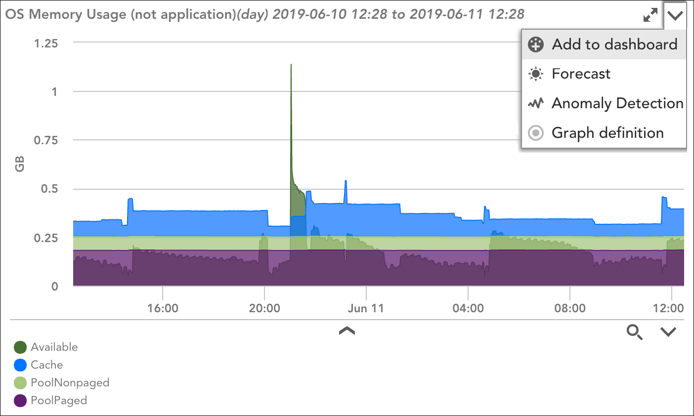
Once added, the graph will no longer be tied to its originating DataSource graph. Rather, its configurations will be saved as a Custom Graph widget.
Change Time Range
As discussed in Changing the Time Range, you can set a time range for all graphs across all aspects of the interface using the Time Range button located in the top right of the Resources, Websites, and Dashboards pages. Additionally, you can change the time range for a single graph by expanding it and using the Time range field provided in the upper left corner of the expanded graph view.
Add Ops Notes
Ops Notes are time-stamped annotations that add context to graph data, notably context that serves to correlate graph data with other events in your environment. For more information on adding Ops Notes context to graphs, see Using Ops Notes.
View Forecast and Anomaly Data
To view forecast conditions or visualize anomalies for the datapoints included in the graph, click the dropdown arrow in the graph’s upper right corner and select “Forecast” or “Anomaly Detection” respectively. For more information on these AIOps capabilities, see Data Forecasting and Anomaly Detection Visualization.
View Raw Data
To view the raw data being charted by the graph, expand the graph and check the Data option located in the upper right corner of the expanded graph view. You can toggle between viewing raw data only, the graph only, or both.
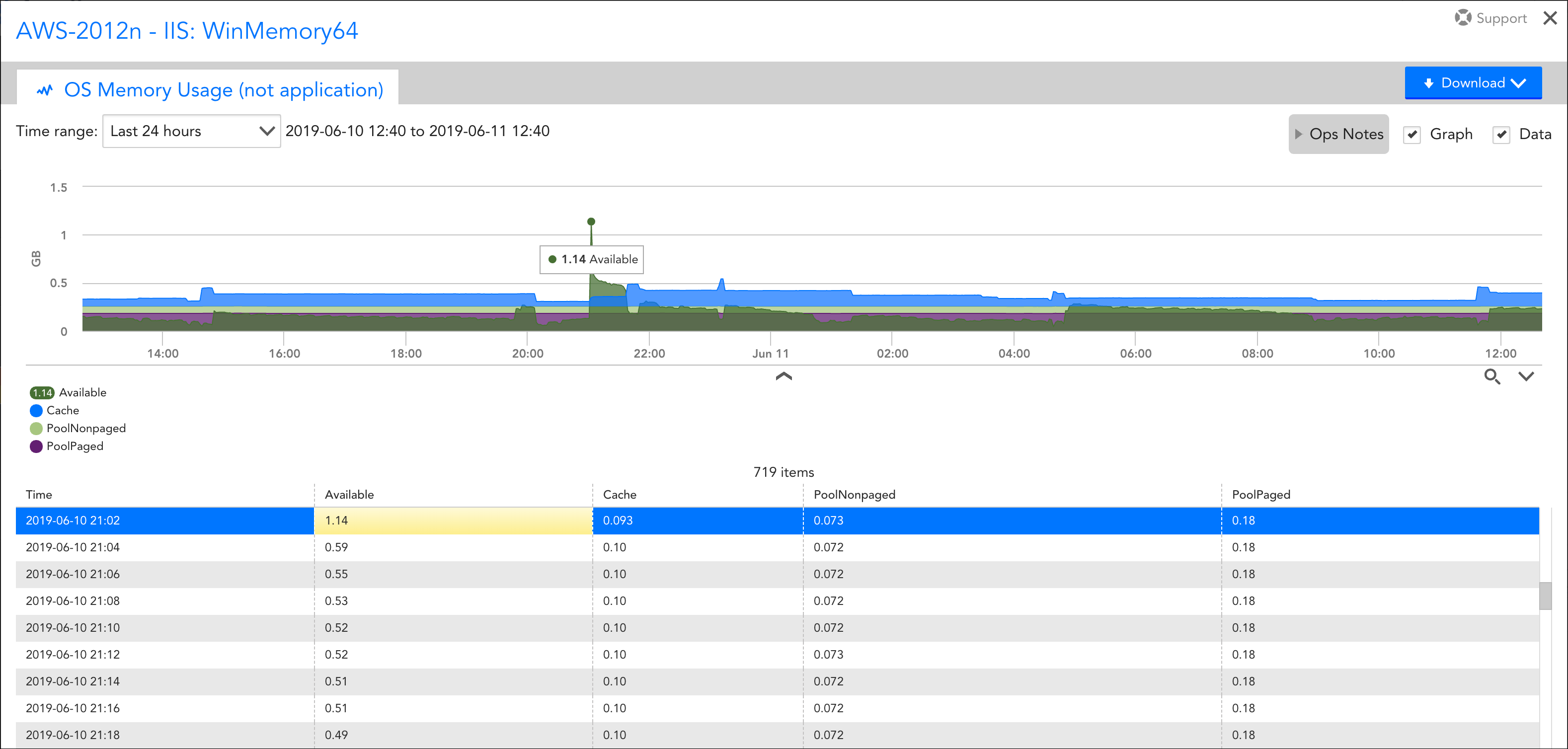
When both the graph and raw data are displayed, as shown here, highlighting a value in either the data or graph causes the corresponding data or graph value entry to highlight as well.
View Logs
To view the log events related to the graph, if they exist. This will redirect you to the Logs page filtered to display log events from the relevant resource during the time period of the graph. See Reviewing Logs and log anomalies.
Download Graph
To download the graph as either a .png image file or to download its raw data as a CSV file, expand the graph and click the Download button located in the upper right corner of the expanded graph view.
Graph Listing Display
Using the icons immediately to the right of the Ops Notes button, you can choose to display graphs in the current view in single-, two-, or three-column format.
Legend Display Customization
To view a graph’s legend, click the drop-down arrow located immediately under the graph. Once the legend is visible, you can:
- Isolate graph lines. Click the dropdown arrow in the bottom right to isolate graph lines either by hiding a graph line when its legend entry is clicked or by highlighting a graph line when its legend entry is clicked.
- Show boundaries. Click the dropdown arrow in the bottom right to optionally display the minimum, maximum, and average values next to the legend description for each datapoint/instance in the graph.
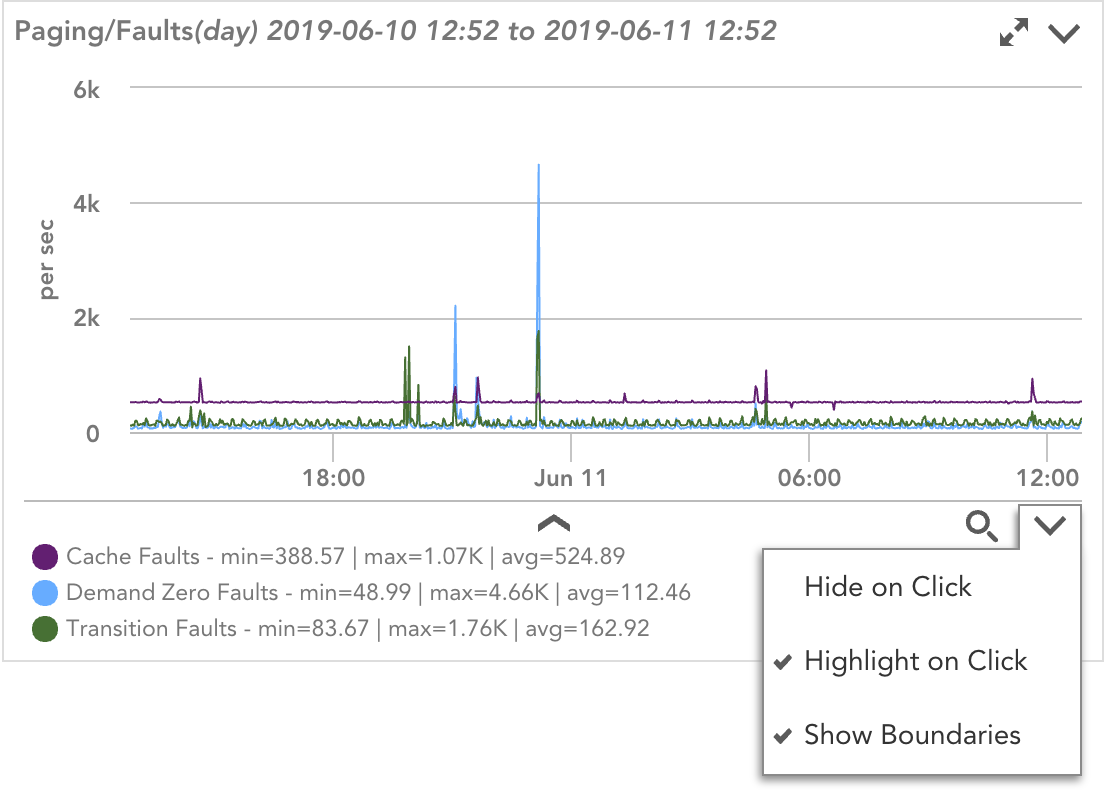
- Search. Click the search icon in the bottom right to quickly find a desired graph line in the legend.
Note: You can display legends for all graphs by clicking the toggle graphs legend icon located next to the column formatting icons.
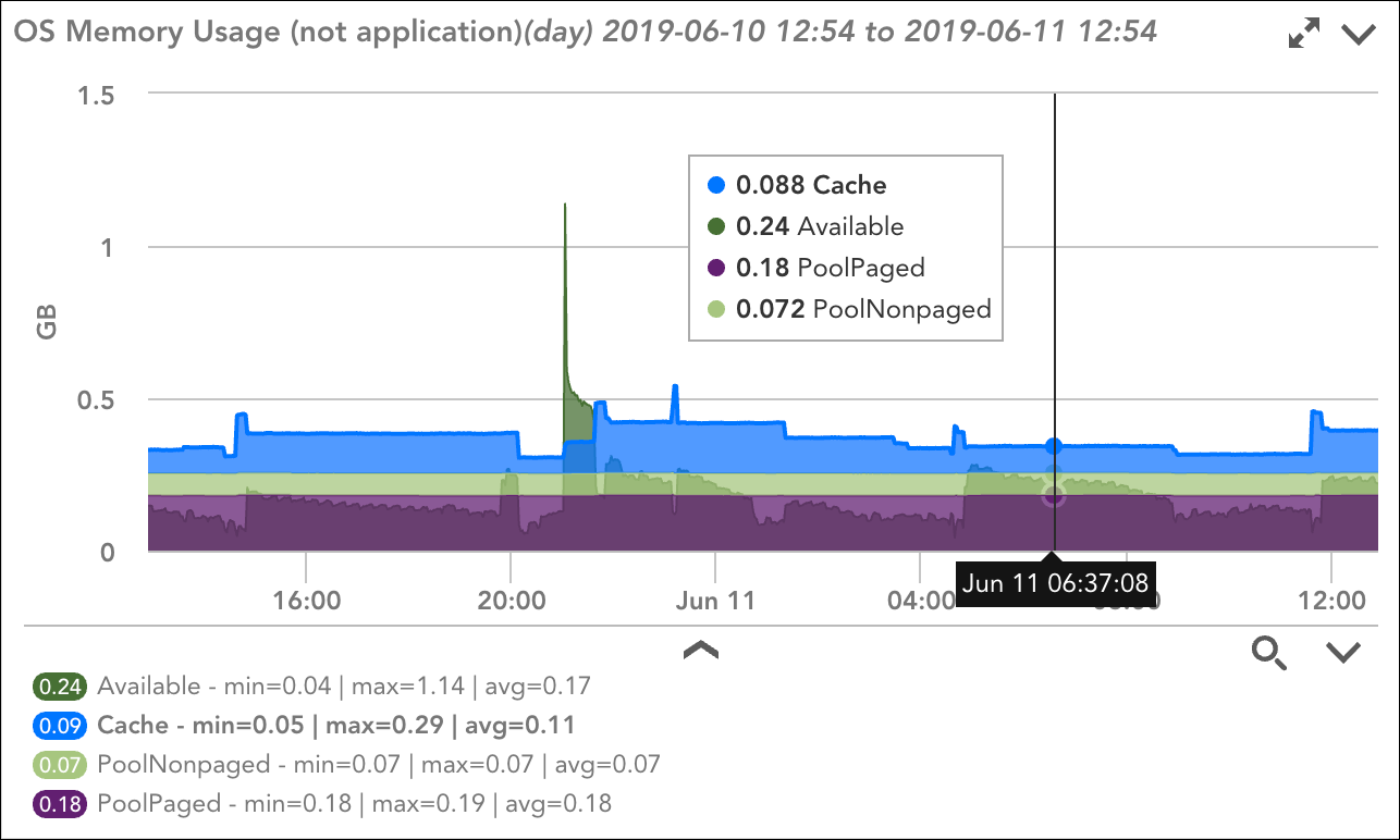
Graph Hover for Multiple Values
Simultaneously display the names and values of multiple datapoints or instances by hovering over the graph. Hovering over a graph will cause corresponding vertical lines to appear across all graphs in the current view. This is useful for correlating events across multiple related graphs.
Graphs use solid lines to connect consecutive data points, dashed lines to indicate gaps where no data was collected, and markers to identify individual data points, including isolated points.
Managing Resource Dashboards
When viewing the Graphs tab at the resource level, The Graphs tab provides custom options, called resource dashboards, for viewing graphs that are applicable to the resource. These options are available for selection from the Current View field’s dropdown menu.
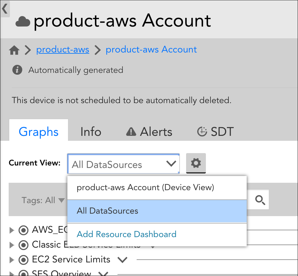
By default, LogicMonitor installs with two resource dashboards, along with the ability to create additional resource dashboards:
- All DataSources. The All DataSources dashboard displays graphs for all instances found in the resource.
- Device/Service View. The Device View (or Service View if you are viewing a service) dashboard is available for all devices/services and is a per-user dashboard whose customizations are not seen by other users.
- Custom Resource Dashboards. Create and save your own dashboard.
All DataSources Dashboard
The All DataSources dashboard will include graphs for all actively monitored instances on the resource. Graphs are grouped by DataSource or DataSource Group (if available) and displayed in alphabetical order. Which graphs display for a particular DataSource (or instance) is defined in the DataSource definition. Graphs in the All DataSources view (and other custom views) are displayed in a tree structure to account for the unknown or dynamic count of instance graphs.
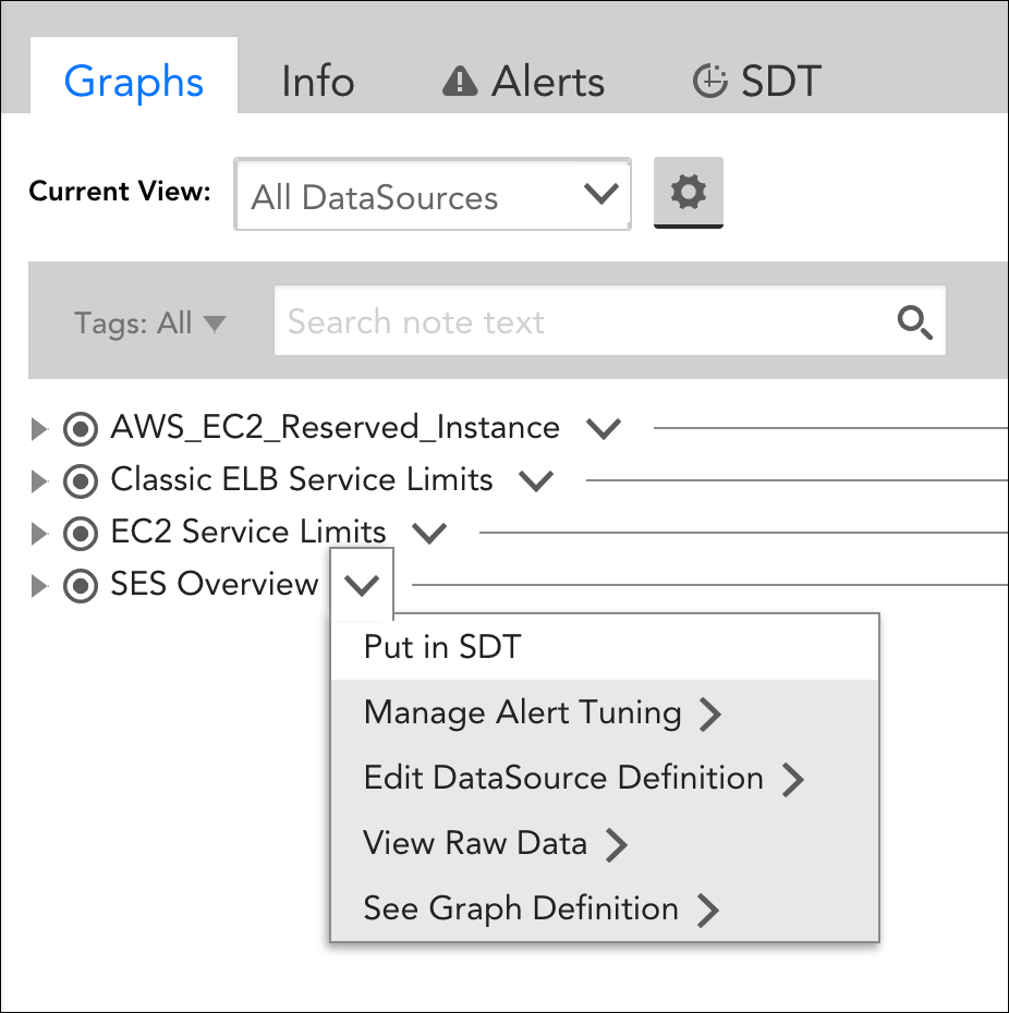
From the tree structure listing, click the drop-down arrow located to the right of a DataSource or instance to perform one of several functions:
- Put in SDT. Selecting this option opens a dialog that allows you to set parameters for putting the DataSource or instance into scheduled downtime (see SDT Tab for more information on putting entities in SDT).
- Manage Alert Tuning. Selecting this option opens either the device/service DataSource or instance in a new browser tab where you can then use the Instances tab or Alert Tuning tab to update the datapoint thresholds that trigger alerts. For more information on threshold tuning, see Tuning Static Thresholds for Datapoints.
- Edit Datasource Definition. Selecting this option (only available for a DataSource) opens the global DataSource definition in a new browser tab, from which you can view or make updates to the DataSource and its graphs.
- View Raw Data. Selecting this option opens the DataSource or instance in a new browser tab with the Raw Data tab in focus. For multi-instance DataSources, this option is only available from the DataSource’s instances. For more information on the Raw Data tab, see Raw Data Tab.
- See Graph Definition. Selecting this option opens the global DataSource definition in a new browser tab, from which you can view or make updates to the various DataSource graphs configured for the DataSource. For more information on DataSource graphs, see DataSource Graphs.
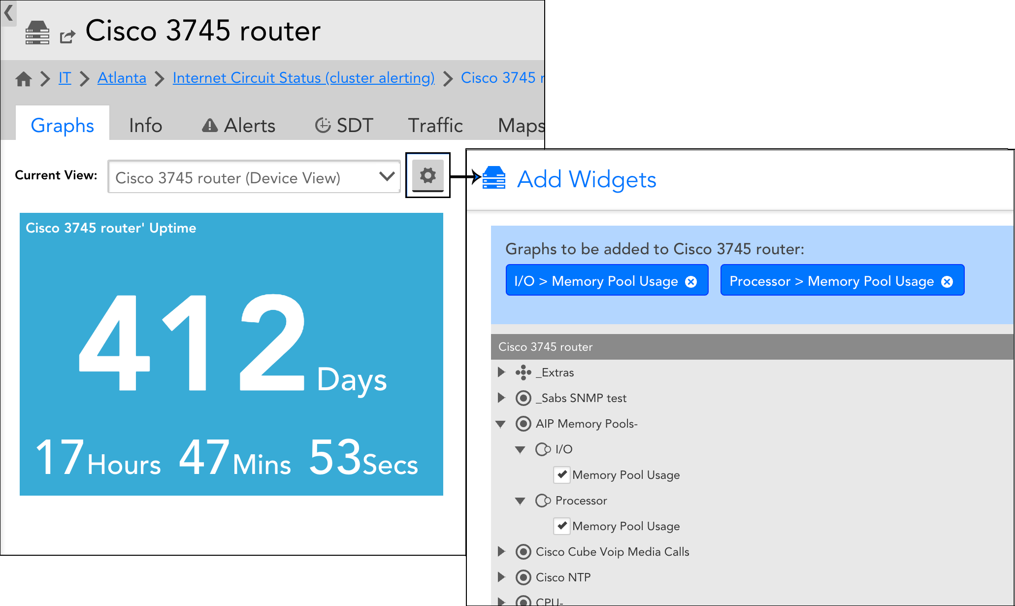
Device/Service View Dashboard
A Device View or Service View dashboard is available for all devices and services. Its parameters are specific to the resource currently in focus and is a per-user view (i.e. customizations will not be seen by other users).
The Device/Service View dashboard is always named after the device or service, followed by “(Device View)” or “(Service View)”. For example:
XenApp1 – Delivery Controller (Device View)
If applicable, an Uptime widget is included by default on Device/Service View dashboards. Resource uptime is determined by multiple DataSources. For example, there are DataSources devoted to tracking uptime for Linux and Windows systems; SNMP engines and hosts; Kubernetes deployments; devices; and so on. If more than one uptime metric applies to a resource, the uptime displayed will be the largest value from among the DataSources.
Instance graphs can be added to this dashboard by selecting the manage icon located to the right of the Current View field. As shown next, each instance graph for the resource’s monitored DataSources (as defined in the DataSource definition) is available to be added to the Device/Service View dashboard.
Custom Resource Dashboards
To create and save a custom resource dashboard, select “Add Resource Dashboard” from the Current View field’s dropdown menu. As discussed next, there are several configurations that must be established in order to create a custom resource dashboard.
Name and Description
In the Name field, enter a name for your custom resource dashboard. Optionally, enter a description in the Description field. If you’d like the description displayed in the dashboard view, check Show description on Dashboard.
Apply this Resource Dashboard to
Use the options and text box in this area of the configurations to determine for which resources the dashboard will display. Only resources that match the query parameters configured here will include this dashboard from the dropdown list. For more information on LogicMonitor’s use of AppliesTo scripting, which is how the query results are displayed, see AppliesTo Scripting Overview.
Add Resource Dashboard Graphs
In this area of a dashboard’s configurations, add the DataSource graphs that will be included in the custom resource dashboard. Glob expressions can be used to allow for applicable instances and graphs to seamlessly apply across various resources.
