Gauge Widget
Last updated – 14 October, 2025
The Gauge widget enables you to present data on a relative scaled, including historical peak values. You can use the Gauge widget for metrics that have a relative or aggregated value.
Configuring a Gauge widget involves configuring datapoints you want represented on the widget, and then choosing settings for how you want your Gauge widget to display on your dashboard.
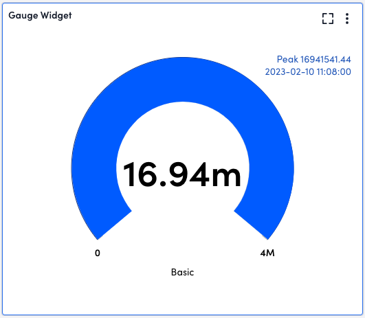
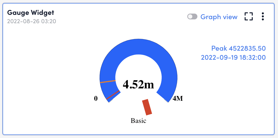
While the gauge Widget is designed to display the current value of a configured datapoint, the Show Peak option enables you to view the highest value of that datapoint over the last hour to year. The peak is historical, so you can choose a time range that doesn’t include now for context. With this, the peak may actually be lower than the current value.
Configuring a Gauge Widget
- Create a Gauge widget. For more information, see Widget Creation.
- Configure Basic Information fields. For more information, see Configuring Standard Widget Settings.
- In the Gauge Options settings, configure the widget datapoints. For more information, see Adding Widget Datapoints.
- (Optional) In the Data Series field, select how you’d like to see the data represented on the gauge, as an average (default), a maximum, or a minimum.
- (Optional) In the Aggregate field, select how you’d like to see the aggregate value of metrics across all resources (Sum (default), Average, Max, Min).
- (Optional) Toggle on Perform Expression on Datapoint to change how the datapoint value is calculated, and the do the following:
- Select Insert Datapoint, and select the datapoints you want to perform and expression on from the list.
- Write a groovy script for the datapoints.
Note: This is helpful if you’re looking to edit units, display the value as a percentage, or have other formulas typically used when displaying the datapoint type.
- (Optional) In the Legend field, enter a legend name to provide an explanation for the data being displayed.
Note: Tokens can be used in this field if you’ve cloned a dashboard and need to update the information for a new client.
- (Optional) In the Gauge Range settings, complete the following configurations:
- In the Minimum field, enter a minimum value to be displayed on the widget.
This is commonly “0”, but potentially a different value if you’re looking at a limited subset or range, or if you range includes negative values. - In the Maximum field, enter a maximum value to be represented on the widget.
- (Optional) In the Display Unit As field, choose one of the following options:
- If the actual number is meaningful (temp, count of servers, requests processed, and so on), select Raw value, and then enter a Unit (like degrees) for the raw value.
- (Default) If the number represents a part of a maximum capacity (CPU load, memory available, disk space available, and so on), select Percentage.
- (Optional) Toggle on Show Peak to display a peak value over a selected time range.
- (Optional) Toggle on Change gauge color according to thresholds to set specific thresholds to be displayed in green, yellow, or red in the Gauge widget.
- In the Minimum field, enter a minimum value to be displayed on the widget.
Note: These thresholds are not related to the alert thresholds even though they’re the same colors.
- Complete the standard widget configurations, and then Save the widget. For more information, see Configuring Standard Widget Settings.
Gauge Widget Dashboard Display
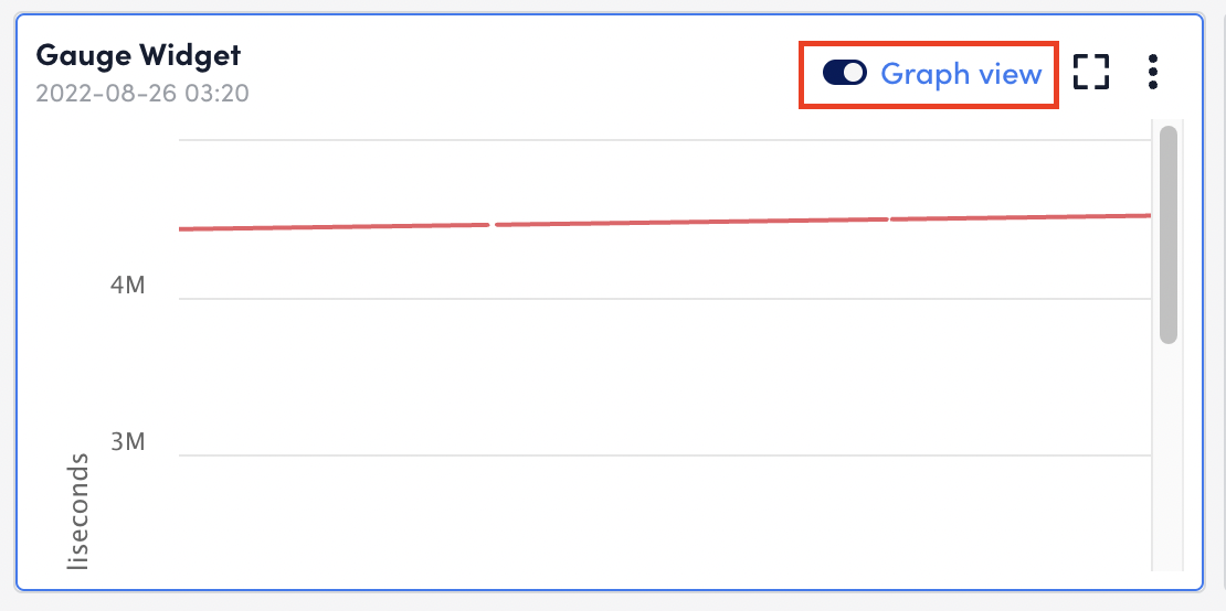
After you configure the Gauge widget, it displays on your dashboard with two designated display modes:
- Gauge: The data displays as a gauge and the most recently collected data will be displayed on the widget. This is a single, snapshot value. The data series configuration field (display the max, min, or mean of collected data) doesn’t impact the data’s display when the widget is set to Gauge mode. This mode is useful for displaying data as a percentage. For example, percent CPU usage on a node.
- Graph View: The data series configuration field (display the max, min, or mean of collected data) impacts the displayed trending values. This mode is useful for displaying all raw historical data on a line graph.