
10. Setting up dashboards
Last updated – 23 July, 2025
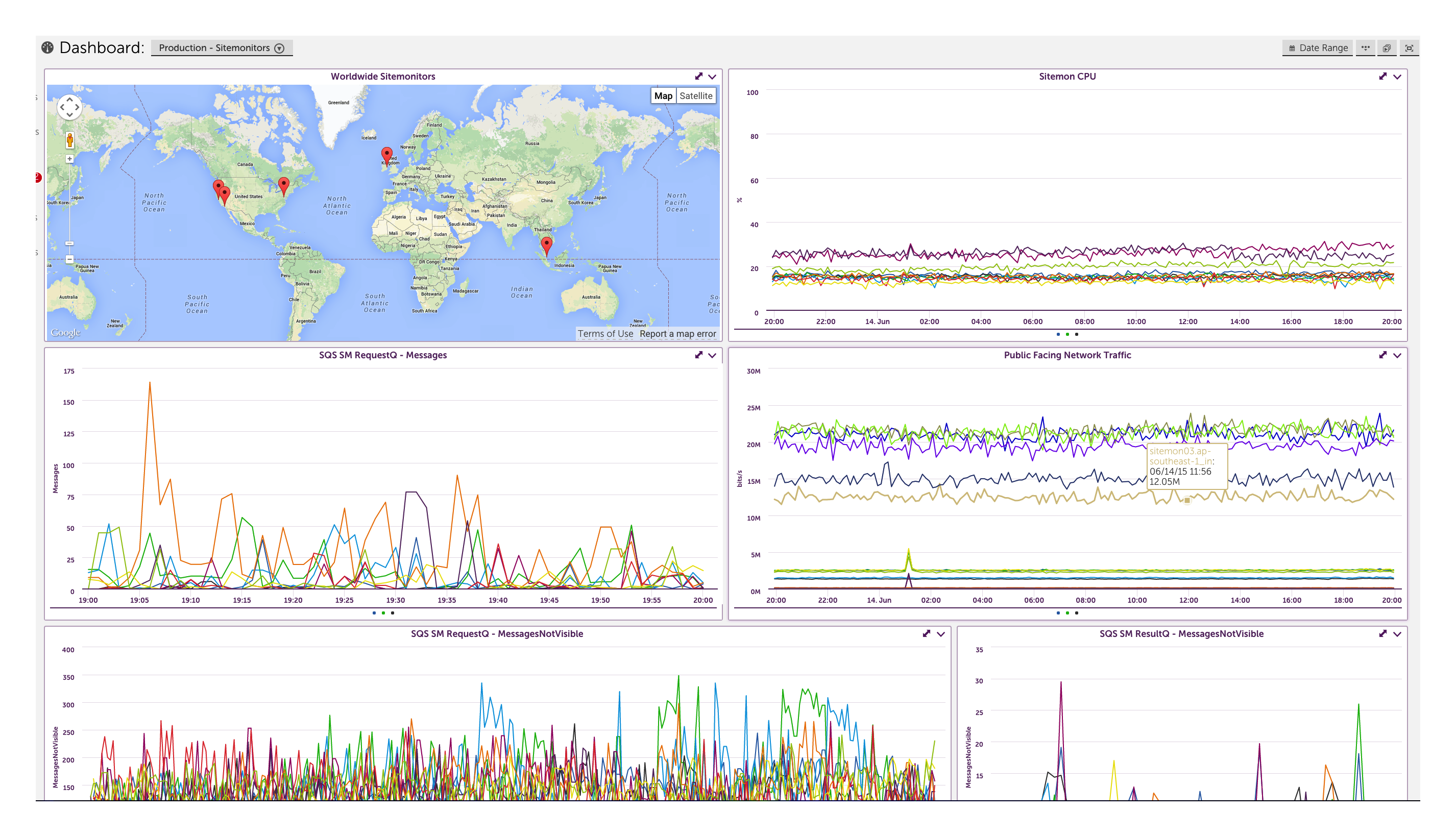
LogicMonitor Dashboards are a great place to display metrics that you want easy access to, or that you’re watching day to day. You can create different dashboards for different groups of users, so that each group in your organization gets the information that is important to them.
Dashboard Overview
You can customize your dashboards by adding different widgets. Widget types include custom graph widgets, NOC widgets, gauge widgets, pie chart widgets, HMTL widgets, Google Map widgets, and more.
Adding Dashboards
To add a new dashboard, select the drop down menu with the list of dashboards and then select ‘Manage Dashboards’:
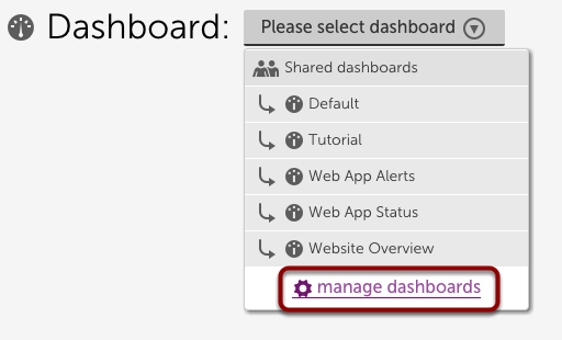
From the manage dashboards window you can add shared dashboards, private dashboards, and dashboard groups. A shared dashboard can be seen by anyone, but you can restrict particular users from seeing the dashboard by applying a custom role to those users. A private dashboard is only available to one user.
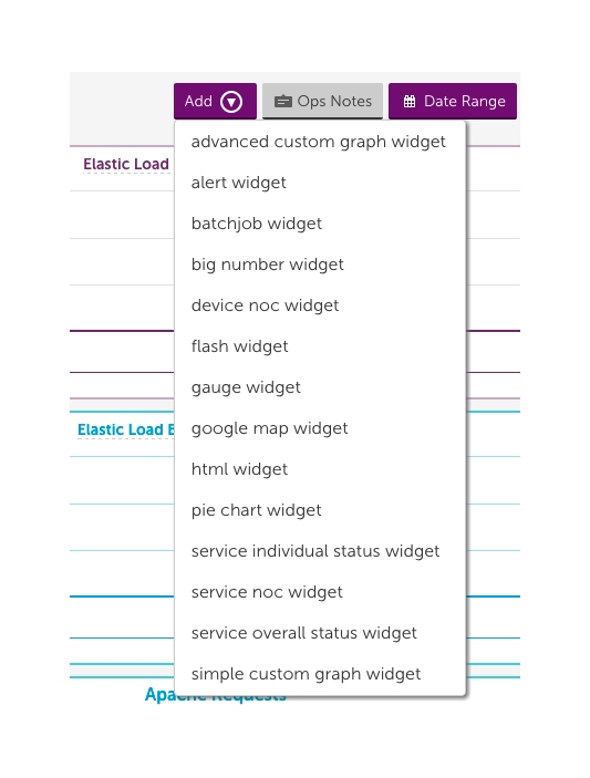
Adding Widgets
Add widgets to your dashboard using the ‘Add’ button. Consider adding NOC widgets to get an overview of your system, google map widgets to display your infrastructure locations, alert widgets to display any alerts for your monitored data, custom graph widgets to display line or area graphs for your monitored data, big number widgets to get the values for datapoints you are keeping a close eye on, pie charts to compare relative values across datasource instances or devices, or give one of our other widgets a try.
Demo
The following demo illustrates how to add a dashboard and walks through creating an advanced custom graph widget:
