
Custom Graph Widget Creation
Last updated - 07 July, 2026
The Custom Graph widget enables you to see patterns in historical data at an intersection of datasource instances and a particular datapoint. The Custom Graph permits glob expressions in the configuration, enabling aggregate and top ten data to be displayed. For more information, see Using Glob Expressions Throughout the LogicMonitor Portal.
You can use the Custom Graph widget to see the 10 most important DataSource Instances from a single datapoint. For example, MemoryUitilizationPercent, CPUBusyPercent, or any other metric across your infrastructure. If the composition of the data changes during monitoring, the graph automatically updates based on the refresh frequency you delivered. This enables you to compare performance of any metric across resources.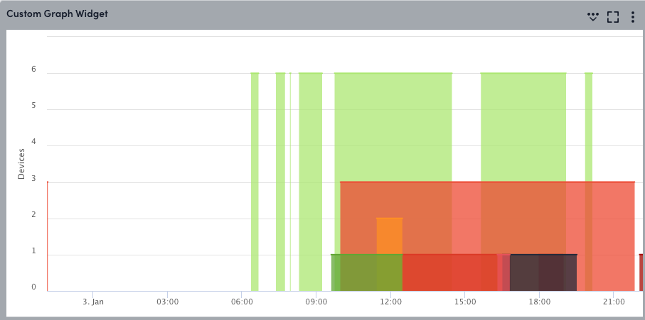
Configuring a Custom Graph widget involves configuring datapoints, lines and legends behavior, and widget display settings.
Requirements for Creating a Custom Graph Widget
To create a Custom Graph widget, you need the following:
- The Custom Graph has a 100 line limit in text entry fields.
- There’s no limitation on the types of datapoints that can be included in the Custom Graph widget, but as the values are displayed on one graph with a single Y access, it is recommended they be comparable units.
Configuring a Custom Graph Widget
- Create a Custom Graph widget. For more information, see Widget Creation.
- Configure Basic Information fields. For more information, see Configuring Standard Widget Settings.
- In the Default Time Range field, select a default time range.
Note: This default time range only becomes the time range for this widget if the dashboard time range is set to Default (Varies per widget).
- To add a widget-level filter, select
 from the Filter by field in the Graph Data section, and do the following:
- Type a property in the Search properties field, or select a property from the list of properties displayed.
LogicMonitor displays applicable properties as you type.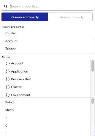
Note: At least one resource property must be added before you can add an instance property. - Type a value for the property in the Search properties field, or select a value for the property from the list of values displayed for the property.
LogicMonitor displays applicable values as you type. - Select whether to include or exclude the value in the filter.
You can select anywhere outside of the filter configuration settings to view the Custom Graph Widget with the configured filter. - Toggle the Allow the Widget level filters to override the dashboard filters switch.
Toggling this switch enables individual widgets to display data independently of the dashboard’s global filter settings.
You can repeat this process to add a widget-level filter for as many resource or instance properties as needed.
- Type a property in the Search properties field, or select a property from the list of properties displayed.
- In the Graph Data settings, select a Graph Type.
Note: This enables you to configure whether the graph displays the top or bottom 5, 10, 25, or 100 lines per datapoint, or aggregates each datapoint to one line. When Aggregate is selected, you are prompted to determine whether the aggregate is calculated based on the average, max, min, or sum of the datapoints.
- Select + Add Record to configure datapoints:
- Add a datapoint or virtual datapoint. For more information see Widget Datapoint Configurations.
- (Optional) In the Line & Legend Behavior field, select one of the following settings:
- Default: To apply the standard color, display type (line), and legend (host, DataSource, and Instance names) to the graph series.
- Custom: To configure the following fields to whatever the user value is:
- In the Legend field, insert a token to populate datapoint-specific information.
This expands the amount of relevant information viewable within the graph’s legend. For more information, see Legend Tokens. - In the Series Type field, choose how the graph displays data.
- In the Data Series field, select a value. For more information, see Line & Legends Data Series.
- In the Color field, select the line color to display in the graph. For more information, see Line & Legend Colors.
- In the Legend field, insert a token to populate datapoint-specific information.
- Do not display: To prevent the datapoint from displaying on the graph.
This is used to configure a datapoint that is referenced in a virtual datapoint configuration.
- Select Apply.
- (Optional) In the Display Settings, configure how you want the information in the widget to display:
- In the Data Display Presets settings, select to whether to display the Y-axis data as Numbers, Percentages, or a Custom option.
- In the Y-Axis Label field, enter a unit of measurement as the label for the Y-axis.
- In the Autoscale Unit field, select whether you want your units to autoscale by 1000 or 1024.
This option defaults to 1024 when your Y-axis is set to “bytes.” For all other Y-axis labels, it will default to 1000. - In the Graph Range field, toggle on Automatically adjust minimum and Automatically adjust maximum to ensure that your graphs adjust to fit the full scope of the data displayed.
By default, Automatically adjust maximum will be toggled on and Automatically adjust minimum will be toggled off so that the default minimum value on your y-axis is 0. - In the Display Granularity settings, select one of the two options to consolidate data in your Custom Graph widget:
- Use Visually Significant Trending (VaST): Calculates the significant inflection points of your time series data and preserves them. Use VaST for detailed views of your data, particularly when dealing with longer time frames.
- Use visual average: Consolidates the view of your data based on the Consolidation Function specified in your datapoint configuration (min, max, or average). Use this option when dealing with shorter time frames or to smooth out data peaks for easier trend analysis.
- Complete the standard widget configurations, and then Save the widget. For more information, see Configuring Standard Widget Settings.
Legend Tokens for Custom Graph Widget
Tokens are supported in the Legend field. The supported tokens are:
- ##HOSTNAME##: The name of the device whose data is being graphed.
- ##DSIDESCRIPTION##: The DataSource instance description (if any) of the line.
- ##DEFAULT##: This is equivalent to ##HOSTNAME##_##DATASOURCENAME##-##INSTANCE##.
- ##DATASOURCENAME##: The display name of the DataSource being graphed.
- ##INSTANCE##: The instance being graphed by this line.
Note: You can change the Legend to any text you want, but you must have at least one token present in the legend. If you do not use a token, the default legend will be added, distinguishing which resource/DataSource/instance is associated with the line.
Lines & Legends Data Series
This option is only relevant when the Use Visual Average option is selected. It’s used to control how the data is displayed when you view the graph data over a longer time period.
For example, consider a datapoint “aborted_clients” that returned a value of zero for every sample interval during a day, except for one sample where it instead returned 100 with a consolidated function of:
- Max: When you look at the graph over a month-long view, including the day described above, the day will have a value of 100 (the max value of all samples in the day).
- Min: When you look at the graph over a month-long view including the day described above, the day will have a value of 0 (the min value of all samples in the day).
- Average: When you look at the graph over a month-long view including the day described above, the day will have a value of 0.5 (the average value during the day).
Line & Legends Colors
This setting contains an option to automatically assign colors to your lines. Keep in mind the following about the auto-assigned color option:
- It assigns the next unused color int he set to the line, avoiding any colors that are statically assigned.
- It’s automatically used if you are using a blog expression in any of the datapoint configuration fields and if you are not configuring an aggregate graph type.
Custom Graph Widget Interaction
There are various actions you can perform on a Custom Graph widget that is added to a Dashboard. This provides you with more flexible actions when interacting with widgets, enabling you to engage in active troubleshooting more efficiently. For example, you can select a specific line on the graph and navigate directly to Resources to view the data for that instance in the Resource Tree. You can perform the following actions for a Custom Graph widget:
- Highlight line—Hide all lines except for the one you select.
- Hide line—Hide the selected line from the graph.
- Go to Resources—Navigate directly to Resources to view the data for the specific datapoint in the Resource Tree.
- Apply to filters—Apply a dashboard-level filter. This filter applies to all applicable widgets on the Dashboard.
- Go to Logs—Navigate directly Logs to view the data for the specific resource in the Logs page.
To access these actions, select a line on the graph. The interaction options display for that line.
Note: Widget actions are not available for virtual datapoints or aggregate lines.
