
Table Widget
Last updated - 25 March, 2026
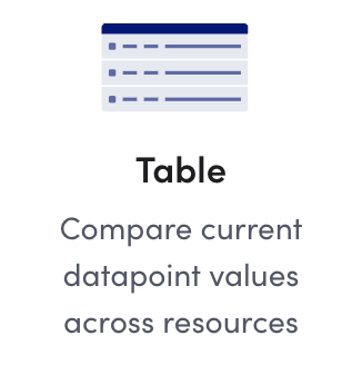
The Table widget lets you compare current datapoint values across multiple resources. This widget is useful for comparing performance and capacity metrics across different resource types. The Table widget lets you enable alert forecasting. For more information, see Alert Forecasting.
When you create a Table widget, you configure settings for columns and rows that build a table. You can add datapoints or resource properties as your columns, and resource groups or resources as your rows. Depending on your environment, you can configure the table with the following options to account for the volatility of your data:
| Option | Description |
| Custom | Enables you to select static datapoints for designated resources in your table. Use this option when the count and volatility of the data you are monitoring is relatively low. This option also enables you to add resource properties to a table to provide a more granular view of the data included in the table. |
| Dynamic | Displays the Top Bottom 10, Top or Bottom 25, or All active instances available for the first configured datapoint (column) based on a glob expression. Use this option when count and volatility of the data you are monitoring is relatively high. This option is ideal if you want real-time insight into which datapoints and devices are using the most or least available resources, such as CPU or Bandwidth. This option also enables you to add resource and instance properties to a table to provide a more granular view of the data included in the table. |
Note: The Table widget can also be thought of as a grid of big numbers, like in the Big Number widget. For more information, see Big Number Widget.
In addition, you can perform an expression on a datapoint by embedding a groovy script for multi-instance DataSources.
Requirements for Creating a Table Widget
To create a table widget, you must know what you want to monitor (resources or datasource instances) and the datapoints you want to monitor. In addition, you must have an understanding of the datapoint synonyms mapping you want to create in the Table widget.
To view a resource property or instance property in the table widget, you must add at least one datapoint before configuring the resource property data.
Note: Instance properties apply to dynamic tables only.
Configuring a Table Widget
- In LogicMonitor, navigate to Dashboards, select a current Dashboard or create new, and then add a Table widget.
For more information, see Dashboard Creation.
For more information, see Widget Creation. - Configure the Basic Information settings.
For more information, see Configuring Standard Widget Settings. - In the Table Options settings, select whether to create a Custom table or a Dynamic table.
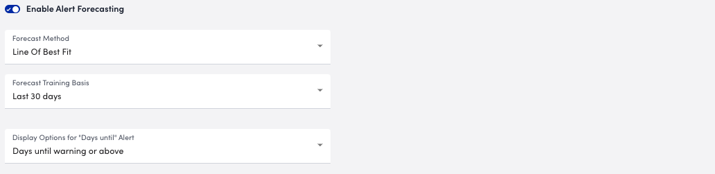
- (Optional) To display the projected number of days until a datapoint surpasses a designated alert threshold, toggle on Enable Alert Forecasting, and do the following:
- From Forecast Method, select a method.
You can select “Line of Best Fit” or “95% confidence.”
The “Line of Best Fit” method displays a trend line of all the points on the graph. The “95% confidence” method displays the 95th percentile to account for outliers and omits the 5% tail of data in the case where values may heavily skew the data. Selecting “95% confidence” provides you with an additional setting that enables you to define the minimum confidence to include in the table. - From Forecast Training Basis, select the time range to use to predict future trends.
- From Display Options for “Days until” Alert, select whether you want to display the number of days until a Warning, Error, or Critical alert is triggered.
- (Applies to the 95% confidence forecast method only) From Minimum Confidence to Include, select a percentage to specify the minimum level of confidence in LogicMonitor’s algorithm must have to predict an alert.
For example, if you choose a 70% minimum confidence, LogicMonitor’s forecasting algorithm must be at least 70% certain of a future alert before it can issue a prediction.
- From Forecast Method, select a method.
Note: The option you choose displays as a “Days Until Alert” column in the Table widget and displays the number of days until the corresponding datapoint surpasses its alert threshold. If a datapoint is already triggering an alert, an icon indicating the alert severity displays in this column.
- (Applies to Dynamic Tables only) From Active Items To Display, select how man items you want to display in the table.
- To configure the columns for your table, select + Add Record in the Column settings, and then do the following:
- To add a datapoint, select + Add Record, enter a DataSource Name and Datapoint Name, and then select Apply.
LogicMonitor attempts to provide a DataSource and a datapoint as you type.
Alternatively, you can enter a *glob expression in each field to select all DataSources and all datapoints.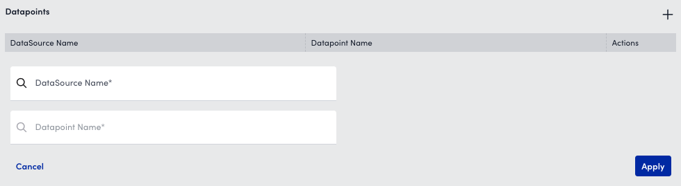
- In the Column Name field, enter a name for the column.
You can use custom display tokens to reuse information when copying widgets and dashboards. - (Optional) In the Unit Label field, enter a unit of measure for the datapoint.
The unit of measure is appended to the value in each cell of the column.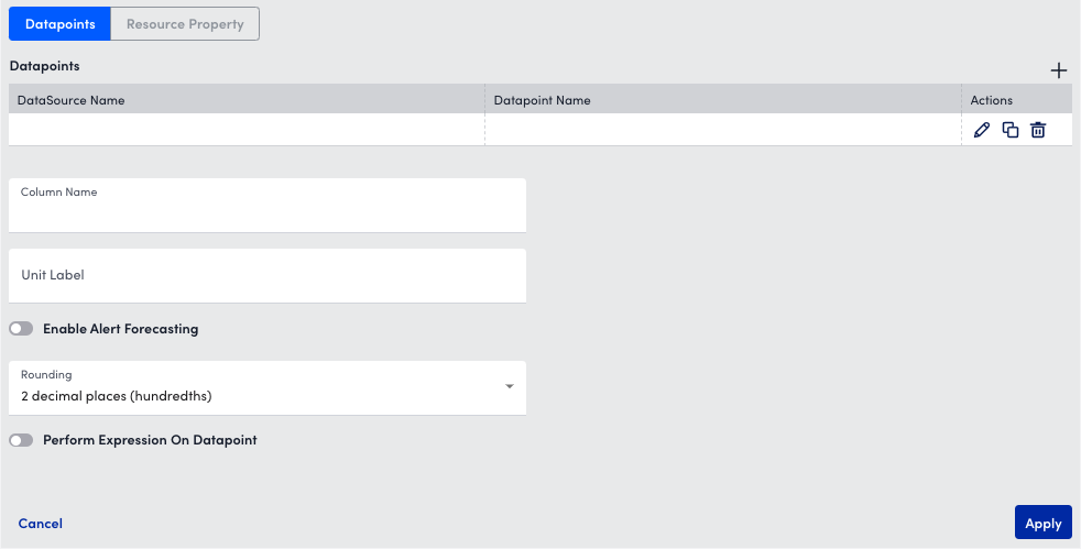
- (Optional) To apply the alert forecasting you configured for the table to the datapoint, toggle on Enable Alert Forecasting.
- (Optional) From Rounding, select a decimal rounding option for the datapoint.
- (Optional) To perform an expression on a datapoint, toggle on Perform Expression On Datapoint, select Insert Column Name to insert as many datapoint expressions as needed, and then enter a groovy script.
- To add a datapoint, select + Add Record, enter a DataSource Name and Datapoint Name, and then select Apply.
Recommendation: If your datapoint is not applicable to all resources you are adding to the table, add an alternate DataSource. When an alternate DataSource is added, and the primary DataSource does not apply to a resource in the table, the alternate DataSource is used. You can add up to five alternate DataSources for each column. For example, if you are comparing CPU busy percent across 4 Linux servers and 1 Windows server, set the primary datasource as “NetSNMPCPUwithCores” and set the alternate DataSources to “WinCPU”.
If your datapoint is for a multi-instance DataSource, you can do one of the following:
- Select an instance per device row in the table using the Select Instance button.
- Select the instance in one row and then select Apply to cells in this column to view the datapoint value for the same instance across all resources.
A checkmark displays if the datapoint exists for all instances, and the table configuration indicates which datapoint values are displayed for each resource.
- (Applies to Dynamic Tables only) To color-code the value of datapoints based on a designated threshold for an at-a-glance view of the health of your environment, toggle on Show Colored Bars, and then enter a minimum and a maximum value for the thresholds. You can choose to display these values as raw numbers or as a percentage using the Show as Percentage setting.
- Select Apply.
You can add as many columns as you need.
- To add a resource property to the table, do the following:
- In the Columns section, select
 to add the property.
 - Select Resource Property.
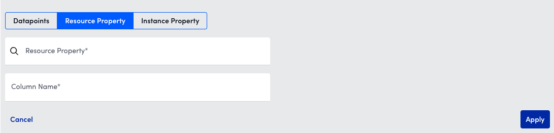
- In the Resource Property field, enter a value for the property.
LogicMonitor attempts to match values as you type. - In the Column Name field, enter a value for the name of the column.
- Select Apply.
- In the Columns section, select
- (Applies to Dynamic Tables only) To add an instance property to the table, do the following:
- In the Columns section, select to add the property.
- Select Instance Property.
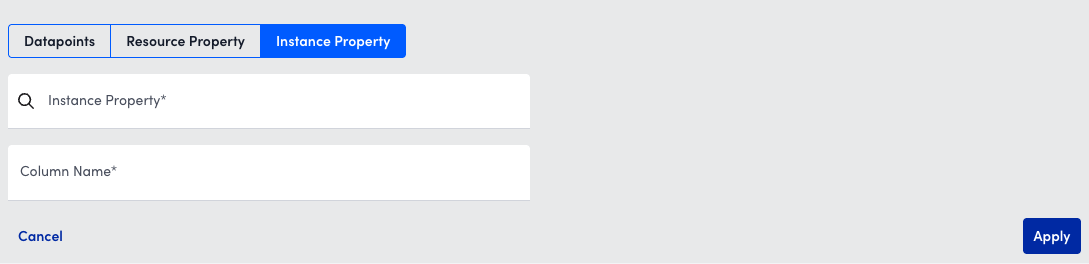
- In the Instance Property field, enter a value for the property.
LogicMonitor attempts to match values as you type. - In the Column Name field, enter a value for the name of the column.
- Select Apply.
- In the Columns section, select
- To configure the rows for your table, select + Add Record in the Rows settings, and then do the following:
- In the Resource Group Name field, enter a resource group name.
LogicMonitor attempts to provide a resource group as you type.
Alternatively, you can enter a *glob expression in each field to select all resource groups.Note: Entering a *glob expression includes all resources within that group, including resources in any subgroups. - In the Resource Name field, enter a resource name.
LogicMonitor attempts to provide a resource name as you type.
Alternatively, you can enter a *glob expression in each field to select all resources associated with the resource group. - In the Row Name field, enter a name for the row.
You can use custom display tokens to reuse information when copying widgets and dashboards.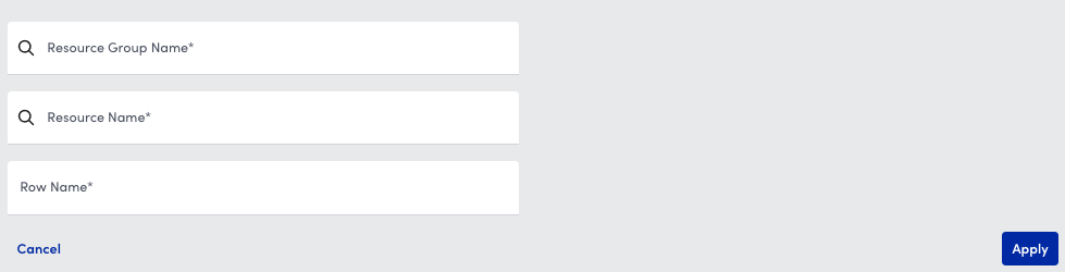
You can use the following custom display tokens for the row label to reuse information when copying widgets and dashboards:- ##RESOURCENAME##—Displays the resource name
- ##INSTANCE##—Displays the instance name
- ##DSIDESCRIPTION##—Displays the instance description (Applies to Dynamic Tables only)
- Select Apply.
You can add as many rows as you need.
- In the Resource Group Name field, enter a resource group name.
Note: For each row where you want to have data, there must be at least one datapoint synonym to supply that data otherwise the row displays as blank.
- (Optional) In the Results Per Page field, select the number of results per page you want to show in the Table widget.
- Complete the standard widget configurations.
For more information, see Configuring Standard Widget Settings. - Select Save.
Table Widget Interaction
There are various actions you can perform on a Tablet widget that is added to a Dashboard. This provides you with more flexible actions when interacting with widgets, enabling you to engage in active troubleshooting more efficiently. For example, you can select a value in a cell of the table and navigate directly to the corresponding Resources in the Resource Tree to view the data for that instance. You can perform the following actions for a Table widget:
- Go to Resources—Navigate directly to Resources to view the data for the specific datapoint in the Resource Tree
- Apply to filters—Apply a dashboard-level filter
This filter applies to all applicable widgets on the Dashboard. - Go to Logs—Navigate directly to Logs to view the data for the specific resource in the Logs page
To access these actions, select a value in a cell of the table. The interaction options display for that property.
