
Sankey Charts
Last updated – 30 August, 2022
A Sankey chart is a flow diagram that is specially designed to visualize traffic flows and volume, which are represented by connections. The connected values are called nodes and the connections are called links. The width of the arrows is directly proportional to the number of packets. Colors are used to show the transition from one state of the process to another.
Viewing Sankey Charts
- Navigate to Resources > select the required NetFlow resource > Traffic.
- On the Traffic tab, click Enable Sankey Charts to view the chart.
The Sankey chart is displayed.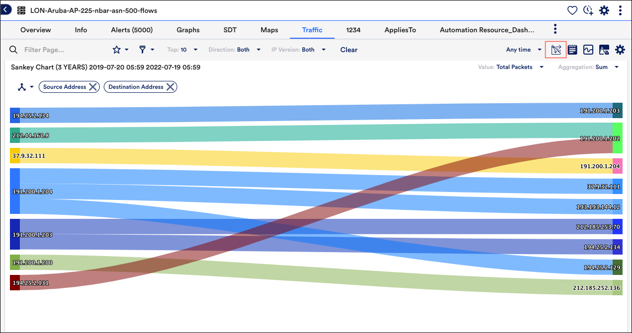
- From the Filter bar, click Add Filter to set the required filters.
- Click Saved Views to save the filtered view. For more information, see Filtering NetFlow Data.
- Click NetFlow Properties
and select the required NetFlow properties to start viewing the Sankey graph.
Note: You must select a minimum of two properties two Netflow properties to view the chart
- From the Value drop-down list, you can select the required values to be displayed in the Sankey charts. Following are the available values:
- In Packets
- Out Packets
- Total Packets
- In Bytes
- Out Bytes
- Total Bytes
- The aggregation value is set as Sum by default.
- As of now the maximum number of ‘nodes’ in the Sankey visualizations is limited to 7 hops (with the source and destination included)
Note: You can view Sankey charts only at the resource level.
