
Managing Alerts from the Alerts Page
Last updated - 16 June, 2026
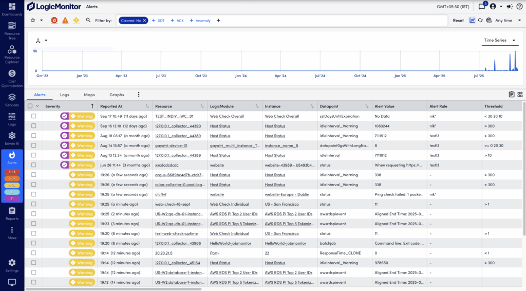
The Alerts page displays alerts for your LogicMonitor account. Accessible from the primary left navigation bar, the Alerts page enables you to filter, sort, view details for, and respond to alerts.
Note: The Alerts page enforces a maximum display limit per query. If the number of matching alerts exceeds this limit, you can refine filters (for example, by time range, resource, or severity) to reduce the result set. For more information, see Filtering Alerts.
In addition to the global Alerts page, you will find filtered alerts pages on the Alerts tabs. These are available from the detail pages of your various resources, cloud resources, instances, websites, services, and groups. Regardless of where you access alerts (page or tab), the functionality is largely identical. For more information, see Alerts tab.
Note: Alerts are timestamped according to the user’s configured time zone, assuming one has been set for the user and that it is the current active time zone. However, it is important to be aware that alert notifications are timestamped according to the time zone configured for the portal because these are not processed on a per-user basis. For more information on how user-specific time zones impacts the LogicMonitor interface, see LogicMonitor Users.
Filtering Alerts
The Alerts page displays a summary of alerts, called the alert table. You can filter the alerts displayed in the alert table to optimize relevance. A large number of filters are available, along with the ability to save sets of commonly-used filter criteria for convenient future access.
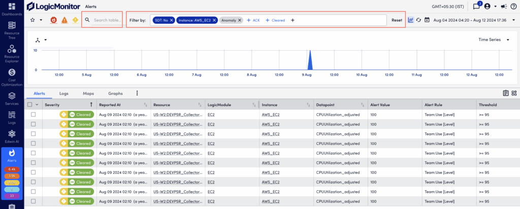
The Filter by feature enables you to refine the alert list on the Alerts page. This feature improves alert management by enabling you to focus on relevant alerts. For easy access, common filter types, such as Cleared, SDT, Acknowledged, and Anomaly, always display in the Filter by field.
The following table describes the available filter types and their behavior:
| Filter | Icon | Behavior |
| Severity level | Filters alerts according to their current severity levels and provides a current active alert count for each severity level. If a severity level filter icon is grayed out, alerts with the corresponding severity level are excluded from the results. Select the icon again to remove the filter. | |
| Cleared | By default, the alert table does not include alerts that have been cleared. Use the cleared filter to toggle the display between the two mutually exclusive cleared states: those alerts that have not been cleared and those alerts that have been cleared. | |
| ACK (Acknowledged) | Filters the alert table by acknowledged status. The filter has these states:
Note: A count is only present for this filter if the “Acknowledged” option is selected to be included in the alert count from the portal settings available on the Account Information page. When an acknowledged count is not present, it is subtracted from the severity level count(s). For example, if you currently have three critical alerts and one of them is acknowledged, the critical alert count will be 2. | |
| SDT (Scheduled Down Time) | Filters the alert table by SDT status. The filter has these states:
For alerts with SDT status, an icon is added to the severity level in the Severity column. Note: A count is only present for this filter if the “In SDT” option is selected to be included in the alert count from the portal settings available on the Account Information page. When an SDT count is present, it is subtracted from the severity level count(s). For example, if you currently have three critical alerts and one of them is in SDT, the critical alert count will be 2 and the SDT count will be 1. | |
| Anomaly | Filters the alert table by anomaly status. The filter has these states:
| |
| Time Range | Filters alerts according to the time the alert was reported. The pre-defined “Any time” filter includes every alert that resides in your database. You can use pre-defined time range filters, or define a custom one. | |
| Resource Group* | Only includes alerts triggered by the resources/websites that are immediate members of the one or more groups specified for this filter. | |
| Resource Group (with subgroups)* | Only includes alerts triggered by the resources/websites that are members of the one or more groups (and their subgroups) specified for this filter. | |
| Resource* | Only includes alerts triggered by the resource(s)/website(s) specified for this filter. | |
| LogicModule* | Only includes alerts triggered by instances belonging to the LogicModule(s) specified for this filter. | |
| Instance* | Only includes alerts triggered by the instance(s) specified for this filter. | |
| Datapoint* | Only includes alerts triggered by the datapoint(s) specified for this filter. | |
| Alert Rule* | Only includes alerts for which the specified alert rule(s) were applied. | |
| Escalation* | Filters the alert table by escalation status. This filter includes two states:
| |
| Escalation Chain* | Only includes alerts for which the specified escalation chain(s) were used to deliver notifications. | |
| Notification State | Use the Notification State filter to restrict the alert table according to alert routing criteria relevant to LogicMonitor’s root cause analysis feature. Also applies for anomaly detection/dynamic thresholds. For more information on this filter, see Dependent Alert Mapping. | |
| Dependency Role | Use the Dependency Role filter to restrict the alert table according to dependency criteria relevant to LogicMonitor’s root cause analysis feature. For more information on this filter, see Dependent Alert Mapping. | |
| Suppression Type | Use the Suppression Type filter to restrict the alert table to active alerts whose notifications have been suppressed. The following suppression types can be used as filter criteria:
| |
*Glob expressions are supported for these fields and the entry of an asterisk into the filter’s search field activates their usage. Glob expressions must be followed by an asterisk and multiple parameters or expressions using special characters must be surrounded by parentheses. For example, to include all resources whose names begin with “172”, you would enter 172*. To include all resources whose names begin with “172” or “192”, you would enter ((172*|192*))*. To exclude all resources whose names begin with “172” or “192”, you would enter (!(172*|192*))*. For more information, see Using Glob Expressions Throughout the LogicMonitor Portal.
| ||
Note: Multiple criteria within the same filter is joined using an OR operator; criteria across multiple filters is joined using an AND operator.
After applying the necessary filters, you can create an Alert report for the alerts displayed based on your filters, by selecting the ![]() Create an Alert Report icon. You are redirected to the Alert report where the alerts are pre-populated for the report based on the filters you applied on the Alerts page. For more information, see Alerts Report.
Create an Alert Report icon. You are redirected to the Alert report where the alerts are pre-populated for the report based on the filters you applied on the Alerts page. For more information, see Alerts Report.
Using Filters for Alerts
- In LogicMonitor, navigate to Alerts.
- In the Filter by field, select a filter type.
For example, Instance, Resource, Severity, and Acknowledged Status.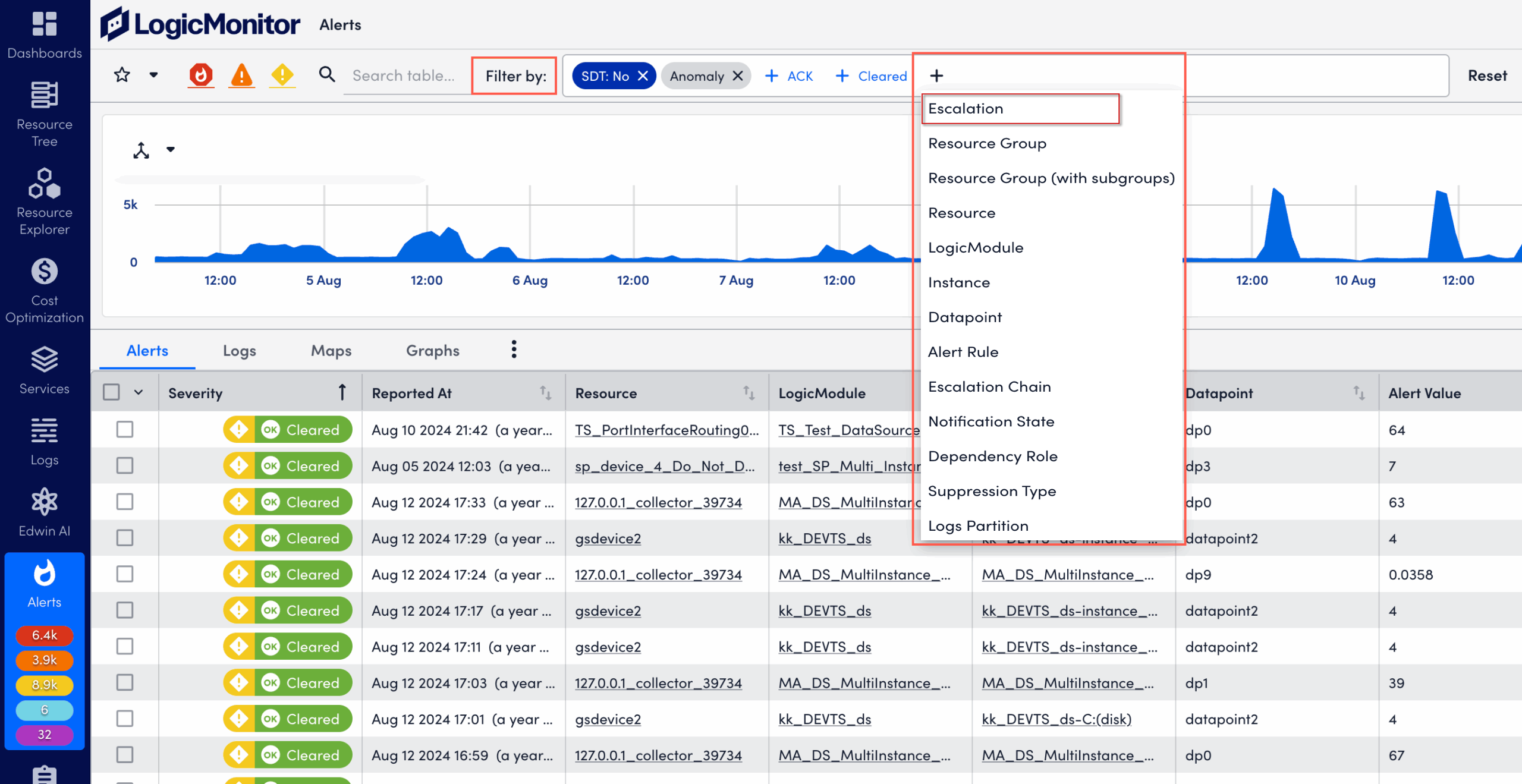
- Select one or multiple filter options within the chosen filter type.
For example, under Instance, select instance names to include.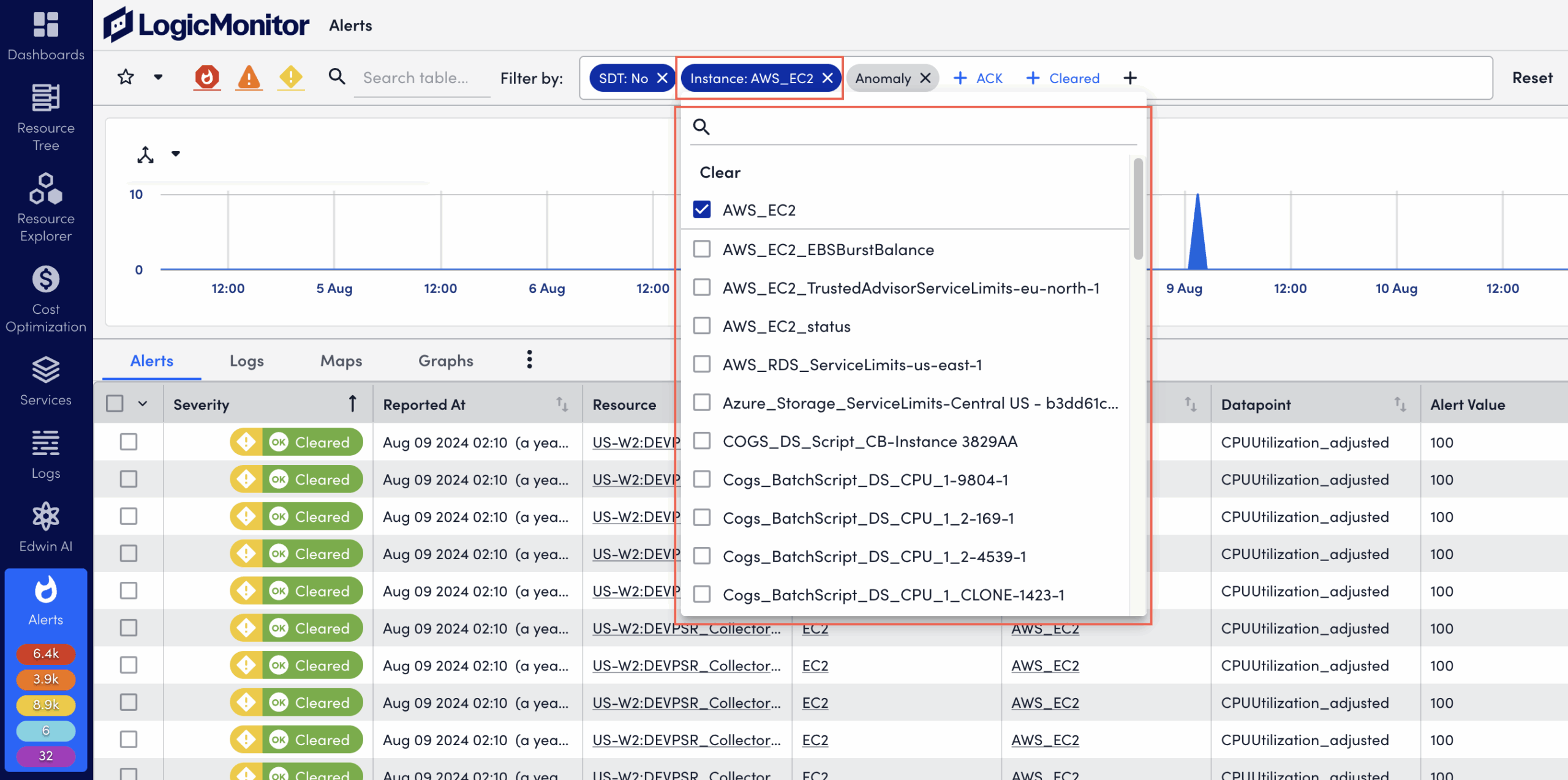
Note: Added filters display as filter pills in grey (pending). After applying the filters, pills display in dark blue (active).
- Select X on the filter category pill to remove the applied filter.
- Enter the specific keyword in the search box.
- Select Reset to reset the alert list.
Keyword Filter
The Quick Filter enables you to filter the alert table by keyword. Single keywords are automatically wildcarded on both ends. For example, a search term of “time” could return “time”, “uptime”, and “timeout.”
Saving Filter Views
When creating filters on the Alerts page, you can select the star icon to save the current filter view for future access. Saved filter views are associated with your individual user account and are not available globally.
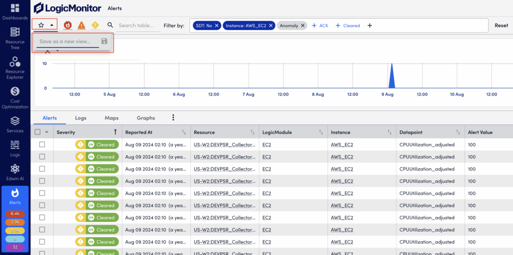
Upon saving, LogicMonitor captures:
- The current time range (as established by the time range filter).
- Any search criteria present in the keyword filter.
- All other filter criteria present. For example, severity level, SDT status, acknowledgement status, defined datapoint(s), instance(s), and so on.
If a saved filter view is active, but criteria has been edited during the current session causing the alert table results to not match the active filter, the star icon reverts back to an unfilled icon. This indicates that you are no longer within the bounds of the selected filter view. Select the star icon to update or save the current active filter view with the new parameters. Or, select the dropdown menu next to the active filter view name to either save the current parameters as a new filter view, or revert back to the saved settings of the current active filter view.
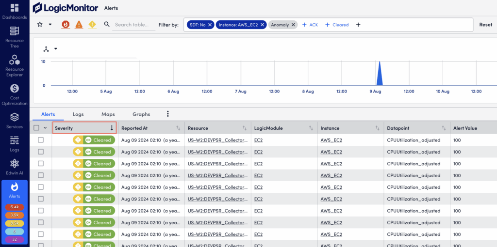
Sorting Alerts
The alert table can be sorted by alert severity level (Severity column), or the time the alert was reported (Reported At column). Select on the column headers to sort, and select once for descending order and twice for ascending order.
You can do secondary sorting using severity level as primary sort, and the time the alert was reported as secondary sort. To do this, first sort by severity level. Then hold down the shift key while additionally setting sorting for reporting time.
Note: Alerts are prioritized by alert state. For example, active alerts display before cleared alerts, and unacknowledged alerts display before acknowledged alerts. As a result, alerts can display outside chronological order.
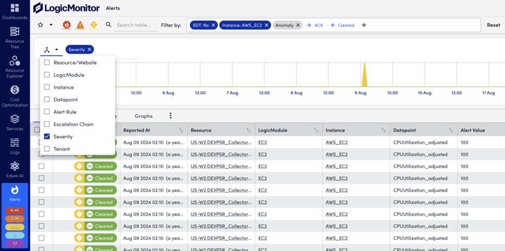
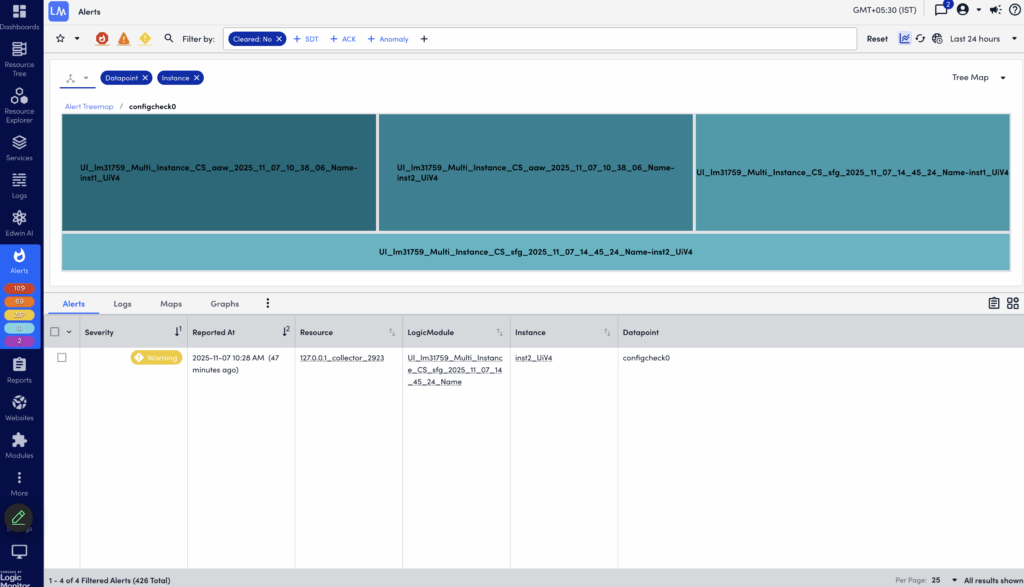
Visually Grouping Alerts with the Header Graph
To speed up troubleshooting and time to resolution, the alerts in the alert table can also be viewed as a time-series graph. At its most basic, this graph mirrors the alerts currently displayed in the alert table and charts the aggregated alert count over a configured period of time.
However, the graph is most impactful when it is used to group aggregated alert counts by a relevant dimension. For example, alerts can be grouped by severity, associated triggers (resource, LogicModule, instance, datapoint), matching rules, tenants, or the escalation chains used to deliver notifications.
The ability to quickly visualize alert commonalities is helpful when investigating an alert storm or identifying recurring issues requiring remediation or adjustments to alert thresholds.
Note: The maximum limit for grouping is 10,000 alerts.
Displaying and Using the Header Graph
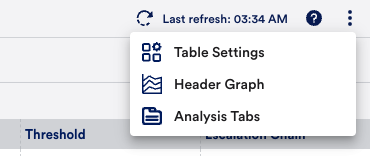
To show (and hide) the header graph, select More Options (three dots) in the upper right corner of the Alerts page and select Header Graph. The graph will retain your prior groupings (dimensions) while reflecting the alerts currently listed in the alert table.
To select a dimension, select the three-way arrow icon in the upper left to display available dimensions. Only one dimension can be grouped per graph, but you can toggle among them using the dropdown menu on the right.
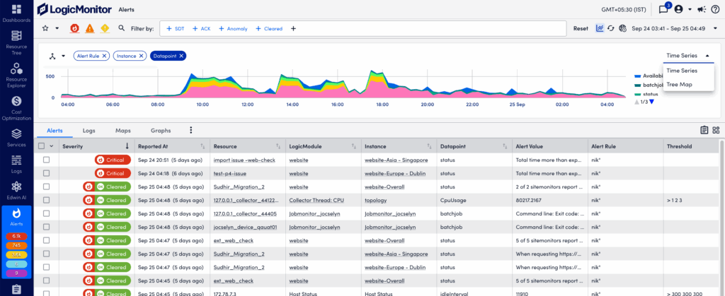
The graph is interactive and enables you to:
- Zoom in on a time range by selecting and dragging across the desired timeframe.
- Select on a grouping in the legend or in the graph itself to quickly include/exclude that group of alerts.
When you change the graph’s filters the alert table automatically updates to stay in sync.
In the Header Graph, you can also manage and display your alert groups in a Tree Map graph. This allows you to select two dimensions when grouping alerts. For example, you can select LogicModule and Resources to get a grouping of all LogicModules that are “in alert” for the given time range, as well as a count of the number of resources with each LogicModule alert. Using the header graph to drill down into a LogicModule will further group the alerts by Resources with that LogicModule alert.
Grouping Alerts by Tenant
Selecting the Tenant dimension grouping option lets you filter alerts based on tenants. This helps you identify resources associated with tenants when investigating alerts. The tenant property can for example represent service provider customers (tenants), or teams within an enterprise organization.
The tenant property can be mapped to resources either manually, or through the API. The tenant value for alerts from unmapped resources will be shown as “undefined” when the Tenant dimension is selected.
If you are already using a custom property for tenant information, you can override the default property name (tenant.identifier) to use a custom name. This is then used to retrieve the tenant information when alerts are triggered.
Do the following to change the tenant identifier property:
- In LogicMonitor, navigate to Settings > Account Information > Portal Settings.
- In the Tenant Identifier Property Name field, change the default value to the name of your tenant property.
To aggregate alerts based on tenants, you can add the tenant.identifier property to the resources and resource groups with the value of a specific tenant. If you have already defined this property, you can specify it in the Tenant Identifier Property Name field on the Portal Settings page. If there is an alert for any resource that has your property, LogicMonitor gets the tenant value from the property specified in the Tenant Identifier Property Name field.
For LogicMonitor to understand and identify the segregation, the system.tenant.identifier property is used. It helps LogicMonitor to identify the tenant of a particular resource. It uses the value of the property that you have set in the Tenant Identifier Property Name field. For example, if you want to group alerts for Kubernetes resources, you can update the Tenant Identifier Property Name field to auto.pod. Once updated, LogicMonitor automatically creates a new system.tenant.identifier property for all resources that have the auto.pod set. In the Info tab of the Kubernetes Pod resource, you can see that LogicMonitor has added system.tenant.identifier property to the same resource. For example, if the value of auto.pod is p01-abc-def-123, then the value of system.tenant.identifier is also the same, that is, p01-abc-def-123.
You cannot update the system.tenant.identifier property because it is a system property. However, if you want to change its value, you can either update the tenant.identifier property or your custom property that you set in the Tenant Identifier Property Name field. LogicMonitor auto-syncs the value so that system.tenant.identifier matches with the value set in your custom property or in the tenant.identifier property.
The Tenant Identifier Property Name field is populated with tenant.identifier out-of-the-box. To utilise the system.tenant.identifier property, you must add the tenant.identifier property to a resource or a resource group. If the tenant.identifier or the property set in the Tenant Identifier Property Name field is not set for a resource, the system.tenant.identifier property is not applied that resource.
You can use the system.tenant.identifier property in the Applies To wizard wherever it is supported such as DataSources, EventSources, and LogSources. For example, you can create DataSource and attach the DataSource to devices with the system.tenant.identifier property set to a value.
If the property in the Tenant Identifier Property Name field is applied to a resource group, LogicMonitor additionally applies the system.tenant.identifier to that resource group. As a result, all the resources that are part of that resource group inherit the system.tenant.identifier property. In such cases, because the resources have inherited the system.tenant.identifier property, they cannot be used for dynamic grouping. However, if the property in the Tenant Identifier Property Name field is directly applied to a resource, the system.tenant.identifier is also applied to that resource, and it is not considered as an inherited property. Therefore, it can be used for dynamic grouping.
If you change the property in the Tenant Identifier Property Name field, LogicMonitor updates the system.tenant.identifier property wherever it is applied and used. For example, if it is used in the Applies-to criteria in few LogicModules and those LogicModules are applied to many devices, then the system removes all those LogicModules. To make all these updates, the Tenant Identifier Property Name field remains disabled for 24 hours.
Viewing Analysis Tabs for Alerts
The Analysis Tabs on the Alerts page helps you streamline troubleshooting. These tabs provide more content such as associated logs, graphs, and topology for selected alerts. The analysis tabs are useful for example when troubleshooting an alert storm.
Select More Options (three dots) in the upper right corner of the Alerts page and select Analysis Tabs.
Logs Tab
This lets you to view the logs for the resources included in your active alerts filter, and quickly access the Logs page for further investigation.
Maps Tab
Using topology visualization, the information here helps you quickly identify where an issue is in your environment. The topology map displays connections between the resources that are part of the filtered alerts. You can double-click on a node to open the associated resource. This view works in a similar way as the mappings for resources. For more information, see Mapping Page.
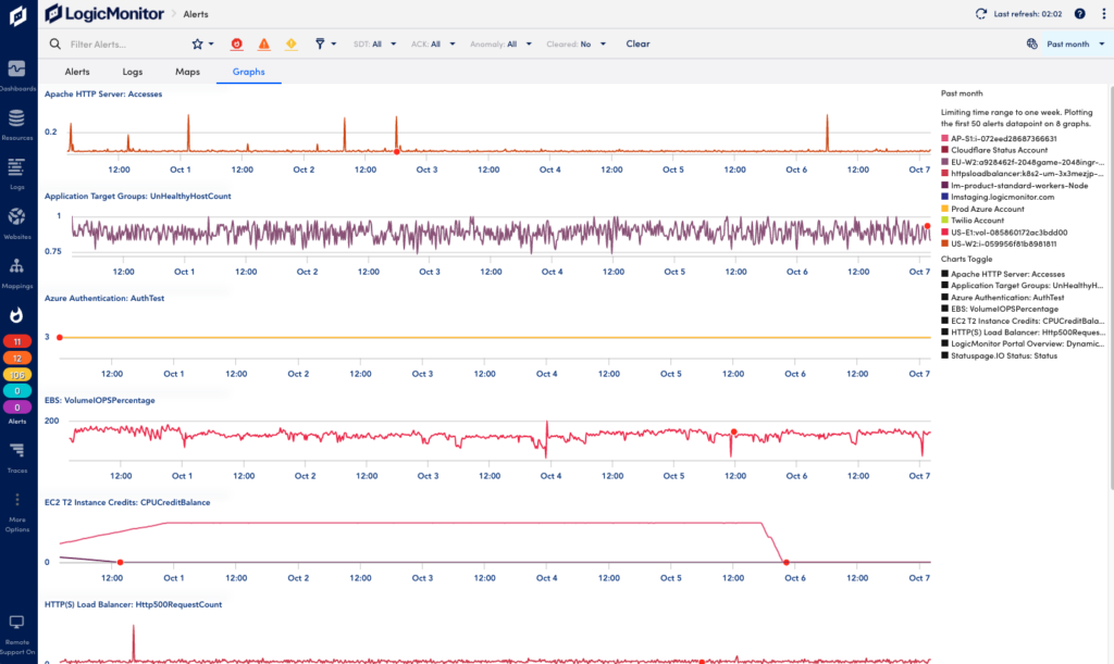
Graphs Tab
This shows a list of datapoint graphs available for the filtered alerts to visualize and help you understand what signals are related to the issue. A datapoint is a piece of data that is collected during monitoring. Datapoints are configured as part of a DataSource definition, and are used to trigger alerts when collected data is outside a specified threshold or range. For more information, see Datapoint Overview.
Using Detail Panels for Individual Alerts
When you select an alert in the alert table list, a detail pane opens at the bottom. This pane provides additional alert context and lets you investigate and act upon the alert in different ways.
When exploring alert details, you can maximize the pane view as follows:
- Select the hyperlink in the upper left of the pane.
- Select the expand icon in the upper right to of the pane.
- Select the Copy Link URL icon to get a link that you can open in a web browser.
- Drag the top border of the detail pane upward.
The following describes the alert action toolbar and context information available from the details panel for individual alerts. Note that you may not see all the information described here for all alerts.
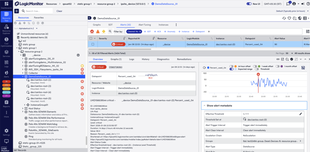
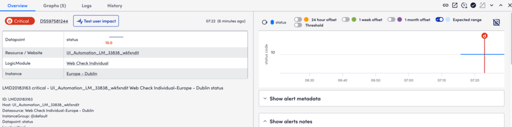
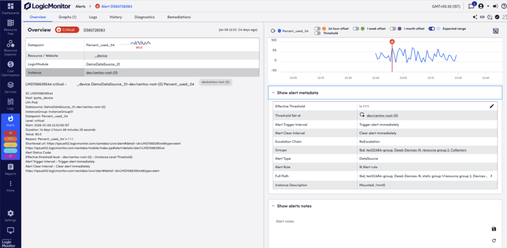
Overview Tab
This consolidates some of the details displayed in the alert table row, and displays the alert message and any manually entered notes.
Note: The manual entry of general alert notes is only permitted for up to 48 hours after the alert has cleared.
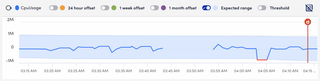
When viewing alerts triggered by datapoints, the Overview tab additionally displays an alert overview graph that plots 60 minutes of data collected for the datapoint. This graph includes the expected range in which datapoint values are expected to fall. The expected range is shaded in blue and available to LogicMonitor Enterprise users only. It also includes the ability to plot offsets that compare the current timeframe to values collected exactly 24 hours, one week, or one month ago. For more information, see Data Forecast Visualization.
You can view all the additional metadata for alerts in the Show alert metadata section.
If you enable Digital Experience, you can run a Digital Experience test from an alert to evaluate user impact and performance for the associated resource by selecting Test user impact. For more information, see Enabling Digital Experience in LogicMonitor.
Datapoint Analysis
Disclaimer: This feature is currently in Beta. Enterprise customers that are currently active in the New UI Beta are eligible to participate.
From the Overview tab, you can view information based on datapoints that are relevant to the alert. LogicMonitor pulls datapoints that are correlated to the datapoint related to the alert, and generates a correlation score. This correlation score is calculated based on datapoints retrieved by several different strategies like datapoints from the same instance. The higher the correlation score for a particular datapoint, the more correlated that datapoint is to the datapoint associated with the alert.
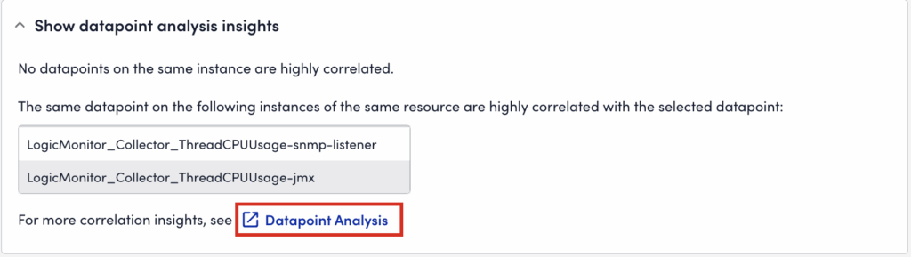
You can view the overview of datapoint analysis in the Show datapoints analysis insights section. To view the datapoint correlation information, select Datapoint Analysis. LogicMonitor displays a summary of the correlated datapoints, instances, and resources in the Datapoint Analysis Insights dialog.
On the Datapoint Analysis page, the analysis for the data is displayed in graphs that map to each of the following strategies used to determine the correlation score:
- Other datapoints on a selected instance
- Datapoint on the resource
- Datapoint on relevant resources
- Relevant Kubernetes resources
You can select a returned value in the strategies to narrow the data displayed in the graphs.
Note: Only the top 100 resources or instances alphabetically are used to calculate the correlation score
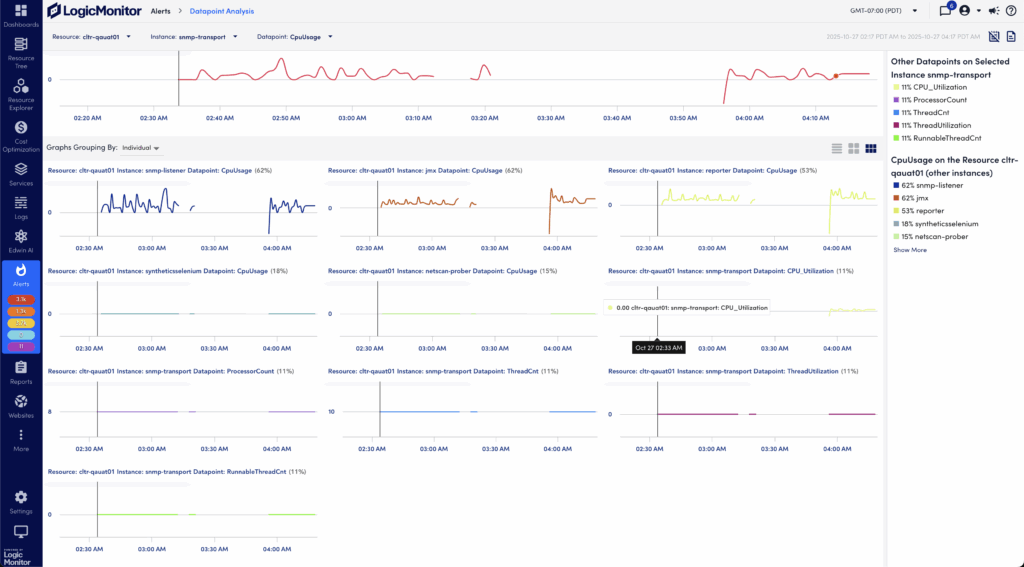
Note: If LogicMonitor cannot calculate a correlation score for the datapoint, a message is displayed indicating that no datapoints were analyzed.
Graphs Tab
This displays all relevant graphs associated with the alert. If the alert is not associated with a DataSource or website, (for example, if the alert is triggered by an EventSource or ConfigSource alert), the Graph tab is not shown. At a time, the system can display maximum 20 graphs.
By default, the time range for all graphs is set to “At time of alert”. This features one hour of data, starting 30 minutes before and ending 30 minutes after the alert occurred. From the dropdown menu you can modify the time range using predefined time ranges, including the current global time range. For more information, see Changing the Time Range.
You can change the output and display of graphs for an alert from the Graphs tab. You can for example include viewing Ops Notes; expanding legends; generating forecasting or anomaly detection versions of the graph; or adding the graph to a dashboard. These options are standard across most areas of the interface in which graphs display. For more information, see Data Forecast Visualization. You can also view anomaly detection graphs. For more information, see Anomaly Detection Visualization.
If there are log anomalies associated with the alert, you can investigate these by selecting More options (three dots) from the log anomalies graph, and select View Logs . This will open the Logs page filtered to display log events from the relevant resource during the time period of the alert. For more information, see Viewing Logs and log anomalies.
You can view the graph for the instance associated with a resource. To do so, select the instance name from the Show graphs from dropdown menu. The graph displays the data for that instance at the time of the alert.
Note: Only the first-level instance from the Resource tree is available in the Show graphs from dropdown menu.
History Tab
This displays the frequency and severity of alerts over the past 24 hours, seven days, 30 days, or over the previous calendar month. Use this to get a view of an instance’s performance over time to help you determine whether an alert was relevant, if thresholds need to be re-evaluated, or if you need to provision more resources to your equipment. You can select the bar graph to view all alerts for the selected time period.
Maps Tab
When viewing the details of an alert triggered by a resource/instance with an external resource ID (ERI) assigned to it, the Maps tab displays. From this you can select Maps, and the Resource or Instance button to generate a topology map for the assigned resource/instance. A new browser window opens displaying the resource/instance as the focus of a new topology map in the Mapping page. This lets you visually troubleshoot infrastructure that may be related to the alert. For more information, see Topology Mapping Overview.
Note: Topology Edge status is available in the Maps tab on the Resource Tree and Alerts pages. This enables you to view edge health status directly within the topology map for faster troubleshooting.
Dependencies Tab
When viewing the details of an alert with dependent alerts, a Dependencies tab displays. This is available for alerts that have undergone root cause analysis, and being determined to be an originating or direct cause alert. For more information, see Dependent Alert Mapping.
Acting on Alerts
You can manually perform actions on single alerts, or on multiple alerts at once. Alerts can be acknowledged, escalated, annotated, or put into SDT.
Note: Notes cannot be added for alerts that cleared more than 48 hours ago.
Acting on Single Alerts
From the toolbar in the upper right corner of the alert detail pane you can do the following:
- Put into SDT—Select the SDT icon to schedule downtime for the device group, device, instance, or website associated with the alert. For more information, see Scheduled Down Time (SDT) Tab.
- Acknowledge the alert—Select the ACK icon to indicate that the underlying issue of the alert is being actively fixed.
- Escalate the alert—Select the Escalate icon to manually escalate the alert to the next level in its assigned escalation chain. The icon is grayed out If no escalation chain is assigned to the alert. For more information, see Escalation Chains.
- Annotate alerts—Add a note for the alert in the Notes area and select Save.
For guidelines on acknowledging or escalating alerts, or putting alerts into SDT, see Guidelines for Responding to Alerts.
Acting on Multiple Alerts
You can perform actions on multiple alerts from the table view in the Alerts page.
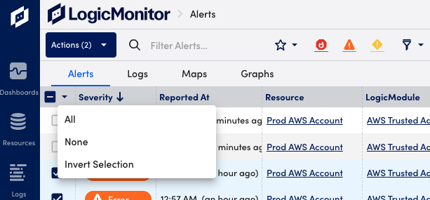
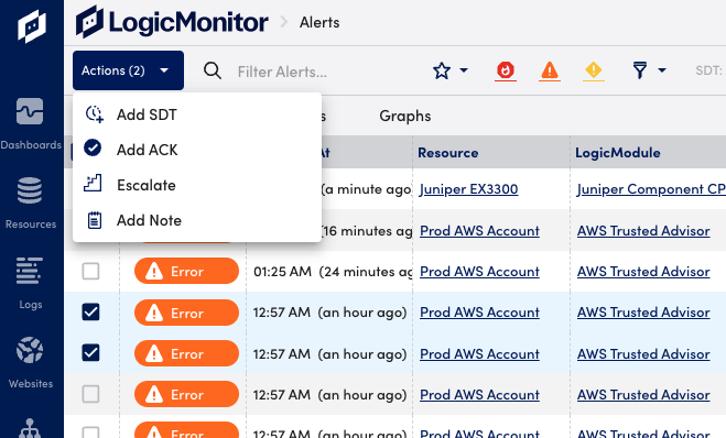
- Select the checkboxes to the left of the desired alerts. You can also use the checkbox to select or deselect all alerts, or invert the current selection.
- Select the Actions button to select one of the available actions from the dropdown menu.
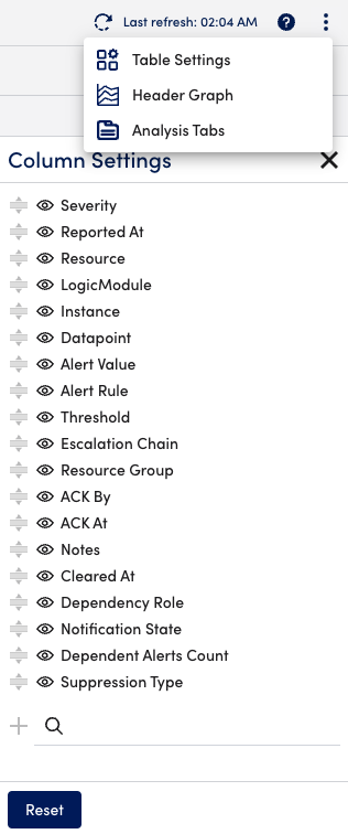
Customizing the Alert Table
You can customize the alert table column display and formatting according to your personal preferences. These settings are saved with your profile.
Customizing Column Display
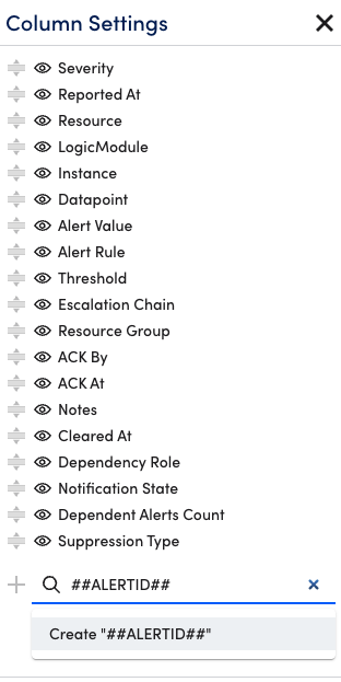
On the Alerts page, select the ![]() Show Table Settings icon. From here you can make default columns visible or invisible, reorder columns, and add or delete custom columns.
Show Table Settings icon. From here you can make default columns visible or invisible, reorder columns, and add or delete custom columns.
Adding Custom Columns
Custom columns can be added to the alert table to display the values of properties or LogicMonitor tokens related to the resource in alert. Use the Search field at the bottom of the Column Settings dialog to add custom columns.
To add a property as a custom column, simply start typing the name of the property whose values you would like to see for each alert into the Search field and matching search results will be auto-generated as you type.
To add a token as a custom column, you must prepend and append the token name with “##” for example, ##ALERTID##. Token names are not case sensitive for example, ##AlertID##. Search results are not auto-generated when typing token names; instead, you must select the “Create ##<token>##” option that displays.
You can further customize the alert table from the Appearance & Sounds settings. For more information, see Appearance and Sounds.
