
Disclaimer: This content applies to the legacy UI and is no longer maintained. It will be removed at a future time. For up-to-date content, see Dashboards Overview. At the time of removal, you will automatically be redirected to the up-to-date content.
What about isolating graph lines, toggling legends, and more?
Last updated - 24 July, 2025
Toolbar functions
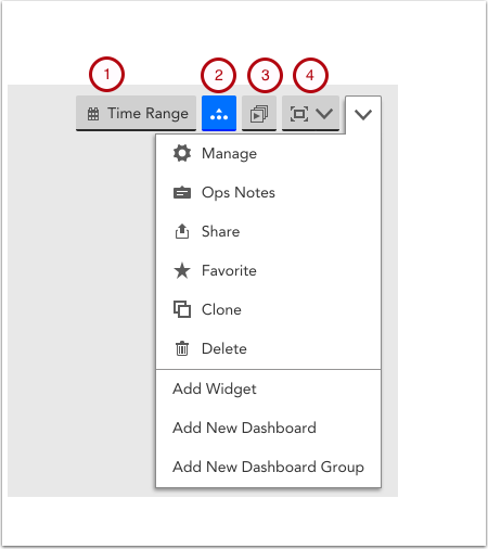
The dashboard toolbar is where you add and manage dashboards, as well as:
- Configure Date Range to be a standard period of time, such as last 24 hours, or a custom time period. The date range impacts the range of data displayed for all dashboard widgets.
- Expand or collapse all widget legends.
- Present a slideshow of different dashboards by choosing a group of dashboards to auto rotate through.
- Display the dashboard in full screen view.
Manage
This will take you to the full Manage Dashboard configuration window. From here, you can make your Dashboard public or private, edit its name and owner, set the Dashboard as your account’s default Dashboard view, and create a dynamic Dashboard using Dashboard Tokens.
Ops Notes
OpsNotes allow you to add time stamped annotations to your Dashboard’s graphs in order to identify correlations between performance and events, or simply to demarcate historical events such as upgrades.
Favorites
Favoriting a Dashboard will save it to the “Favorites” group in your Dashboard navigation panel. This will centralize your most frequently viewed dashboards in one location.
Clone
Cloning a Dashboard will allow you to replicate its configuration and apply it to a new set of devices using Dashboard Tokens.
Add Widget
Add a Widget to your Dashboard. Click here for a full list of available widgets and their respective configuration best practices.
Add New Dashboard
Create a new Dashboard. Click here for instructions on Dashboard creation best practices.
Add New Dashboard Group
Create a Dashboard group. Best practices recommend you organize Dashboards based on shared attributes, such as displaying content related to a specific datacenter/office location, end user, etc.
Isolating a graph line
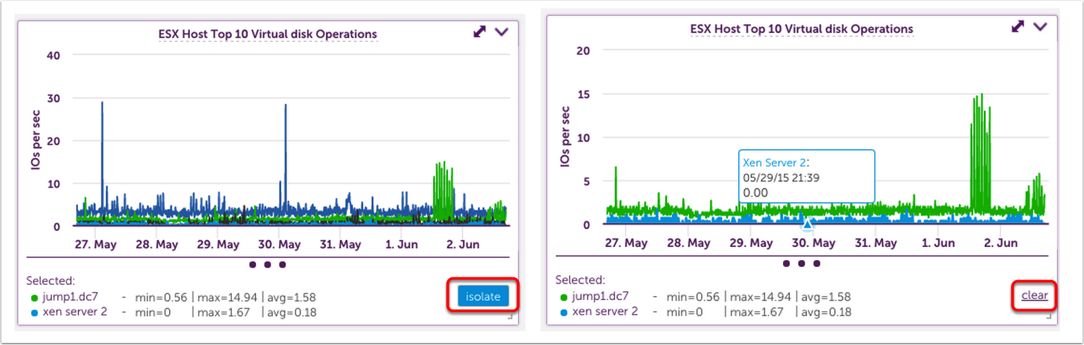
It’s not uncommon to have a graph with a lot of data where you want to view just one or two lines. To do so, click on the line(s) in the graph. The legend will be replaced with only the selected lines and the ability to isolate the view.
To remove the isolation filter, click clear.
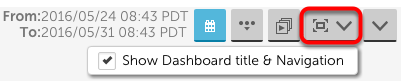
“Faux” Full Screen View
Most browsers will force you to exit full screen mode after 24 hours, meaning you have to adjust your full screen display at least once each day. To avoid this, LogicMonitor uses a “Faux” full screen view, which hides the lefthand navigation bar as well as gives you the option to hide your Dashboard titles and top navigation panel.
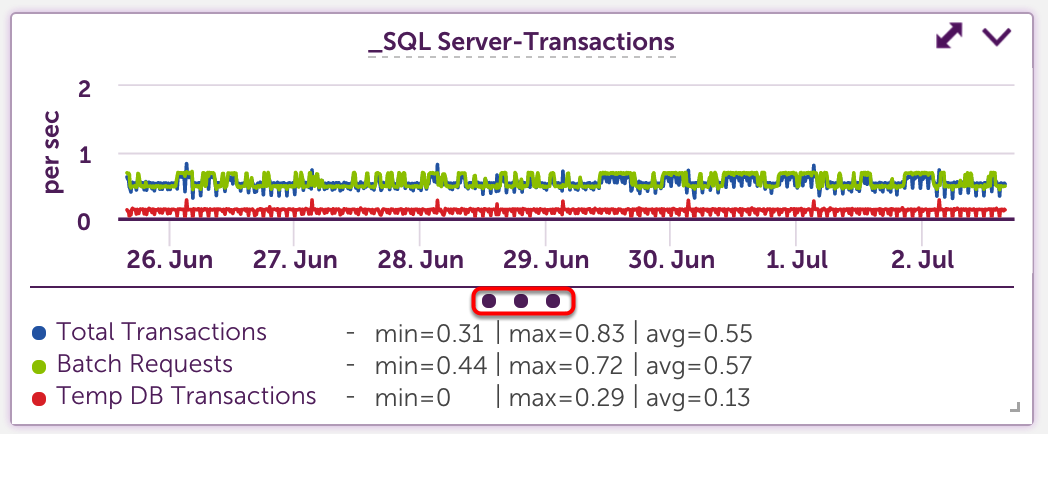
Legends
Widget legends are collapsed by default. To view a legend, you can select the expand all option from the header (number 4 above), or click on the three dots at the bottom of the widget as show below.
When expanded, legend details will paginate if they exceed the allowed space. If there is room, min, max, and average data will display.
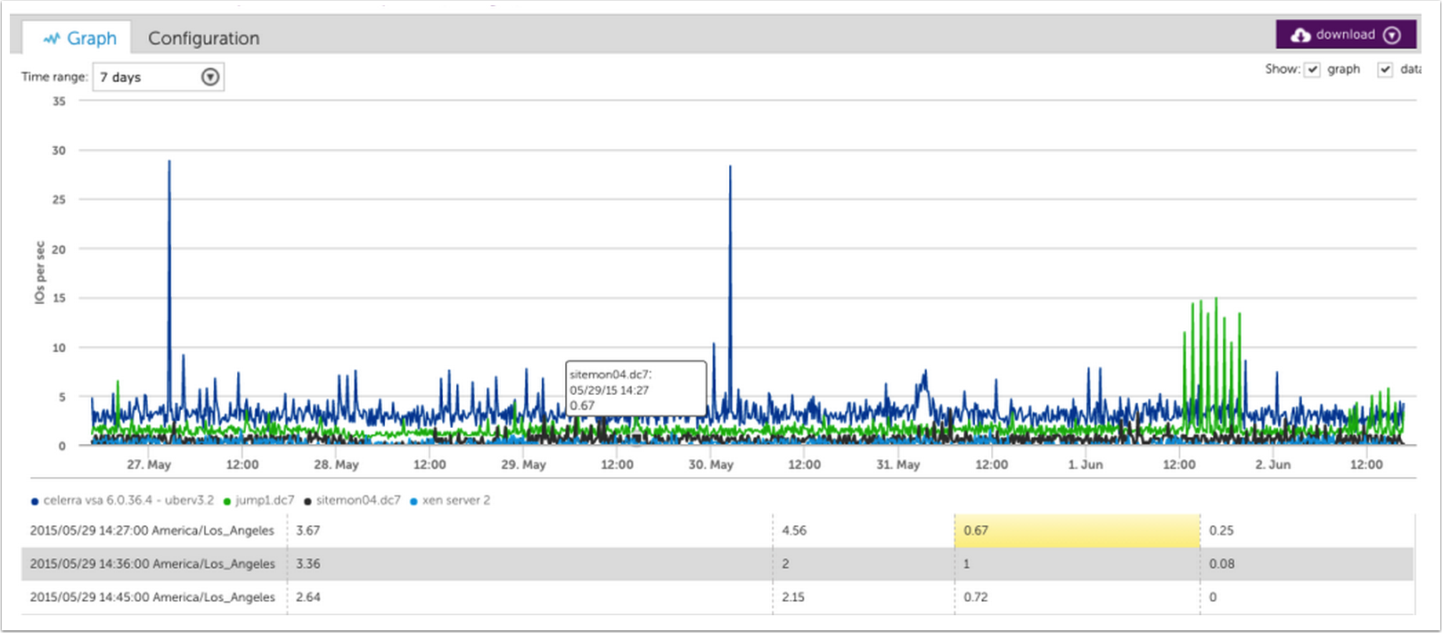
Widget detail view
You can expand any widget by clicking the two headed arrow in the upper right corner. Doing so will provide a more detailed view.
When graphs are expanded, you have the ability to view the underlying data. Hovering over a point in the graph will auto scroll the data table and highlight the corresponding datapoint.
Auto Zoom
Highlight an area on a graph to automatically zoom in on graph details. This can be done on the standard or expanded widget view.
