
Disclaimer: This content applies to the legacy UI and is no longer maintained. It will be removed at a future time. For up-to-date content, see Navigating the Resources Page. At the time of removal, you will automatically be redirected to the up-to-date content.
Navigating the Resources Page
Last updated - 25 July, 2025
Overview
The Resources page is where all devices and cloud resources being monitored by your LogicMonitor account are managed. If you haven’t added any devices to your account yet, see Adding Devices for instructions on adding devices to be monitored. If devices are already present in your account, read on for an overview of the primary interface components—and their functionality—available on the Resources page.
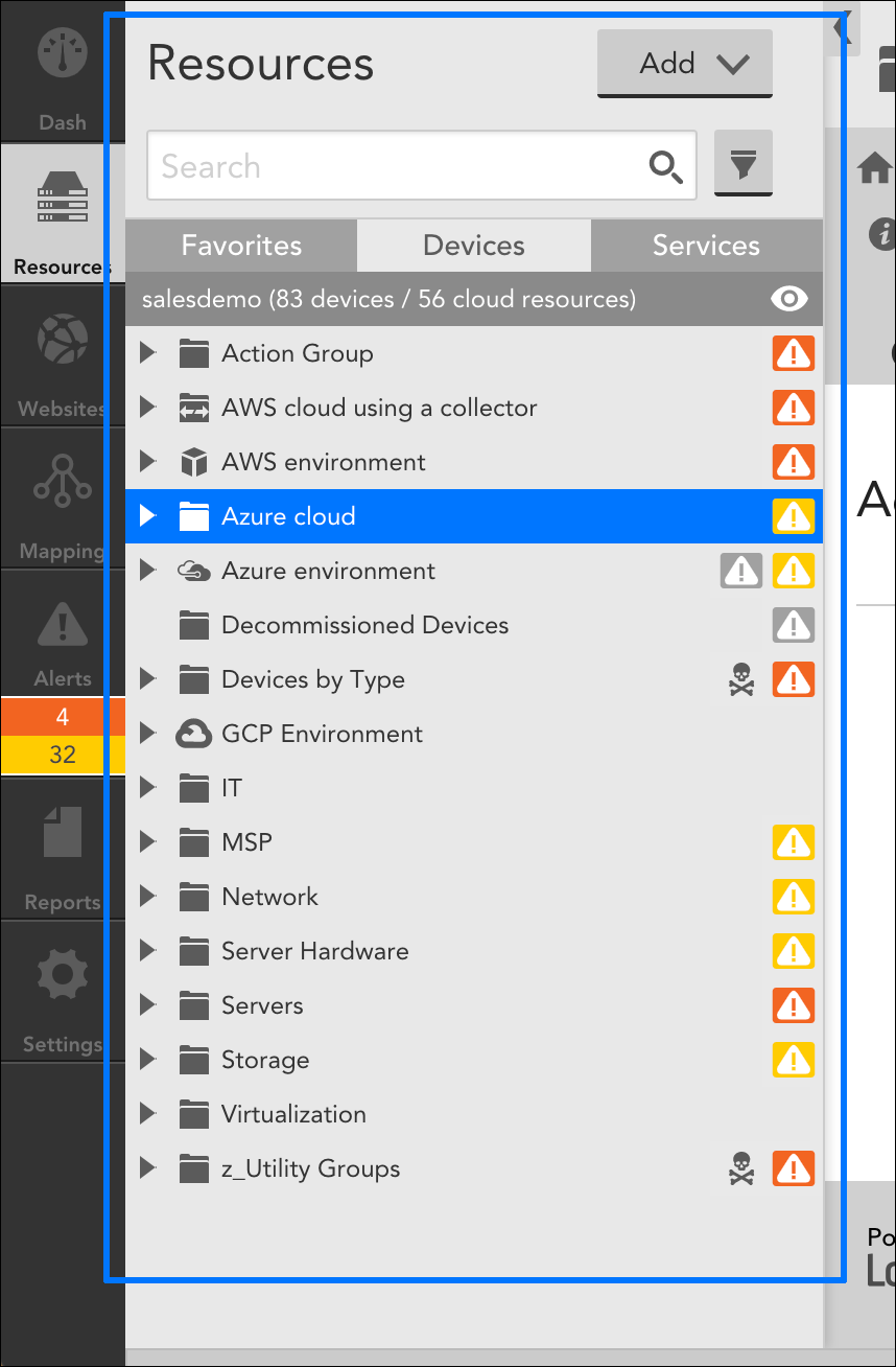
Resources Tree
The Resources tree allows you to efficiently search for, navigate among, and identify relationships between the many devices, cloud resources, device groups, instances, DataSources, and other LogicModules in your LogicMonitor account.
In the following sections, we’ve broken down the functionality of the Resources tree into several categories:
- Navigating Resources
- Identifying Resource Status at a Glance
- Searching and Filtering Resources
- Favoriting Resources
- Managing Services
Navigating Resources
Expanding and Viewing Tree Nodes
There are a few places to click on each tree node, each resulting in slightly different behaviors:
- Click the arrow to the left of any node to expand that tree level without making the node active (i.e. don’t show it in the detail panel). This is helpful for quickly drilling down through levels. Click it again to contract that level.
- Click an alert severity icon to the right of any node to make that node active and automatically open the Alerts tab in the detail panel without expanding the tree level. Click it again to refresh the detail panel content, if needed.
- Click the node name to expand that tree level and make it active (i.e. show the details in the detail panel). Click it again to refresh the detail panel content, if needed.
Viewing Alerts in the Resources Tree
Parent tree nodes will show alerts on child elements with a directional alert severity icon. As you expand each level, the alert severity icon “moves” to the newly-visible child node until you reach the node (usually an instance) that is actually in alert.
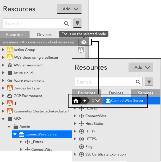
Focusing on a Single Node
When dealing with large numbers of child nodes, it can be helpful to reduce the visual noise by focusing in on a single node in the tree. As shown next, clicking the focus icon (which appears when any group, device, or cloud resource is selected) at the top of the Resources tree will focus the tree at the active tree level. The focused resource will appear in the breadcrumb bar, which you can use to re-focus on a higher tree level. Clicking the home icon will return the tree to the root level and its normal behavior.
Tree Width
The right border of the Resources tree can be dragged to widen or narrow the Resources tree. Widths between 300 and 1000 pixels are supported.
You can hide the Resources tree altogether by clicking the < icon (i.e. less-than sign) located along the top right border of the Resources tree.
Drag and Drop
Drag and drop any device or group to change its group membership:
- Dragging a device to a group will add the device to that group
- Dragging a group to a group will add the group as a sub-group
- Dragging a device to a device will create a new group with the two devices
Note: This functionality is not available for dynamic groups as dynamic group membership is automated and cannot be manually determined. For more information on device groups, see Device Groups Overview.
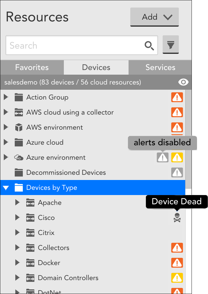
Identifying Resource Status at a Glance
A quick glance at the Resources tree provides an overview of your environment’s health. Alert severity icons display to the right of a resource in the Resources tree to denote the highest-level active alert for that node or its children. Similarly, icons display to the right of the resource to denote additional detail such as the fact that the device is dead, alerting has been disabled, or the resource has been put into SDT.
Standard icons display to the left of resources to allow you to quickly identify what a particular node represents (e.g. device, cloud resource, group, dynamic group, instance, DataSource, etc.). As shown next, you can hover over any icon in the Resources tree for its description.
Searching and Filtering Resources
Searching Resources
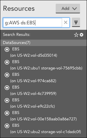
Use the Search field at the top of the Resources tree to quickly locate a resource without having to traverse the Resources tree in order to find it. As shown next, a keyword search will return all matches sorted by resource category.
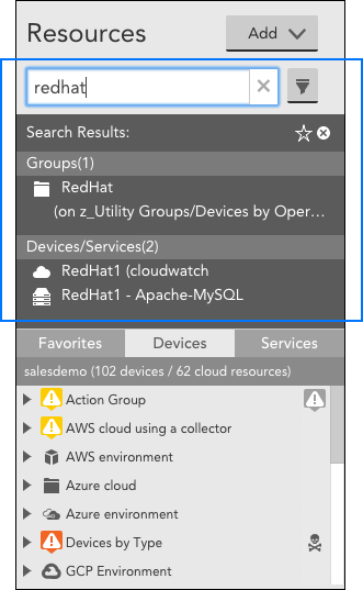
You can narrow your search by specifying a category for each keyword. The following search categories are available:
- g: will search device group names for a keyword match
- d: will search device and cloud resource names for a keyword match
- ds: will search DataSource names for a keyword match
- i: will search instance names for a keyword match
If you specify two or more keywords for the same category, the criteria will logically be interpreted with an OR. For example, g:DEV g:AWS will return device groups containing “DEV” or “AWS” in their names.
If you specify two or more keywords for different categories, the criteria will logically be interpreted with an AND. For example, g:AWS ds:EBS will return DataSources that contain “EBS” in their names and are members of groups that contain “AWS” in their names.
Selecting an item from search results will update your detail view, but will not change the focus of your Resources tree. To update the tree, you can either click the focus icon or select the breadcrumb in the detail panel. This allows you to keep search results active and displayed until you find what you’re looking for.
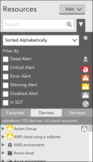
Filtering Resources
Filters are applied to the active view of the Resources tree. In other words, it will limit the current view of the tree, not return all resources that match the filter criteria. For example, if your Resources tree is currently focused on a single device group, only resources from that current group that match the filter will display.
Favoriting Resources
The Resources tree has three views, represented by tabs: the device view, which carries the bulk of the functionality, the services view which is discussed in the following section, and the favorites view, which allows you to customize a list of your most frequently viewed devices, cloud resources, device groups, instances, DataSources, and other LogicModules in one convenient view.
As discussed in the Toolbar Header section of this support article, resources can be added to favorites by clicking the star icon button, located in the detail panel’s toolbar.
Managing Services
Services are logical groupings of instances across one or more monitored resources (e.g. devices). Managed from the Services tab found in the Resources tree, services are part of LogicMonitor’s premium, add-on LM Service Insight feature. LM Service Insight enables you to aggregate service-level indicators across various instances to obtain, monitor, visualize, and alert on service-level data.
You may find this service-level monitoring and alerting useful when the health of overall services is a higher priority than the health of individual monitored devices. For example, you could use LM Service Insight to monitor an application running across many containers, where an individual, ephemeral, containerized application instance is not necessarily indicative of overall application performance. For more information on LM Service Insight, see About LM Service Insight.
Detail Panel
The Resources page’s detail panel provides additional details and functionality for the resource that is selected in the Resources tree. At the top left of the detail panel, the breadcrumb and description for the selected resource displays beneath its name. Clicking on any portion of the breadcrumb will change the focus of the Resources tree and detail panel to the new level selected.
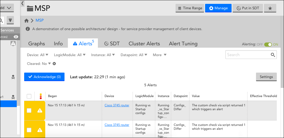
The detail panel also displays a series of tabs for the selected resource. The tabs available for a resource vary depending upon the type of resource it is, although there is considerable overlap among resources. For example, DataSources have a slightly different set of tabs than instances.
Next, we’ve listed the various tabs available from the detail panel. For an in-depth explanation of that tab’s functionality, visit its dedicated support article.
- Alerts tab. The Alerts tab provides a filtered view of the Alerts page, displaying alerts only for the selected resource (e.g. device, cloud resource, device group, DataSource, instance, etc.).
- Alert Tuning tab. The Alert Tuning tab allows you to view and manage datapoint thresholds at the device group, DataSource, and instance level.
- Cluster Alerts tab. The Cluster Alerts tab allows you to view and manage cluster alerts (i.e. alerts based on the overall state of devices in a device group).
- Graphs tab. Use the graphs tab to view graphs and created curated views of graphs (i.e. device dashboards) for DataSource instances.
- Info tab. The Info tab displays properties and group membership data for resources.
- Instances tab. The Instances tab allows you to view and manage settings for instances contained by a multi-instance DataSource or instance group.
- Raw Data tab. The Raw Data tab displays all data collected for an instance.
- SDT tab. The SDT tab allows you to view and configure scheduled down time for various types of resources (e.g. devices, cloud resources, device groups, DataSources, instances, etc.).
To the right of the available tabs found in the detail panel, you may find up to two toggle switches that allow for the disabling of alerting or monitoring for a particular resource. For more information on this functionality, see Disabling Alerting and Disabling Monitoring for a DataSource or Instance respectively.
Toolbar Header
The toolbar displays in the top right corner of the Resources page. Next, we’ve listed the various buttons available from the detail panel’s header toolbar.
- Time Range. The Time Range button allows you to edit the time range for a resource’s graphs. For more information on this functionality, see Changing the Time Range.
- Manage. The Manage button opens the configuration settings for the selected resource.
- Put in SDT. The Put in SDT button allows you to schedule down time for the selected resource. For more information on scheduling down time, see Scheduled Down Time (SDT) Tab.
- Star icon. The star icon button allows you to favorite a resource. As discussed in the Favoriting Resources section of this support article, favorited resources appear in the favorites panel of the Resources tree for convenient access.
