Disclaimer: This content applies to the legacy UI and is no longer maintained. It will be removed at a future time. For up-to-date content, see Pie Chart Widget. At the time of removal, you will automatically be redirected to the up-to-date content.
Pie Chart Widget
Last updated - 24 July, 2025
Whether your business measures success based on the current value of a single metric, the aggregate value of metrics across devices, a value from your database, or a combination of any of the above, you can represent it in an at-a-glance view with the Pie Chart widget.
Overview
Creating a Pie Chart widget is a multi step process, similar to Big Number and Custom Graph widgets. First, select the datapoints you wish to include. These can be values of a datapoint on a single instance, values of datapoints across instances, or the top ten or aggregate value of a datapoint across instances.
Once your datapoints have been selected, you can create virtual datapoints if desired. This gives you the ability to change units of measure, combine values, or perform a function on the value prior to display. You can also add two values together to create a single value, although ensuring the values are in the same unit of measure is recommended.
The final step is to select which values will appear in the pie widget. This is a separate step to allow for the use of virtual datapoints, which may rely on a datapoint that will not be displayed individually in the widget.
Create a Pie Chart Widget
Click on the Add drop-down and select pie chart widget from the list. The Configuration form for setting up the widget will be displayed. See these instructions for help filling out the title, description, dashboard and refresh frequency fields.
Datapoints
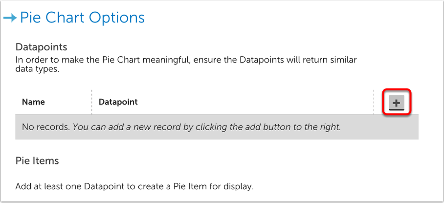
The next step is to add datapoints to be used for Pie Items. As with other widgets, you can select individual Groups, Devices, and Instances, or use glob expressions to include many. A specific datapoint must be selected.
You will have the choice of selecting the following types of datapoints:
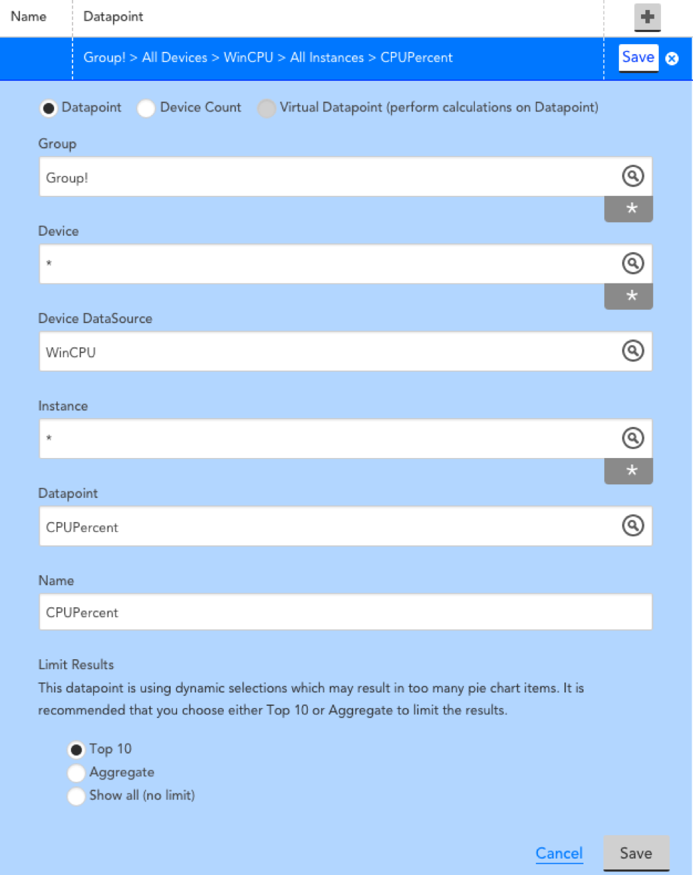
- Datapoint: the raw datapoint value will be displayed
- Virtual datapoint: a calculation involving multiple datapoint values from a DataSource will be displayed
- Device Count: this datapoint will return the number of devices that matches any AppliesTo expression
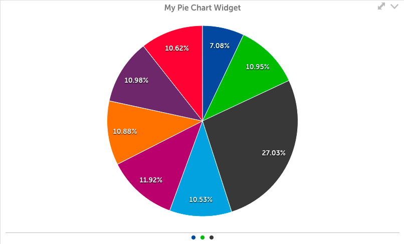
If multiple groups, devices, or instances are included you can also choose to only display top ten values, aggregate the values as Max, Min, or Sum, or display all. If Top Ten was selected, ten items will be calculated among the total 100% of the pie. If Aggregate was selected, or a distinct datapoint, it will be one value calculated as part of the 100% of the pie.
Follow these instructions to add datapoints to your Pie Chart widget. You’ll also need to specify a Name for each datapoint:
Name
Provide a name for this datapoint.
Example Datapoint Configuration
In the following example, data will be included for:
The CPUPercent datapoint on all instances of Win CPU or all devices in groups with a name starting with Group1. The Top 10 values will be used.
If this is the only datapoint added to the Pie Items section, the top 10 values would appear as a relative 0-100% of the pie.
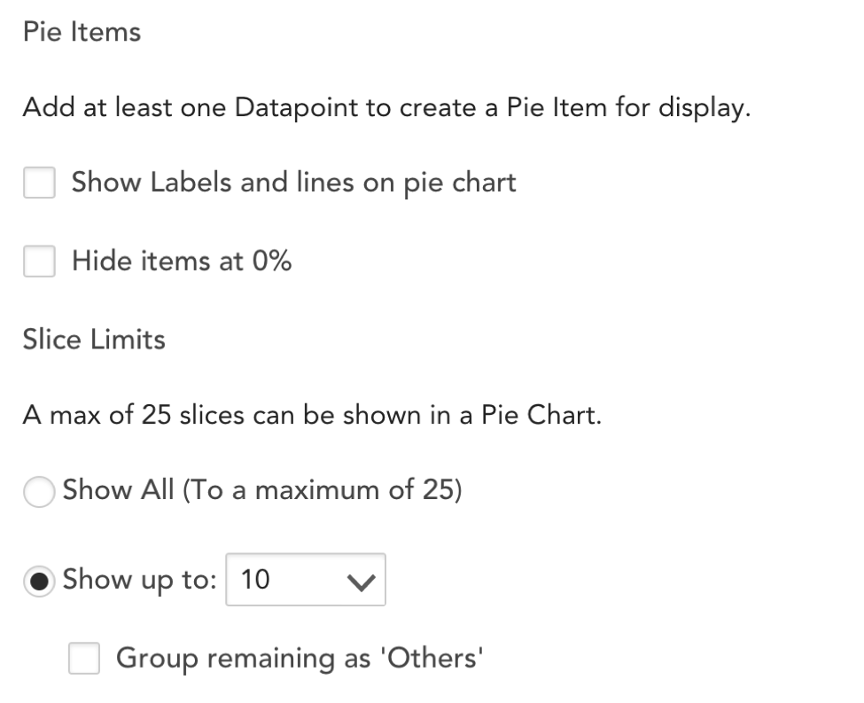
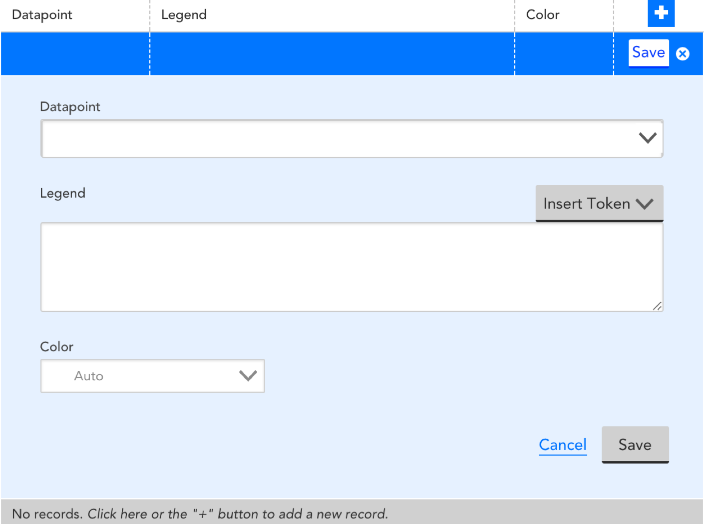
Pie Items
You will need to configure the appearance of the pie chart based on the datapoints you have configured for this widget:
Datapoint
Select from the dropdown of datapoints that were configured in the previous “datapoint configuration” section.
Legend
Enter the text you would like to see for this datapoint. Tokens are provided to allow each datapoint to be displayed with the appropriate label. Legends are displayed in the following ways.
- When you hover over a pie slice.
- At the bottom of the widget under the pie.
- As a label when “Show labels and lines” is selected.
Color
Select the color for each datapoint. Multiple datapoints from one line of the Pie Items chart will display as the same color if you choose a specific color. If you choose Auto for this line, each datapoint will be displayed as a different color.
Show labels and lines
Select this checkbox to show the legends as labels connected to the pie chart with lines.
Hide Items at 0%
If any of the datapoints are 0% of the total, then selecting this option will hide the metric from the pie chart.
Slice Limits
Select whether you’d like to limit the number of slices displayed in the pie. A maximum of 25 slices will be enforced regardless of your choice. If you select ‘Show up to’ and limit the displayed slices, you can choose to display all slice values that won’t be included in the specified limit as a sum with the label “Others”.