
DataSource Graphs
Last updated - 24 July, 2025
Overview
DataSource graphs chart the values of the various datapoints monitored by the DataSource. LogicMonitor’s pre-built DataSources install with accompanying DataSource graphs to ensure that monitored data is thoroughly visualized and useful.
There are two types of DataSource graphs:
- Standard Graphs. Standard graphs carry data for a single instance, and are displayed for each monitored instance of a DataSource (e.g. a standard graph would display for every disk on a server).
- Overview Graphs. Overview graphs are available for multi-instance DataSources and carry data for the top ten instances in an instance group (by default, a DataSource only has one instance group; if you define multiple instance groups, an overview graph can be restricted to just those instances in the group). For example, an overview graph might display information for all monitored disks (up to ten) on a server.
Note: The top ten instances graphed will always be those with the highest values for the first line defined in the Lines area (discussed in a later section) of the graph’s configurations.
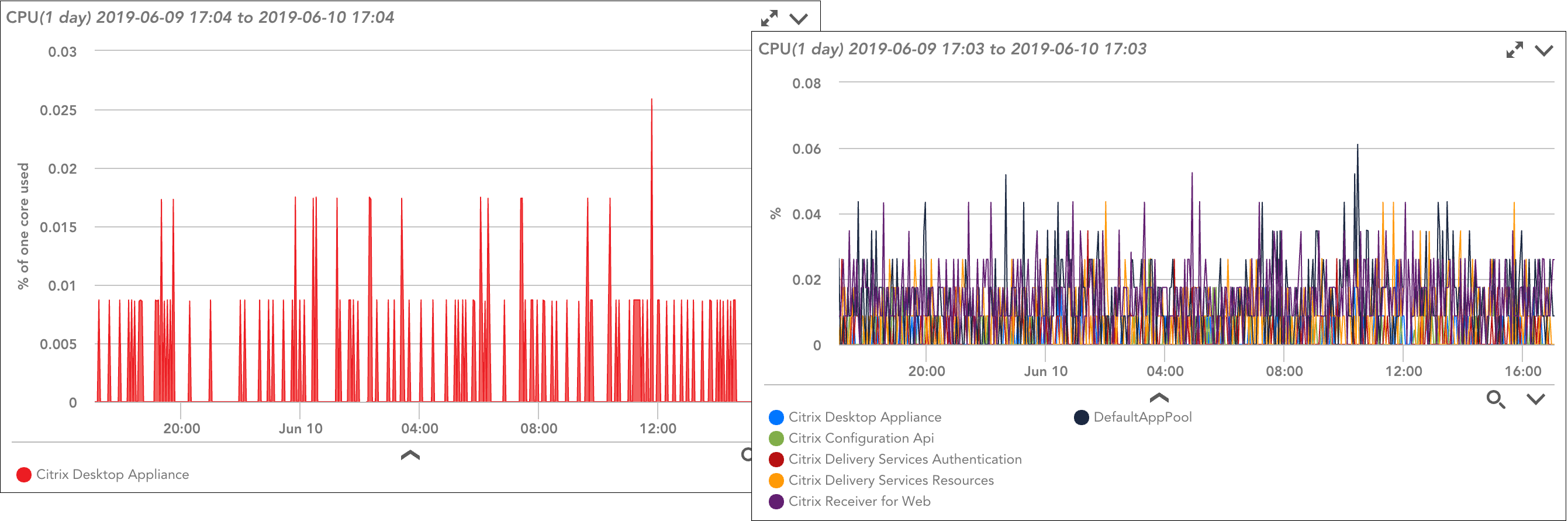
The graph on the left shows CPU used for a single instance; the graph on the right contrasts CPU used across all instances the DataSource is applied to (up to top ten).
Viewing DataSource Graphs
While DataSource graphs are configured and managed from the DataSources page (as discussed in the following section), they are viewed from other areas of the interface, including:
- Dashboards. DataSource graphs can be added to your dashboards. For more information on adding DataSource graphs to dashboards, see Graphs Tab.
- Resources page. When viewing the details of a resource that has been added into monitoring, the Graphs tab that displays for the instance, instance group, DataSource, or resource currently in focus displays relevant DataSource graphs. For more information on viewing DataSource graphs from the Resources page, see Graphs Tab.
- Alert notifications. Alert notifications that arrive via email include DataSource graphs for faster time to resolution. All graphs relevant to the instance and datapoint in alert are included and feature 60 minutes of data immediately preceding the alert.
Note: DataSource graphs also serve as the foundation for several of LogicMonitor’s AIOps features, including the ability to visualize anomalies and forecast trends, as discussed in Anomaly Detection Visualization and Data Forecasting respectively.
Configuring DataSource Graphs
To add graphs or edit existing graphs for a DataSource, navigate to the DataSource (Settings | DataSources). In the DataSources tree, you’ll see existing graph definitions, grouped by graph type (e.g. standard or overview). You can open one of these existing graphs for configuration or you can add a brand new graph by clicking the + Add Graph or + Add Overview Graph button located in the upper right corner of the DataSources page.
Note: If the + Add Overview Graph button isn’t available, the DataSource doesn’t support multiple instances.
There are several configurations available for DataSource graphs, as discussed next. The processes for creating standard and overview DataSource graphs are largely identical. This section covers the creation of both types of graphs, but will identify where configurations diverge.
Displayed Title
In the Displayed Title field, enter a title for the graph that will display at the top of the graph. Tokens can be used in this field.
Graph Name
In the Graph Name field, enter the name of the graph. The graph name will be used throughout the interface to select the graph.
Vertical Label
In the Vertical Label field, enter the unit of measurement that will display for the graph’s Y axis (e.g. milliseconds, percent used, tasks/second, bytes, etc.).
Min and Max Value
In the Min value and Max value fields, optionally enter the minimum and maximum values to display on the graph. If no minimum or maximum value is set, the graph will auto-scale to cover the range of monitored data. Setting a minimum or maximum value to scale displayed data may be useful if you’d like to compare values between graphs.
Display Priority
The numeric value entered into the Display Priority field determines the graph’s display order in relation to other graphs for the same DataSource. Graphs with a lower display priority will be displayed before graphs with a higher display priority. If two graphs have the same display priority values, they will be displayed in alphabetical order according to the graph titles.
Time Scale
From the Time Scale field’s dropdown menu, select the default time scale that will display for the graph. This default can be overridden by the time range setting when viewing the graph from the Resources, Websites, or Dashboards pages, as discussed in Changing the Time Range.
Aggregate
The Aggregate option is only available when configuring overview graphs. When checked, it indicates that the aggregate method defined for each of the graph’s datapoints (defined in the Datapoints area, as discussed in a later section) should be used. The aggregate method for a datapoint determines how data across multiple instances will be aggregated into a single value (e.g. all CPU utilization percents may be averaged across all cores for a device).
If this option is left unchecked, the aggregate methods defined, if any, for included datapoints will be ignored.
Scale by Units of 1024
By default, units will auto-scale to 1000. Check the Scale by units of 1024 option if you’d like them to auto-scale to 1024 (e.g. unit of measurement is bytes) instead.
Datapoints
From the Datapoints area of a graph’s configurations, add all datapoints (normal and complex) from the DataSource’s definition that you would like displayed in your graph—or used in the calculations of a virtual datapoint (but not necessarily displayed). For each datapoint added, define the following:
- Name. This value defaults to the datapoint name, but you can enter a different name to use when referring to the datapoint.
- Consolidation Function. There are three consolidation functions available for controlling how data is displayed when you view the graph over a longer time period. For example, consider a datapoint “aborted_clients” that returned a value of zero for every sample interval during a single day, except for one sample where it returned a value of 100:
- Average. With a consolidation function of average, when you view the graph over a month-long time period including the day described above, that day will have a value of 0.5 (the average value during the day) for the “aborted_clients” datapoint.
- Max. With a consolidation function of max, when you view the graph over a month-long time period including the day described above, that day will have a value of 100 (the maximum value of all samples in the day) for the “aborted_clients” datapoint.
- Min. With a consolidation function of min, when you view the graph over a month-long time period including the day described above, that day will have a value of zero (the minimum value of all samples in the day) for the “aborted_clients” datapoint.
- Aggregate Method. Available only when configuring an overview graph, the aggregate method determines how data across multiple instances will be aggregated into a single value. The aggregate can be calculated based on the average, max, min, or sum of the datapoints. For example, choosing “sum” would add all of the instance values together and that total value would display as a line on the graph, rather than the individual values for each instance.
Note: The Aggregate option must be checked in order for the aggregation method selected here to be considered.
Virtual Datapoints
In addition to including existing DataSource datapoints in your graph, you can create one or more virtual datapoints for graph inclusion. Virtual datapoints allow you to perform calculations using the datapoints previously added to the Datapoints area. For details on writing valid datapoint expressions, see Complex Datapoints.
Note: There is no history associated with virtual datapoints, nor can they be alerted on. A virtual datapoint is a calculation made specifically for the graph with which it is associated. If you want to associate history or alerts with these types of custom datapoints, you must create them as complex datapoints within the DataSource definition. Once created, complex datapoints are then available for inclusion in a graph from the Datapoints area of a graph’s configurations. For more information on creating complex datapoints, see Complex Datapoints.
Lines
In the Lines area of a DataSource graph’s configurations, add the datapoints and/or virtual datapoints that will be displayed as graph lines. Only datapoints present in the Datapoints and Virtual Datapoints areas are available for selection as lines.
Note: If you are configuring an overview graph with multiple datapoints, consider carefully which line displays first in this area; this is the line that determines which instances are considered top ten instances (those with the highest values for the first line defined here).
For each datapoint that will be rendered in your graph, define the following display properties:
- Type. There are several data plotting formats available per line:
- Line. Data will be plotted in a line.
- Area. Data will be plotted as an area.
- Stack. Data will be plotted as an area and the areas for each ‘line’ will be stacked on top of one another.
- Column. Data will be plotted as a column.
Note: Stack and area line types are displayed independently of one another. This means only lines designated as stack lines can be stacked; stack lines will not be stacked on top of area lines. For example, let’s say you have the following three lines on a graph: L1=area, L2=stack, and L3=stack. L3 will be stacked on top of L2, but neither will stack on top of L1. Rather, L3 and L2 will overlay L1.
- Legend. Line legends can be static content, or can be populated using dynamic tokens (variables). The following tokens are available for use in line legends:
- ##HOST##. The device associated with the graphed data.
- ##DATASOURCE##. The DataSource display name.
- ##INSTANCE##. The instance name.
- ##DSIDESCRIPTION##. The DataSource instance description, which may be set by Active Discovery, or manually from the Instances tab to more descriptive text (e.g. “C:\ – finance database volume”).
- Arbitrary device properties. Any property defined on the host can be displayed in the legend by referencing the property name (e.g. ##SYSTEM.DEVICEID##).
Note: For overview graphs that chart a single datapoint across multiple instances (i.e. you did not check the Aggregate option), you should use an instance-level token in the legend (e.g. ##INSTANCE##, ##DSIDESCRIPTION) in order to determine which value corresponds to which instance.
- Color. For standard graphs and overview graphs with aggregated lines, color can be assigned to each line. As best practice, consider using red for datapoints that represent undesirable conditions and green for desirable conditions (e.g. a graph that shows two lines as areas could use green to display total disk space and red to overlay used disk space).
Note: For overview graphs with lines that are not aggregated, the Color field is not available. This is because one datapoint configuration could potentially generate up to ten graph lines, each representing an instance, and one single color assignment would prevent you from distinguishing between these lines.
