Data Forecasting
Last updated on 29 April, 2025Disclaimer: This content applies to the legacy UI and is no longer maintained. It will be removed at a future time. For up-to-date content, see Data Forecast Visualization. At the time of removal, you will automatically be redirected to the up-to-date content.
Overview
LogicMonitor’s data forecasting allows you to predict future trends for your monitored infrastructure, using past performance as the basis. When forecasting data, LogicMonitor first identifies and removes anomalies and missing data from the sample (i.e. the set of data you choose for forecasting). Then it applies a capacity trending algorithm to the sample to find a model of best fit for the collected data and calculate future data based on these model parameters.
Forecasting is an AIOps tool that is very helpful for issue diagnosis and mitigation. When paired with LogicMonitor’s alerting system, forecasting can help you determine whether an alert represents a one-time anomaly, requires immediate attention, or will require attention in the near future. For example, imagine for a moment that you have received a warning alert indicating that disk usage is at 85%. A key question that arises is how much time until the disk hits a critical threshold of 95% usage? One or two days? Or is there still plenty of time before disk usage creeps to 95%? In this case, forecasting would analyze the past rate of rise in order to predict the future rate.
Forecasting is also helpful for budget planning and resource management. For infrastructure components that have lifetimes (e.g. solid state drives) or capacity (e.g. disk) associated with them, forecasting based on the predicted health and performance of your monitored devices can provide insight into the timeframe and magnitude of recurring events, as well as upcoming expenses.
Forecast Graphs
Similar to anomaly visualization, data forecasting is available from any graph in the LogicMonitor interface, regardless of whether it is being viewed from the Graphs tab, Alerts page/tab, or dashboard.
To display the forecast version of a graph, click the dropdown arrow in the upper right corner of the graph and select “Forecast” from the dropdown menu. A dedicated forecast graph opens. As shown next, the forecast graph uses background color to differentiate between previously-collected data and forecasted data.
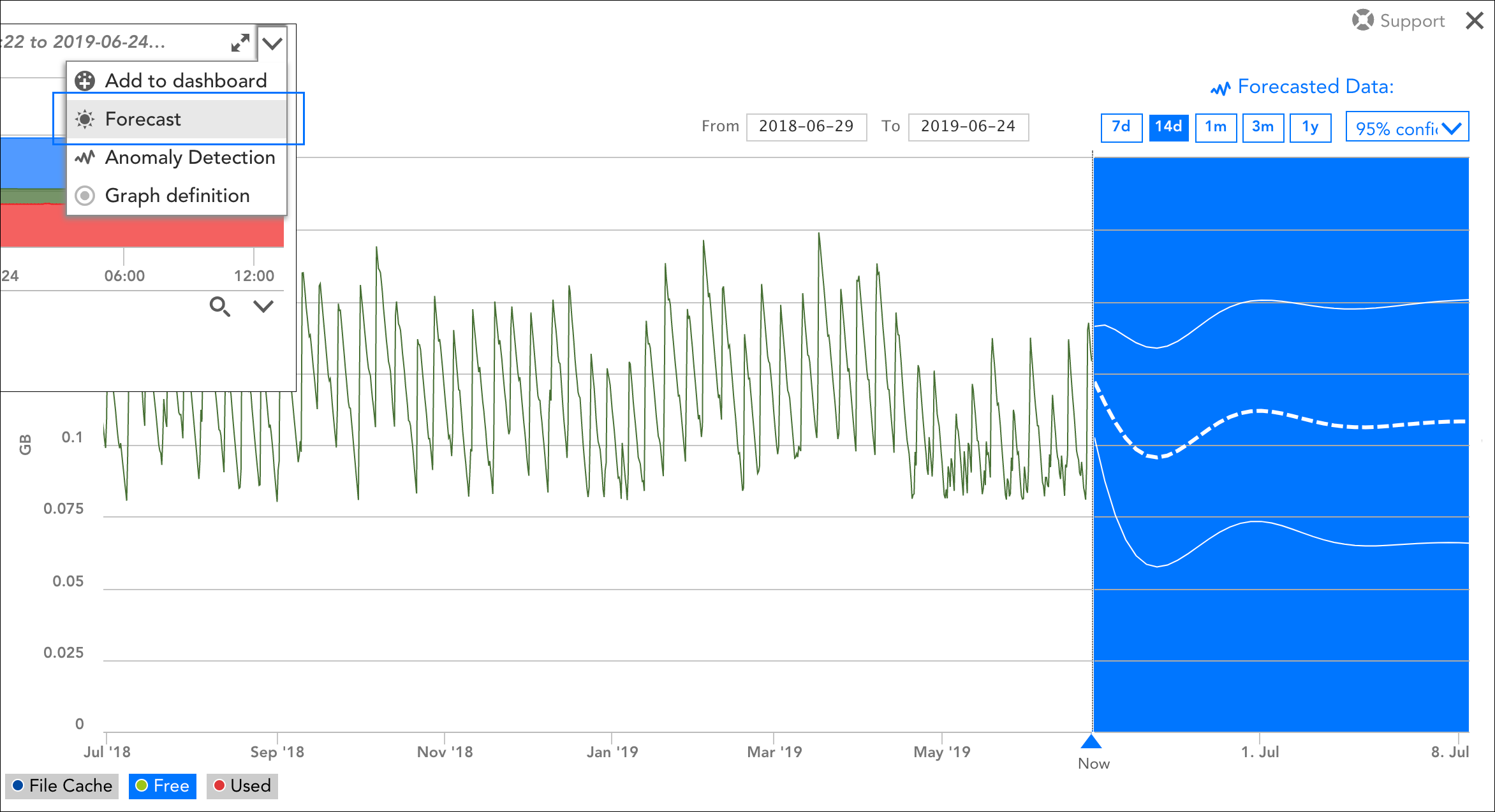
Note: Forecast graphs can only visualize one datapoint or instance at a time. If your graph includes data for multiple datapoints (or multiple instances per datapoint), use the legend selections in the bottom left corner of the graph window to toggle between datapoints/instances.
As discussed in the following sections, there are several unique tools available for forecast graphs that you can use to derive additional context from the data presented.
Time Range for Collected Data
In the upper left corner of the forecast graph, select a time range for the collected data (i.e. training data) that will be used as the basis for the forecast. You can specify a custom time range using From and To fields or you can use the preset options of one month, three months, six months, and one year. Data with timestamps during the specified time range will be used to calculate the forecasted data.
Time Range for Forecasted Data
In the upper right corner of the forecast graph, select the duration of the forecast. You can choose to forecast out seven days, 14 days, one month, three months, or one year from now.
Forecast Method
From the dropdown available in the Forecasted Data area, choose which forecast method you would like to use to calculate and display the forecast:
- 95% confidence forecast. This method projects lines that represent forecast values (the middle, thick dashed line), as well as upper and lower confidence bounds. These confidence bounds indicate that LogicMonitor is 95% confident that future datapoint values will fall within this range.
- Line of best fit forecast. This method draws a single straight line that best fits forecasted data. This is generally a more useful option if your datapoints are highly variable.
Alert Forecasting
Although LogicMonitor doesn’t currently offer the ability to alert on forecasted data, it does have the ability to predict when a datapoint is likely to surpass its designated alert threshold. Specifically, both the Table widget and the Alert Forecast report offer insight into when specified datapoints will go into alert. For more information on these, see Table Widget and Alert Forecast Report respectively.