
Viewing Logs and Log Anomalies
Last updated – 24 November, 2025
LogicMonitor performs anomaly detection on log events after they are ingested and mapped to a monitored resource. Log anomalies represent log events that are new, or seen for the first time on the monitored resource it’s associated with.
You can see log anomalies in these places:
- The Logs page, where you can review raw logs and investigate log anomalies across your entire infrastructure.
- The Graphs tab for Alerts, where they are displayed contextually with metric alerts to help speed troubleshooting.
Exploring Logs
The Logs page provides an overview of recent log events and anomalies. Default time range is past 5 minutes. You can filter the time range on other available options, or create your own custom filter.
Note: For performance reasons the maximum search range is limited to 31 days. Logs are however retained for a longer period. To get logs for a full year, you can do multiple month queries (search for May, June, July, and so on).
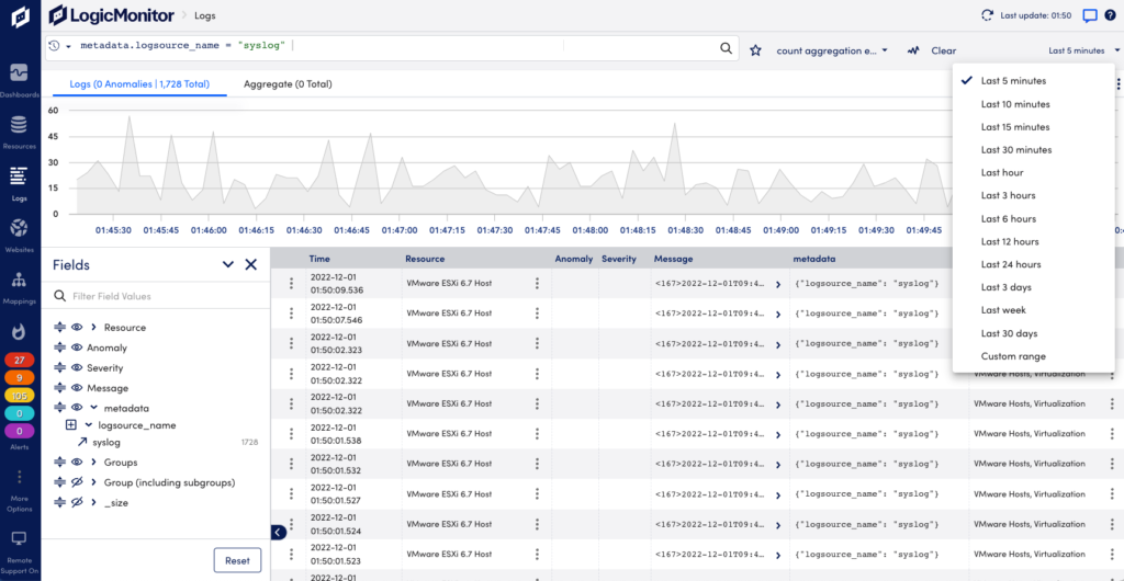
On the Logs page you can see raw logs and log anomalies across your entire environment, and search and filter for specific logs.
- Search and filter logs—Use the query language to troubleshoot issues and summarize your logs for reports. For more information, see Query Language Overview.
- Fields panel—Browse fields that exist in the events returned by the current query. You can see the number of events that contain a particular field value. Use the icons to show/hide fields as columns in the table. Use drag and drop to change their display order. Select the arrow icon to add a field and value pair to the query bar to refine a search. For more information, see Query Language Overview.
- Anomaly column—Shows if the log event for the resource is an anomaly. For more information, see Anomaly Detection.
- Severity column—Shows the alert severity for the log event.
- Trace ID column—Displays the related trace ID.
- More actions—For each log event line in the list, selecting a Resource will provide options to view the Resource page or filter the Logs page on the resource. Select the options menu to the left to see options to Copy log message or Create Alert Condition. For more information, see Log Alert Conditions.
- Details panel—Select a log row to open a panel with more information, including the full log event and its metadata. You can also find quick links to add metadata fields to your query filter and run a new search for the selected field and value with a plus/minus one minute window.
- Log export—You can export log data for example to share with vendors when investigating issues. Select the Download Logs CSV icon in the upper right corner to download a file in CSV format. The file will include the columns you have on the screen. Only the Time column with the time the log event was received is default. Scroll down to add the desired number of log rows to include in the download file.
Note: It may take some time before logs from resources in a newly created resource group are included in the log count totals. This is because the log metadata is established at log ingestion, and using resource groups that existed at that time.
Note: When changing the display name for a resource and searching for log entries for it, it may take some time before the new name is applied. If your search includes a time after the name change, the new name is displayed. If your search includes a time before the name change, the old name may be displayed.
Log Aggregates
The Logs Aggregate tab in LogicMonitor provides powerful visualization and analysis capabilities for exploring grouped log data. It supports advanced searches that use aggregation, processing, and formatting operators to refine and customize query results.
For more information, see Advanced Search Operators.
You can sort aggregated data by selecting column headers or switch between chart and table views to analyze data from multiple perspectives. It supports Pie and Donut charts, offering an intuitive way to analyze aggregated results. Donut charts include a central Big Number metric that summarizes key figures, such as totals or averages.
You can compare datasets of varying scales using the Merge Y-axis option that aligns value ranges across multiple series, ensuring that charts display proportional trends accurately.
The Add to Dashboard feature helps to pin an active visualization to a selected dashboard. This enables you to transform your aggregated log insights into reusable dashboard widgets.
In addition, enhanced tooltips, percentage-based data labels, and a context menu option to View in a new window help you to move seamlessly from high-level visualization to detailed log analysis.
This enables you to quickly identify patterns such as error frequency by application, log volume by host, or performance metrics by environment without manually sorting through large result tables.

You can display the data using the following chart types:
| Chart Type | Purpose | Example |
|---|---|---|
| Column | Displays grouped log data as vertical bars. | Compare log volumes across different services. |
| Line | Connects values with lines to show change or trend across ordered groups. | Track average response times or errors over time. |
| Area | Fills the space below a line to show magnitude or cumulative totals. | Visualize total traffic volume trends. |
| Pie | Represents grouped values as proportional circle segments. | Display error type distribution by service or log source. |
| Donut | Similar to Pie but includes a central Big Number summarizing a selected metric. | Visualize proportional application usage while displaying total log count. |
| Big Number | Displays a single numeric value such as total events, averages, or sums for quick, high-level insights. | Display the total number of error logs in the last 24 hours. |
Depending on the Chart Type selected, a metric dropdown displays. Use this to choose which aggregation metric you want displayed in your selected chart.
Available aggregate columns are as follows:
- Average (if supported) — Mean of a numeric field
- Count — Number of log entries in each group
- Sum — Cumulative total of numeric field values
- Max / Min — Highest or lowest values in each group
Note: The selected column determines which data is plotted or rendered in the chart.
If the query returns only one aggregation metric, it is automatically applied.
Each chart type supports the following interactive exploration features:
- Hovering over a segment displays a tooltip with value, count, and percentage.
- Selecting a segment filters the Logs view to display logs matching that segment’s value.
- Use the legend to isolate or toggle specific categories for focused comparison.
- Right-click on context menu to access View in a new window. This opens a drill-down window displaying detailed logs behind the selected data point, replicating the Row Drill Down functionality available in table views.
These features simplify the transition from visualization to log-level investigation, ensuring analysts can identify and act on patterns quickly.
Requirements to Visualize Log Data in the Aggregate Tab
To visualize log data in the Aggregate tab you need the following:
- You must have a LogicMonitor role with “Logs View” permission.
- Your account must include an LM Logs license.
- Queries must return at least one groupable field.
- To use Pie or Donut charts, queries must include aggregate columns such as Count or Max.
Visualizing Log Data in the Aggregate Tab
- In LogicMonitor, navigate to the Logs page.
- Run a log query.
- Select the Aggregate tab.
- From the Chart Type dropdown menu, select a chart type you want to apply.
- From the Data dropdown menu, select the aggregation column you want to visualize (for example; Count, Sum, or Max).
- (Optional) If using a Donut Chart, select the Big Number metric to display in the center (Total, Average, Max, or Min).
This enables you to visually highlight key metrics while comparing group proportions.
- Interact with segments or use the context menu to filter logs or open detailed drill-downs.
The aggregate results display in the selected chart format.
Adding a Visualization to a Dashboard
When you select the Add to Dashboard option, LogicMonitor captures the current query context, including applied filters, groupings, aggregation metrics, and chart type, and converts it into a dynamic widget. Once added, the widget continuously refreshes based on the latest log data, ensuring that your dashboards display up-to-date information for ongoing monitoring.
To add a visualization to a dashboard, do the following:
- Select
 Add to dashboard to add the visualization.
This opens the Add to dashboards modal.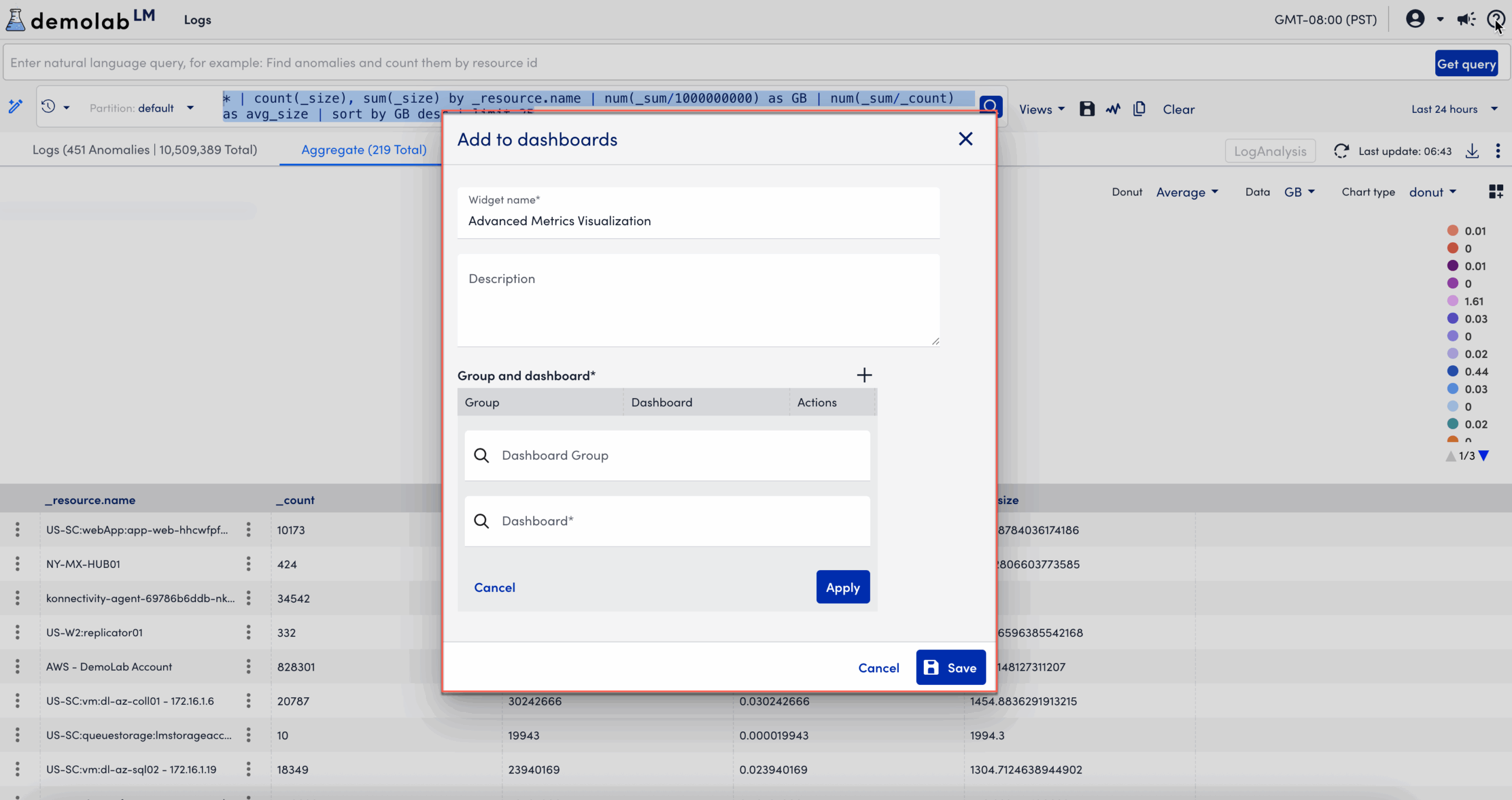
- In the Add to dashboards modal, enter the following information:
- In the Widget name field, enter a name for the widget.
This is the name that displays for the widget on the dashboard. - Enter descriptive information about the dashboard in the Description field.
- In the Group and Dashboard section, select
 Add to add a group and dashboard.
 - Add a Dashboard Group.
- Add a Dashboard.
- Select Apply.
After you add the dashboard group and dashboard, you can edit, clone, or delete the widget for the selected dashboard.
- In the Widget name field, enter a name for the widget.
- Select Save.
The visualization displays on the dashboard.
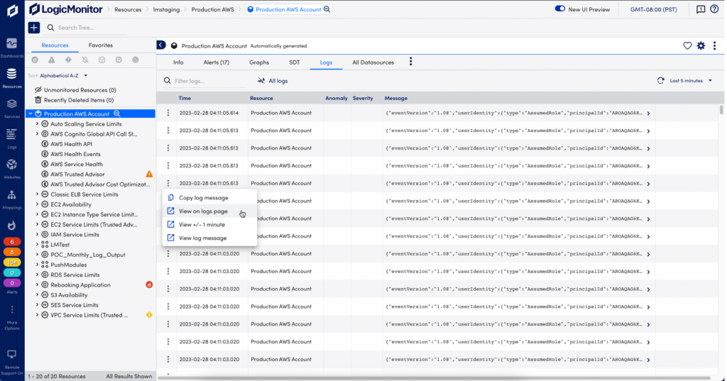
Resources Page
From the Resources page, select the desired resource or resource group, and select the Logs tab. By default this shows logs from the last 5 minutes for the selected resources or groups. You can change this to show logs for a time range up to 30 minutes. From Resources you can open the Logs page to continue investigating logs.
Graphs Tab for Alerts
When you get alerted for an issue with a monitored resource, you can troubleshoot the issue with log anomalies as additional context in the Alerts page.
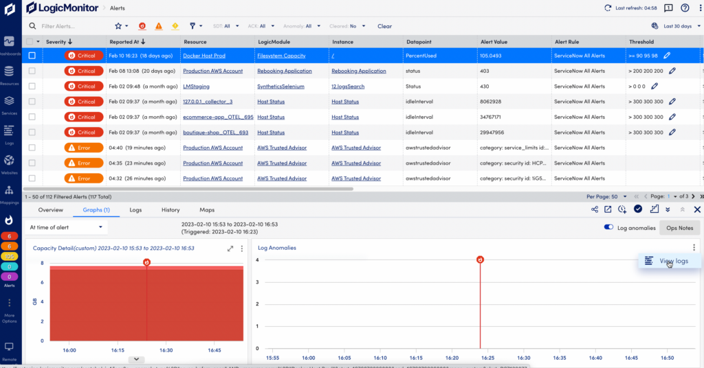
If there are log anomalies related to a metric Alert, you can investigate them in the Graphs tab:
- The log anomalies graph and table displays log anomaly occurrences and log messages over the time period of the alert.
- The red line in the graphs indicate when the alert was triggered in relation to the log anomalies and graphed time series data.
In the log anomalies graph, select “View Logs” from the drop-down menu to switch to the Logs page for further investigation. The Logs page will open with filters preselected on the Resource and the time period of the alert to display related log anomalies.
